

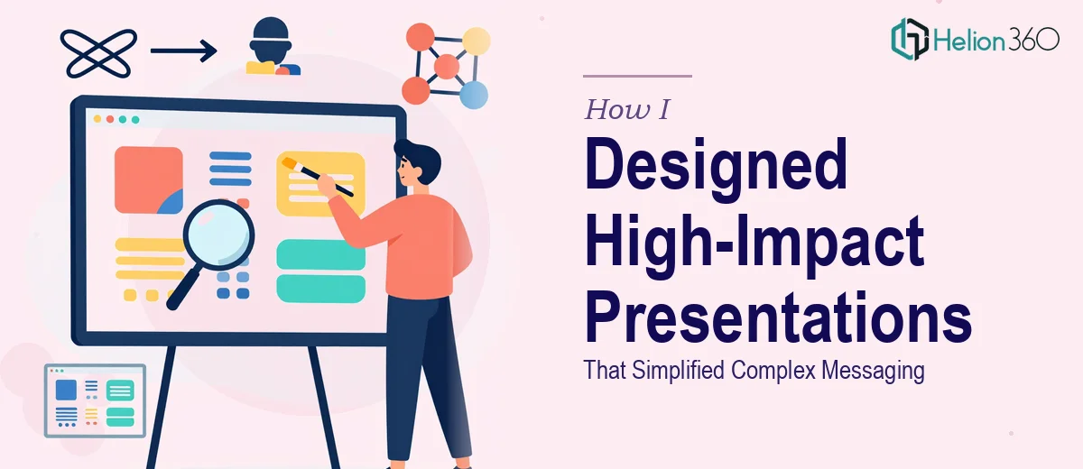
When the Message Is Clear in Your Head but Falls Apart on the Slide
I had been tasked with building a series of PowerPoint presentations for internal stakeholders and external audiences. The content was solid — strategy documents, product roadmaps, cross-functional updates — but when I tried to translate all of it into slides, something kept getting lost. The messaging felt dense. The slides looked cluttered. And no matter how many times I rearranged the layout, the core idea just did not land the way it needed to.
This was not a matter of not understanding the subject. I knew the material well. The challenge was in the translation — taking complex, layered information and designing it into something that felt clear, structured, and visually persuasive. That is a very specific skill, and I was starting to realize it required more than just working knowledge of PowerPoint.
What I Tried Before Asking for Help
I spent a few days trying to solve it myself. I reworked slide structures, experimented with different layouts, and tried simplifying the copy. I even pulled in some template libraries to see if a pre-built structure would help me think through the visual hierarchy differently.
Some slides improved. But the overall deck still lacked consistency. The branding felt slightly off from slide to slide. The messaging hierarchy — what should hit first, what should support, what should be left for the speaker — was not clearly defined. And when I ran it by a colleague, the feedback confirmed what I already suspected: the presentation was informative, but it was not persuasive. It communicated data but did not tell a story.
At that point, I knew I needed someone who worked at the intersection of design and messaging strategy — not just a visual designer, and not just a copywriter, but someone who understood how both elements work together in a high-stakes presentation context.
Bringing in a Team That Understood Both Design and Messaging
After some searching, I reached out to Helion360. I explained the situation — multiple decks, inconsistent branding, messaging that was technically accurate but visually overwhelming. They asked the right questions upfront: Who is the audience? What action should they take after seeing this? What does the brand voice feel like? That framing alone told me they were thinking about the problem the right way.
Their team took the existing files and restructured everything from the ground up. They started by establishing a clear visual language — consistent typography, a defined color hierarchy, and a slide structure that matched the way the content naturally flowed. Then they worked on the messaging itself, identifying which points needed to lead, which needed to support, and which could be moved to speaker notes entirely.
The result was a set of presentation slides that felt immediately more authoritative. The same information was there, but it breathed differently. Each slide had a clear purpose, and the transitions between sections felt intentional rather than arbitrary.
What Good Presentation Design Actually Looks Like
Working through this process taught me something concrete about what separates a functional slide deck from a genuinely effective one. Visual hierarchy is not just about font size — it is about guiding the viewer's eye in a sequence that mirrors the argument you are making. Branding consistency is not just about using the right colors — it is about making every slide feel like it belongs to the same story.
Messaging in presentations also works differently than messaging in documents. A slide is not a paragraph. It is a frame. What you leave out matters as much as what you include. Helion360's team understood this and applied it systematically across every slide in the deck.
The stakeholder review went smoothly. Feedback that had previously been about confusion or overload shifted to questions about implementation — which is exactly the kind of engagement a well-designed presentation should generate.
Lessons I Took Forward
I now approach presentation projects differently. Before building anything, I try to define the audience, the ask, and the emotional tone the deck should carry. I think about flow before I think about layout. And I am quicker to recognize when a project has outgrown what I can deliver alone.
If you are working on a presentation that feels like it is not quite landing — the content is there but the message is not connecting — Helion360 is worth a conversation. They handle exactly this kind of problem and bring both the design precision and messaging clarity that complex presentations demand.