

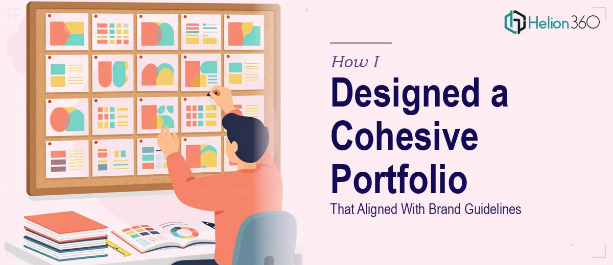
The Brief Sounded Simple Enough
Our company needed a fresh portfolio presentation — one that could communicate who we are, what we do, and why we do it well. The slides had to reflect our brand identity, feel polished enough for external audiences, and be flexible enough for the team to update over time.
On paper, this was a standard PowerPoint redesign project. In practice, it turned into something considerably more involved.
Where I Started and Where Things Got Complicated
I began where most people do — pulling together the existing slides, collecting the brand assets, and opening up PowerPoint with a rough idea of what the final result should look like. I had access to our brand guidelines document, the logo files, and the colour palette. I figured a few hours of layout work would get me close.
The first problem was consistency. Every time I built a new slide section, something felt slightly off — the spacing, the type hierarchy, the way images sat next to text. Nothing was dramatically wrong, but nothing quite held together either. A professional portfolio presentation needs to feel like a single, unified system, not a collection of individually designed slides.
The second problem was the master slide setup. I wanted the PowerPoint template to be reusable — something the team could open and populate without breaking the design. Building a proper slide master with locked brand elements, correct font styles, and editable content zones is genuinely technical work. I kept running into situations where editing one layout affected five others, or where placeholder behaviour did not carry through as expected.
I also wanted to bring in some visual storytelling elements — icon sets, section dividers, image treatment styles — that would give the portfolio a distinct look. But sourcing, adapting, and integrating those assets while keeping the file clean and lightweight took more time than I had budgeted.
Bringing In the Right Help
After a week of incremental progress and growing frustration, I reached out to Helion360. I explained what we were trying to achieve — a branded PowerPoint portfolio system with a clean master template, consistent slide layouts, and visual elements that matched our company guidelines. I shared the brand assets and a rough outline of the slide sections.
Their team asked the right questions upfront. They wanted to understand how the file would be used after delivery — who would be editing it, on what devices, and for which audiences. That kind of scoping conversation made a real difference to the final output.
What the Final System Looked Like
Helion360 built the presentation from the ground up using a properly structured PowerPoint master. Every layout was defined at the master level, which meant the typography, colour application, and spacing rules were locked in by default. The slide designs themselves were clean and uncluttered — visuals were given room to breathe, and the brand story came through without the slides feeling overdesigned.
The icon style was consistent across every section. The image treatment — how photos were cropped, framed, and positioned — followed a single visual logic. Section transition slides gave the portfolio a sense of flow rather than just a series of disconnected content blocks.
Perhaps most usefully, the file was delivered with a short internal guide explaining which elements were editable and which were locked. That alone saved us from future formatting problems.
What This Project Taught Me
Building a presentation that genuinely aligns with brand guidelines is not just a design task — it is a systems task. Getting the visual output right matters, but so does how the file is structured, how it behaves when someone else opens it, and whether it can scale across future updates.
I had the content knowledge and the brand direction. What I was missing was the technical execution and the design experience to make all of it hold together as a coherent whole. That gap is where professional presentation design work actually lives.
If you are in a similar position — you know what your company portfolio needs to say but cannot get the slides to reflect that properly — Helion360 is worth a conversation. They took a scattered set of assets and requirements and turned them into something that actually worked.