

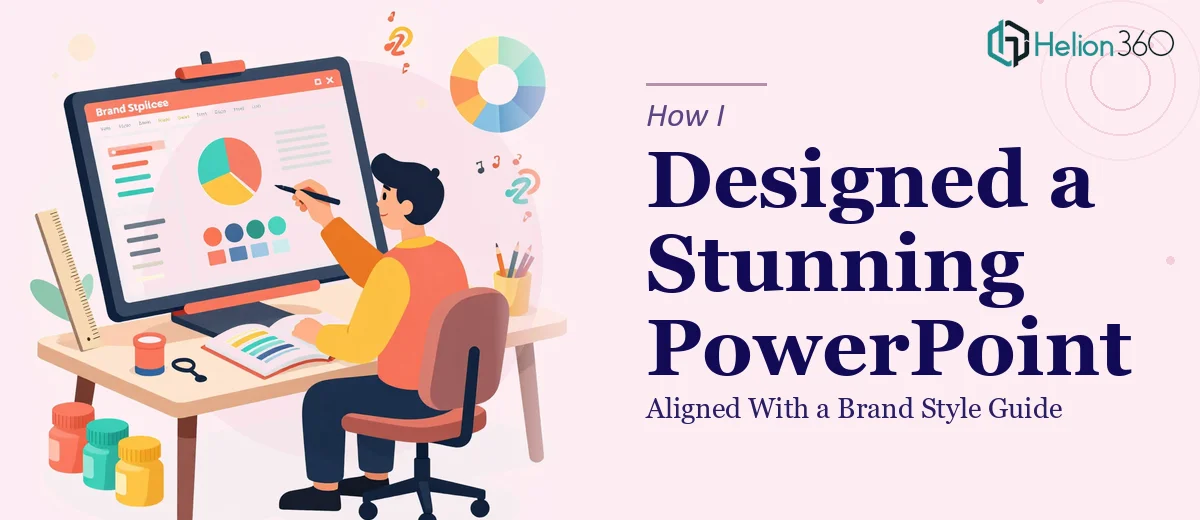
The Brief Looked Simple. It Wasn't.
I had a clear ask on paper: build a comprehensive PowerPoint presentation that covered recent company achievements, upcoming projects, and future plans. The slides needed graphs, charts, images, and even embedded video. Everything had to feel modern and professional, and — most importantly — every design choice had to stay locked to an existing brand style guide.
I figured a few hours in PowerPoint and I'd have something solid. I was wrong.
Where Things Started Getting Complicated
The style guide was detailed. Specific hex codes, defined font hierarchies, strict logo placement rules, and a grid system that governed every layout. Following it correctly while also making the slides visually engaging turned out to be harder than I expected.
I'd get a slide looking clean and branded, then realize the data visualization looked flat. I'd fix the charts and find the layout had drifted from the grid. Embedding a video without breaking the slide structure created a new round of issues. Keeping everything consistent across 30-plus slides while hitting every brand requirement — that's when I realized the scope of the work was well beyond what I could execute cleanly on my own.
Brand-aligned PowerPoint design isn't just about matching colors. It's about understanding how type, spacing, imagery, and data work together to communicate the right message without ever looking like someone just dropped content onto a slide.
Bringing in the Right People
After hitting a wall with the slide layouts and chart styling, I came across Helion360. I explained the full brief — the style guide, the content structure, the need for embedded media, and the fact that this presentation had to impress a real audience. Their team asked the right questions upfront: what's the purpose of each section, who is presenting this, and how does the brand typically communicate visually?
That clarity in the intake process told me they understood this wasn't just a formatting job.
What the Design Process Actually Looked Like
Helion360 started by building a master slide template that respected every element of the style guide — the correct typefaces at the right weights, precise color application, and a grid that held across all slide sizes. That foundation made everything else easier to build on.
For the achievements section, they designed custom data visualizations — bar charts and progress indicators — that carried the brand's visual language rather than looking like default PowerPoint chart styles. The upcoming projects section used a timeline layout with iconography that matched the brand's tone. For future plans, they created a roadmap visual that communicated strategy clearly without crowding the slide.
The video slides were handled cleanly, with branded placeholder frames and proper export settings so playback wouldn't cause issues during the actual presentation.
Throughout the process, every slide felt like it belonged to the same deck. That consistency is harder to achieve than it looks, especially across a long presentation with varied content types.
What the Final Deck Delivered
The finished presentation was exactly what the brief asked for — visually cohesive, brand-accurate, and built for a real audience. The charts communicated data without being dense. The layouts guided the eye naturally. The slides felt designed, not assembled.
Looking back, the complexity wasn't in any single element. It was in holding everything together — brand rules, content logic, visual hierarchy, and technical requirements — across every slide simultaneously. That kind of professional presentation design requires both design skill and process discipline.
Working with Helion360 on this gave me a clearer sense of what a brand-aligned PowerPoint presentation should actually feel like when it's done properly. The difference between a formatted deck and a designed deck is significant, and it shows the moment the presentation is on screen.
Need a Presentation That Reflects Your Brand the Right Way?
If you're working with a brand style guide and need a PowerPoint presentation that genuinely honors it — across layouts, data visualizations, and media — Helion360 can take that complexity off your plate and deliver work that holds up in front of any audience.