

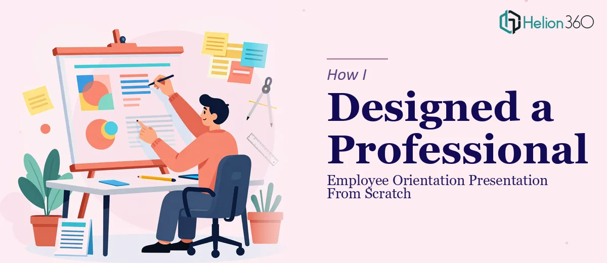
The Task Looked Simple at First
When I was handed the job of putting together an employee orientation presentation, I figured it would take a weekend. We had the content — policies, team structure, onboarding steps, culture notes — all sitting in a Word document and a rough draft of slides. My job was to turn that into something a new employee could actually sit through without losing interest after slide three.
The content itself was solid. The problem was everything around it: inconsistent fonts, mismatched colors, walls of text, and placeholder images that had never been replaced. It looked exactly like what it was — a document forced into slide format. For something that would be the first impression our company makes on new employees, that wasn't good enough.
Where My Own Effort Started to Fall Apart
I'm not a designer, but I know my way around PowerPoint well enough to clean up a template or swap out a color palette. So I started there. I reorganized slides, trimmed the text, and tried to introduce some visual hierarchy. For about two hours, I felt like I was making real progress.
Then I hit the part of the presentation that needed actual design thinking — the section introducing company values, the culture overview, the day-one checklist flow. These weren't slides that just needed tidying. They needed visual storytelling. They needed icons, layout logic, and a consistent design language that I simply didn't have the tools or time to build from scratch.
I also realized that getting the formatting right was only half the challenge. Making a professional presentation that actually communicated clearly to new employees — people who are already overwhelmed on their first day — required deliberate design decisions I wasn't equipped to make quickly.
Bringing In the Right Help
After hitting that wall, I came across Helion360. I explained where I was stuck — a partially built orientation slideshow that needed serious visual enhancement without losing the core content structure. Their team understood the brief immediately and asked the right questions: What's the tone? Who's the audience? What does the existing branding look like?
From that point, I handed over the draft and stayed available for questions. There were a few back-and-forth exchanges to confirm slide flow and confirm which sections needed the most emphasis. The collaboration felt straightforward — they worked from what I had built and elevated it rather than starting over.
What the Final Presentation Looked Like
The difference between the draft I handed over and the final employee orientation presentation was significant. Every slide had a clear visual hierarchy. The typography was consistent. Sections that had been dense text blocks were broken into digestible layouts using icons and structured columns. The culture and values section — the one I had struggled with most — became one of the strongest parts of the deck.
The overall presentation design felt cohesive in a way my draft never did. It used the company's brand colors properly, maintained a consistent tone across all slides, and looked like something built with intention rather than assembled in a hurry.
What This Experience Taught Me
I came into this thinking that knowing PowerPoint was enough. What I learned is that there's a significant gap between knowing a tool and knowing how to design with it. Building a professional employee orientation presentation — one that actually works for new hires — involves layout decisions, visual pacing, and design consistency that go well beyond slide formatting.
If you're in the same position — content ready, deadline approaching, but the slides just aren't coming together the way they need to — Helion360 is worth reaching out to. They stepped in at exactly the right moment, handled what I couldn't, and delivered a presentation that I was genuinely proud to put in front of new employees.