

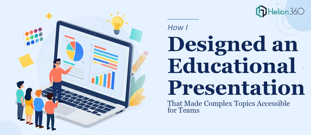
The Task: Make Complex Information Easy to Understand
A few weeks ago, I was handed a project that sounded straightforward on paper — create an educational presentation for our team covering a dense, multi-layered subject. The goal was clear: take complicated material and make it genuinely accessible, visually engaging, and easy to follow during a live session.
I decided to use Canva since the team was already familiar with it, and I figured the drag-and-drop interface would make things fast. I had the content ready. I had a rough outline. What I did not anticipate was how quickly the design side of things would become a real challenge.
Where I Hit the Wall
I started with one of Canva's built-in templates and began dropping in content. Introduction slides, main topic sections, a conclusion — it all looked fine at first glance. But when I stepped back and reviewed the deck as a whole, something felt off. The slides were inconsistent. Some text-heavy slides felt cluttered, while others looked bare. The visual hierarchy was not guiding the reader anywhere useful.
I also struggled with the interactive elements. The brief had specifically asked for something that would keep the audience engaged — not just a wall of slides. I tried adding icons, timelines, and call-out boxes, but none of it felt cohesive. The presentation was informative, yes, but it did not look like something a team would actually enjoy sitting through.
I spent a solid two days trying to fix the layout and honestly made it worse in parts. The problem was not a lack of effort — it was that combining clear educational structure with strong visual design is genuinely a specialized skill.
Bringing in the Right Support
After hitting a wall, I reached out to Helion360. I explained what the presentation was for, shared my draft, and described the outcome I was trying to achieve — a polished, easy-to-navigate educational deck that could hold a team's attention from the introduction through to the conclusion.
Their team reviewed what I had and got to work. They restructured the flow, aligned the visual language across all slides, and created a consistent design system that made each section immediately recognizable. Where I had dense paragraphs, they introduced clean visual layouts with supporting graphics. Where I had awkward transitions between topics, they created clear section breaks that helped the audience follow the narrative.
The interactive elements I had struggled with were handled thoughtfully too — they added engagement cues and visual checkpoints throughout the deck without making it feel gimmicky.
What the Final Presentation Looked Like
The finished educational Canva presentation was a significant step up from what I had started with. Every slide had a clear purpose. The introduction set expectations without overwhelming anyone. The main content slides used a mix of visuals, short text, and structured layouts that made even the densest topics digestible. The conclusion wrapped everything up in a way that felt natural, not abrupt.
When I presented it to the team, the feedback was genuinely positive. People said it was easy to follow. A few mentioned that the visuals helped them understand concepts they had found confusing in written form. That was exactly the outcome the project had been built around.
What I Took Away From This
Designing an educational presentation is not just about putting information into slides. It requires thinking about how people process information visually, how much content belongs on a single slide, and how the overall structure guides someone from not knowing something to understanding it. Canva gives you the tools, but using those tools to produce a genuinely professional and effective deck takes more than familiarity with the platform.
The two weeks I had for this project felt tight when I was working alone. With the right design support, the timeline became manageable and the output was something I was actually proud to deliver.
If you are working on an educational presentation and finding that the design is not matching the quality of your content, Helion360 is worth reaching out to — they took my rough draft and turned it into something the entire team responded well to.