

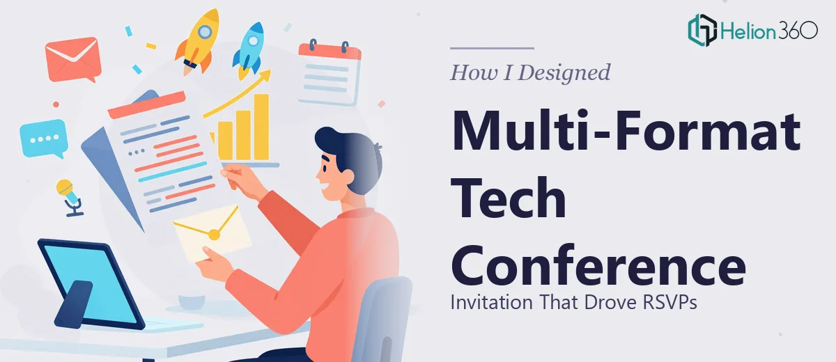
When a Simple Invitation Turned Into a Real Design Challenge
I thought it would be straightforward. We had an upcoming tech conference focused on the latest trends in artificial intelligence, and I needed to put together an invitation that would actually get people to show up. Something professional, on-brand, and clear enough that attendees would know exactly what they were signing up for.
I started by sketching out a layout myself. The brief was specific: include the event date, time, and location prominently, work in the company's color scheme and logo without making it feel like a corporate brochure, add a strong call-to-action for RSVPs, and keep the visual tone sophisticated while still feeling current and engaging.
That part I had covered — at least in theory.
Where Things Started to Unravel
The first version I put together looked decent on screen. But then came the real requirements. The invitation needed to work across multiple formats — a print-ready version at high resolution, a digital version optimized for email distribution, and a social media cut that could be shared across platforms. Each format had different size constraints, different color mode requirements (CMYK for print, RGB for digital), and different expectations around how text and imagery would render.
I also had to source imagery relevant to an AI-focused conference — not generic stock photos of servers and code, but visuals that felt conceptual and forward-looking. And every version had to feel like the same design family, just adapted for its platform.
I spent a few evenings trying to reconcile all of this. The print version looked great but the email version felt flat. The social crop lost the elegance of the original layout. Getting the RSVP call-to-action to land well in every format without looking like an afterthought was harder than I expected.
Bringing in Helion360
After hitting a wall trying to keep all the versions consistent, I reached out to Helion360. I explained the full scope — the AI conference theme, the brand guidelines, the need for multiple file formats, and the RSVP-focused design goal. They asked the right questions upfront: what was the primary distribution channel, what tone did the brand lean toward, and did we have existing brand assets or were those being built fresh.
That level of clarity in the briefing process made me feel like they had done this kind of work many times before.
Their team took the project from there. They developed a design concept that balanced the sophistication the brief called for with a visual language that felt relevant to an AI audience — clean geometry, restrained use of color, and typography that communicated authority without being cold. The company's color scheme and logo were incorporated naturally, not bolted on.
What the Final Deliverables Looked Like
The finished set included a print-quality version at 300 DPI with proper bleed and CMYK color values, a digital version formatted for email headers with an embedded RSVP link placement, and a condensed social media version that maintained the visual hierarchy of the full design. All three felt like part of the same campaign rather than separate assets cobbled together.
The date, time, and location were placed prominently in each version, and the RSVP call-to-action had enough visual weight to stand out without dominating the layout. The AI-themed imagery they sourced was abstract enough to feel high-concept but grounded enough to communicate what the event was actually about.
When we distributed the invitation across channels, the response rate was noticeably stronger than previous events. People commented on how polished it looked. A few even asked who designed it.
What I Took Away From This
Designing an invitation sounds like a contained task until you factor in multi-format delivery, print specifications, brand consistency, and a specific audience tone. The visual design itself is only part of the work — knowing how to adapt one design across different technical outputs without losing the original intent is a different skill set entirely.
If you're in a similar situation — working on a conference invitation or event communication that needs to hold up across print and digital — Helion360 is worth reaching out to. They handled the complexity that was slowing me down and delivered a finished product that actually performed.
Learn more about how modern PowerPoint presentations can captivate audiences, or explore how brand identity and data storytelling come together in compelling visual designs.