

Every quarter, the same pressure hits. Sales reports pile up, financial summaries come in from three different departments, and somewhere in that stack of spreadsheets and PDFs is a story that leadership actually needs to hear. The problem is getting it out of the data and onto slides in a way that makes sense — clearly, consistently, and on time.
That was exactly where I found myself when our team needed to prepare a QBR PowerPoint presentation for a cross-departmental stakeholder review. The ask was straightforward enough on paper: pull together performance metrics, market context, and forward-looking insights into a cohesive quarterly business review deck. In practice, it turned out to be far more complex.
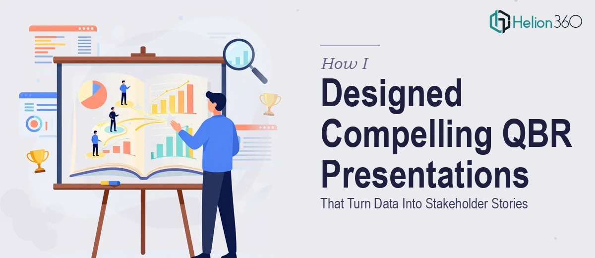
The Challenge with QBR Presentations
A quarterly business review presentation is not just a data dump. Stakeholders do not want to sit through forty slides of raw numbers. They want to understand what happened, why it matters, and what comes next. That means every chart needs context, every metric needs a narrative, and the design itself has to guide attention — not scatter it.
I started by pulling together the inputs: sales reports, financial statements, and a market analysis summary. My initial attempt at structuring the deck felt disjointed. Each section looked like it belonged to a different presentation. The charts were accurate but visually inconsistent. The slides for the sales team used a completely different layout than the slides for the finance section. The branding was off in places, and some of the data visualizations were honestly hard to read.
I spent a few evenings trying to standardize the layout and bring visual consistency to the deck. I could handle the content side reasonably well — the narrative logic, the flow, the key takeaways. But the design execution at the level this review required was beyond what I could produce in the time available.
Bringing in the Right Help
After hitting that wall, I came across Helion360. I explained what we were working with — multiple data sources, different departmental inputs, a need for consistent branding, and a hard deadline. Their team took it from there.
What impressed me was how methodically they approached the QBR slide design. They did not just make things look nice. They reorganized the flow of the presentation so each section built on the last, creating a coherent stakeholder story from what had been a fragmented set of inputs. Charts were redesigned with clarity in mind — appropriate chart types for the data, clean labels, and visual hierarchy that directed the eye to the key numbers. Every department's section followed the same layout logic while still feeling relevant to its specific audience.
What a Well-Designed QBR Deck Actually Requires
Going through this process taught me something I had underestimated before. A strong quarterly business review presentation requires several things working together at once. The data visualization has to be accurate and readable. The narrative structure has to support the business context. The design has to reflect consistent branding so the whole deck feels like one unified communication, not a patchwork.
Helion360 handled all of that. The final deck covered performance highlights, revenue trends, market analysis, departmental updates, and a forward-looking section — all styled consistently and structured to hold attention from the opening slide to the last.
When we presented it, the feedback was noticeably different from previous quarters. Stakeholders engaged with the content more directly. The questions were sharper because the information was clearer. That is the outcome a well-designed QBR PowerPoint presentation is supposed to produce.
What I Would Do Differently Next Time
I would not wait until I had already spent days struggling with the design before asking for help. The content strategy and data gathering are things I can own. The actual slide design — especially when it needs to look polished, stay on brand, and communicate complex data clearly — is a different skill set entirely.
There is no shame in recognizing where a project needs more than you can provide on your own. For a quarterly business review that goes in front of senior stakeholders, the quality of the presentation directly affects how the work gets perceived.
If you are preparing a QBR deck and finding that the design is not matching the quality of the content behind it, Helion360 is worth reaching out to — they handled exactly that problem for us and delivered a presentation that actually did its job.