

The Brief Looked Simple Enough — Until It Wasn't
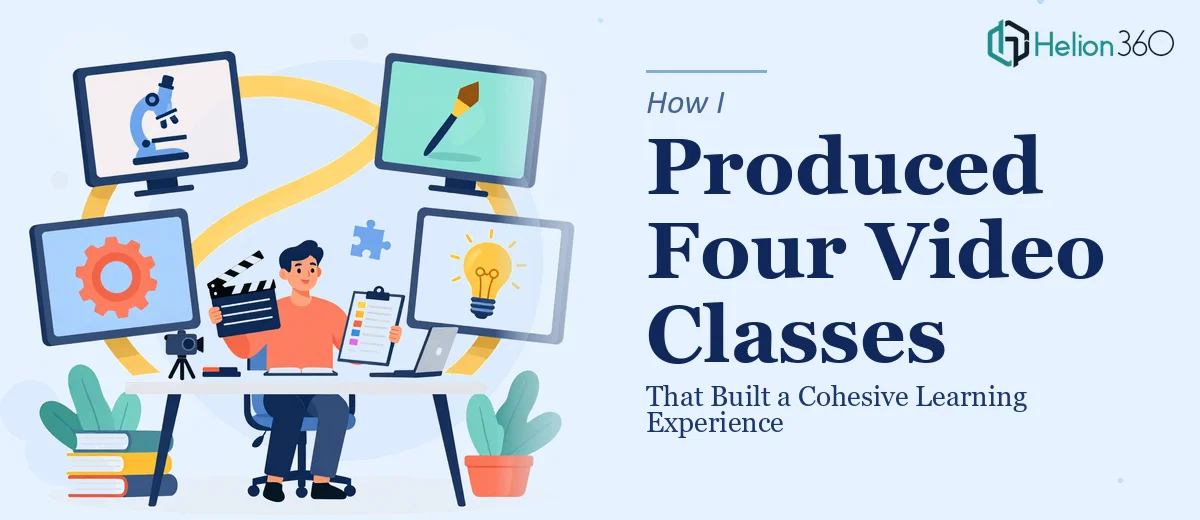
When the project first landed on my desk, it read straightforwardly: produce four video classes, each between 20 and 30 minutes long, covering a topic from foundational concepts all the way through to advanced strategies. Three sessions would be content-focused, and the fourth would serve as a presentation class — a wrap-up that included key takeaways and a live Q&A format.
I had done smaller-scale video work before, so I figured I could manage this end to end. The structure seemed clear. The content outline was mostly there. I just needed to pull it all together.
What I underestimated was how much work goes into making four separate video classes feel like one unified learning experience rather than four disconnected recordings.
Where the Complexity Started to Surface
The first class — foundational concepts — came together reasonably well. I had a script, a rough slide structure, and a recording setup that worked. But once I moved into the intermediate and advanced sessions, the cracks started to show.
Each video needed to build deliberately on the last. That meant every visual reference, every example, every transition between ideas had to carry forward something from the previous session. Getting the content right was one challenge. Getting the presentation layer — the slides, the pacing, the visual consistency — to support that arc was a different problem entirely.
The presentation class at the end added another dimension. It was not just a summary. It needed to tie all three content classes together into something coherent, include structured key takeaways per video, and leave room for an interactive Q&A section. Designing that final class required knowing exactly what had been said across the first three — and presenting it in a way that felt conclusive without being repetitive.
I had the content knowledge. What I lacked was the bandwidth and design precision to pull the full series together at the quality it deserved.
Bringing in the Right Support
After a few days of stalled progress on the visual and structural side, I reached out to Helion360. I explained the scope — four video classes, a clear progression from foundational to advanced, and a final presentation class that needed to hold the whole series together visually and structurally.
Their team asked the right questions upfront: What tone did the classes need to carry? How much existing content was already scripted? What did the presentation class need to achieve beyond summarizing? That conversation gave me confidence they understood the project was more than a design job — it was an instructional design challenge with a visual layer on top.
Helion360 took over the slide architecture and the visual framework for all four sessions. They built a consistent design system across the classes so that each one felt like a continuation of the last — same type hierarchy, same visual language for concepts, same structural rhythm. That consistency was exactly what I had been struggling to create manually.
What the Final Series Looked Like
The three content classes each followed a clear internal structure: an opening that connected back to the previous session, a core teaching section, and a close that planted a hook for the next one. The visuals reinforced the instructional flow without overpowering it.
The presentation class — the fourth video — came together as a genuinely useful standalone session. It recapped the arc of the full learning experience, surfaced the most important takeaways from each class in a way that was easy to follow, and created a natural format for the Q&A segment.
When the full series went out to the community, the response confirmed that the cohesion had landed. Viewers commented on how well each class built on the previous one. A few specifically mentioned that the final presentation class helped everything click into place.
What I'd Do Differently Next Time
The biggest lesson from this project was to think about the full learning experience arc before building any individual class. Content depth matters, but structural continuity is what makes a multi-part series feel intentional rather than assembled.
I also learned that visual consistency across a video class series is not a cosmetic concern — it is part of how learners process and retain information. When the look and feel shifts between sessions, it creates subtle friction. When it holds steady, the content moves to the foreground.
If you are working on a similar multi-part video or educational content project and hitting the same structural walls I did, Helion360 is worth reaching out to — they stepped in at exactly the right moment and brought the kind of structural and visual precision the project needed.