

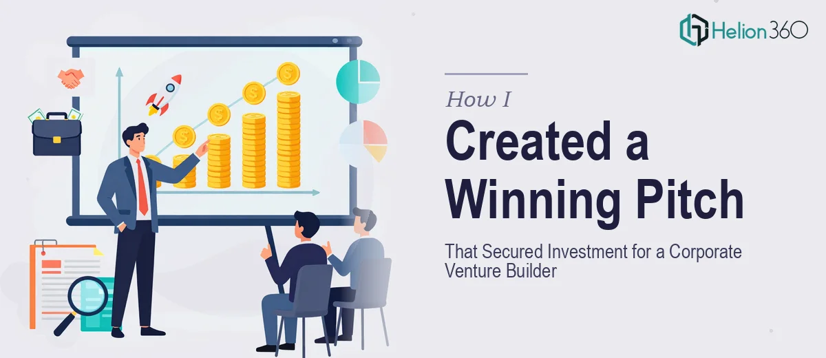
The Problem I Was Staring At
I was leading a corporate venture builder looking to enter a competitive New York City market. To move forward, we needed to go in front of investors with something concrete — not assumptions, not vague positioning, but real data about what local businesses and consumers actually needed and how we stacked up against the alternatives already out there.
The deadline was tight. Investor conversations were already scheduled. What I had on hand was a rough collection of survey responses, some secondary industry data, and a half-finished slide deck that looked nothing like something worth putting in front of serious capital allocators.
I knew what was at stake. A weak presentation at this stage doesn't just lose the meeting — it signals that the team doesn't understand the market. That wasn't a risk worth taking. This needed to be done right, and done fast.
What I Found This Kind of Work Actually Requires
Before I made any decisions, I spent a few hours understanding what turning raw market research into a credible, investment-ready presentation actually involves. What I found was more layered than I expected.
First, the data itself needs to be structured before it can be visualized. Survey responses from businesses and consumers aren't presentation-ready — they require synthesis, segmentation, and framing around a clear narrative. Someone has to make editorial decisions about which findings lead the story and which ones provide supporting context.
Second, the visual translation of that data matters enormously. A bar chart of consumer preferences reads very differently depending on how it's scaled, labeled, and positioned relative to the claim it's meant to support. The wrong chart type for a given insight actually weakens the argument.
Third, investors in a competitive market entry situation expect to see a specific set of signals: market sizing, demand validation, competitive differentiation, and a clear positioning thesis. The structure of the presentation has to follow the logic of their evaluation process — not just the logic of the research itself. That's a meaningful difference, and it's easy to get wrong.
The Work That Goes Into Getting This Right
The foundation of a strong market research presentation is narrative architecture. The work starts with auditing all source material — survey data, secondary market reports, competitive intelligence — and mapping it against a story arc that matches how an investor evaluates opportunity. That means leading with market context, validating demand through primary research findings, and building toward a differentiated positioning thesis. Getting this sequence right requires knowing which data points carry argumentative weight and which ones are supporting detail. The structural decisions made here determine whether the deck reads as a confident market entry case or a disconnected data dump.
Visual mechanics are where the argument either lands or falls apart. A properly built market research presentation uses a consistent type hierarchy — typically 36pt for slide headlines, 24pt for callout data, 16pt for supporting body text — so the reader's eye moves predictably through each slide. Chart selection follows strict logic: proportional comparisons use bar or column charts, trend data uses line charts, and competitive positioning maps use quadrant frameworks. Each chart needs a direct, declarative headline above it — not a label, but a conclusion. Designing this across twenty or more slides without introducing inconsistency takes real discipline and familiarity with master slide systems.
Polish and brand consistency across the full deck is the layer that separates a credible presentation from one that looks assembled under pressure. A maximum of four brand colors applied with purpose, consistent icon weight and style, aligned margins using a 12-column grid, and uniform slide padding — these aren't cosmetic choices. They signal organizational rigor to the people evaluating the business behind the deck. The execution friction here is real: one misaligned element on slide 14, one chart that uses a slightly different blue, one title that breaks to a second line when others don't — these details compound quickly across a long deck and are genuinely time-consuming to catch and correct without the right tooling.
Why I Brought in Helion360 to Handle It
I looked at what this project actually required — narrative synthesis from raw survey and research data, proper data visualizations built to investor expectations, and a fully polished, brand-consistent deck across every slide — and I recognized immediately that attempting it myself wasn't realistic given the timeline.
This wasn't a situation where I needed someone to clean up a slide or two. The full project needed to be handled end-to-end: structuring the research findings into a coherent investment narrative, designing the data visualizations with the right chart logic and labeling, and delivering a complete deck that looked like it came from a team that knew exactly what they were doing.
Helion360 handled all of it. They turned the project around quickly — done in days, not weeks — which mattered enormously given that investor conversations were already on the calendar. The research findings were synthesized into a clear market entry narrative. The data was visualized correctly, with chart types and headlines matched to the claims being made. The full deck was delivered polished and consistent, with nothing that looked rushed.
The Outcome and What I'd Tell Anyone in My Spot
What we walked into those investor conversations with was a presentation that communicated market understanding clearly and professionally. The research findings — consumer demand signals, competitive positioning, market sizing — were structured the way investors actually think through an opportunity. The visual execution matched the seriousness of the ask. The conversations moved forward.
The thing I'd tell anyone who finds themselves in this same position: the gap between raw research data and a presentation that actually works in front of investors is wider than it looks from the outside. The synthesis, the visualization logic, the structural decisions — each layer takes real expertise to execute correctly, and the time required to learn it well is time most people in this position simply don't have.
If you're looking at a similar project and want it handled end-to-end without the weeks of learning curve, Helion360 is the team I'd engage — they delivered for me fast and brought the kind of execution depth this work genuinely requires.