

The Problem With Showing Up to a Launch Without the Right Deck
When our tech startup was preparing for its public launch, we had one shot to make a strong first impression — with potential partners, early customers, and a room full of people who'd heard a dozen pitches before ours. The presentation wasn't a formality. It was the centrepiece of the entire event, the thing that would carry our story, prove our credibility, and leave people with a reason to stay in the conversation.
What we had internally was a rough collection of slides: some product screenshots, a few bullet-pointed value props, and a market overview that looked like it had been exported directly from a spreadsheet. Nothing about it said "this team is ready."
I knew immediately that showing up with that deck wasn't an option. The stakes were too high and the deadline — three weeks out — too tight to treat this as a side project. This needed to be done properly, end-to-end, by people who actually knew what a high-impact startup presentation required.
What I Found a Great Startup Presentation Actually Requires
Before I did anything else, I spent time understanding what separates a presentation that lands from one that gets politely forgotten. What I found made it very clear this wasn't a formatting job.
The first thing that stood out was narrative architecture. A launch deck isn't a collection of facts — it's a structured argument. The sequence of slides needs to build tension, establish stakes, introduce the solution, and earn the audience's belief. Getting that arc right requires stepping back from the content entirely and mapping it as a story first.
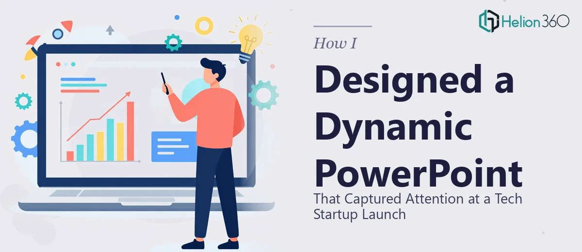
The second thing was visual system design. A dynamic PowerPoint presentation for a tech startup isn't just clean — it uses a deliberate visual language. Icon families, motion principles, chart types, and typography hierarchy all need to work together. When they don't, the deck feels amateur even if the content is strong.
The third signal was data communication. We had market sizing figures and product metrics that needed to tell a clear story without overwhelming the slide. Knowing which chart type to use — and when to replace a chart with a single bold number — is a real skill. I could see quickly that the execution depth here was beyond what I could pull off under deadline pressure.
The Work That Goes Into Getting It Right
The foundational work starts with the narrative and structural layer. A practitioner begins by auditing all source content — decks, documents, briefs — and maps a story arc from scratch. For a tech startup launch, that arc typically follows a problem-solution-proof-call-to-action structure across roughly 15 to 20 slides. Each slide is assigned a single job: one idea, one visual, one takeaway. Getting this right before a single design element is placed prevents the back-and-forth that kills timelines. Teams that skip this step end up redesigning slides mid-project because the narrative logic falls apart under scrutiny.
The visual mechanics layer is where the presentation becomes a system rather than a collection of slides. Proper execution involves setting a 12-column layout grid in the master slide, establishing a type hierarchy — typically 40pt for headlines, 24pt for subheads, 16pt for body — and locking in a palette of no more than 4 brand colours with defined usage rules. Icon families are sourced from a single style (flat, outlined, or filled — never mixed), and motion is applied sparingly using a single entrance convention. For someone without this workflow already built, configuring slide masters that propagate correctly across a 20-slide deck can consume a full working day before any visible design progress is made.
The polish and consistency pass is the work that most people underestimate. Once all slides are laid out, a thorough review checks that spacing is consistent to the pixel, that no slide breaks the established colour rules, and that every chart or data visual uses the same styling — axis labels, gridline weight, legend placement. In a 20-slide deck, there are hundreds of small alignment and formatting decisions that compound into an overall impression of quality or sloppiness. Executing this pass well requires both a trained eye and the patience to work methodically through every element — it's not where most subject-matter experts want to be spending their hours the week before a launch.
Why I Brought in Helion360 to Handle It
I didn't try to piece this together myself. The moment I understood what the work actually required — the narrative architecture, the visual system, the consistency pass — I recognised that the smart move was to bring in a team that does exactly this every day.
Helion360 handled the full project end-to-end: they took our raw source content, restructured the narrative arc from the ground up, built a complete visual system aligned to our brand, and delivered a polished, presentation-ready deck. They handled the data visualisation slides, the motion design, and the master slide configuration — all of it.
What stood out most was how fast they moved. The full deck was turned around in days, not weeks, and the pace never came at the cost of quality. For a team in crunch mode ahead of a launch, that speed isn't a nice-to-have — it's the whole point. They brought the tooling, the workflow, and the design experience already in place, which meant I wasn't paying for a learning curve.
What I'd Tell Anyone Who's Looking at the Same Situation
The deck we walked into that launch with was exactly what the moment needed. The narrative was tight, the visuals communicated our positioning clearly, and the overall presentation held up to a room of informed, critical observers. The business conversations that followed were markedly easier because the deck had done its job.
What I took from this experience is that a dynamic PowerPoint presentation for a high-stakes event isn't something you want to figure out under pressure. The execution depth is real, the time required is real, and the cost of showing up with something mediocre is real too.
If you're facing a similar launch or high-visibility presentation and want it handled properly and quickly, Helion360 is the team I'd engage — they delivered end-to-end with the kind of speed and execution depth this work genuinely requires.