

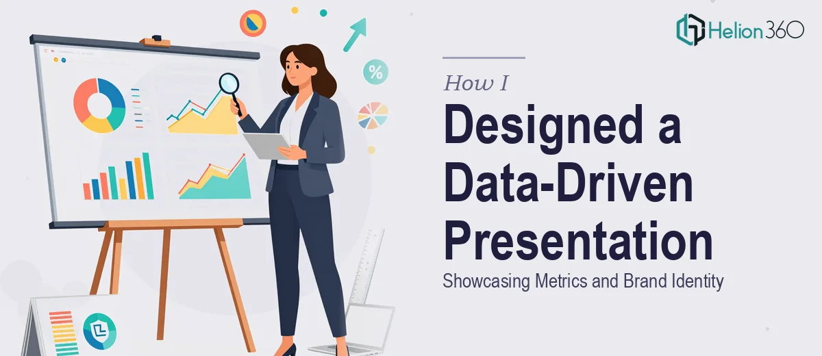
The Presentation I Kept Putting Off
Running a small business means wearing a lot of hats. For most of the year, I had been collecting data — growth numbers, customer metrics, operational benchmarks — and promising myself I would eventually turn it all into something presentable. That moment finally came when I needed a clean, professional PowerPoint to share our progress with a wider audience.
I assumed it would be straightforward. The content was ready. The numbers were formatted. All I had to do was build the slides.
It was not straightforward at all.
Why "Just Building the Slides" Was Harder Than I Expected
The moment I opened PowerPoint, I realized I was solving three problems at once, not one.
First, I needed each slide to tell a story — not just display a number, but communicate what that number meant. Raw metrics sitting inside a text box do not say anything on their own. I needed charts, visual hierarchies, and layout logic that guided the viewer from one slide to the next without losing them.
Second, I had rough sketches of how I wanted the data visualizations to look, but translating those ideas into actual graphs and infographics that were both accurate and visually clean turned out to be more technical than I anticipated. Every chart I built felt either too cluttered or too bare.
Third — and this is the part I underestimated the most — I needed consistent branding throughout. Our brand has specific colors, a particular tone, and a visual identity that I wanted woven into every slide. Not stamped on as an afterthought, but genuinely integrated into the design. Getting that right across twenty-plus slides while also managing the data layout was simply more than I could handle alone within a reasonable timeframe.
Bringing in the Right Help
After spending two evenings spinning my wheels on layout decisions and misaligned charts, I decided to stop fighting the process and look for proper support. That is when I came across Helion360. I sent over my content, explained what the presentation needed to accomplish, shared our brand guidelines, and described the visual direction I had in mind.
What happened next was a significant relief. Their team did not just drop the content into a template. They actually thought about the structure — how each slide connected to the next, which data points deserved visual emphasis, and how to use our brand colors purposefully rather than decoratively.
What the Final Presentation Looked Like
The finished PowerPoint was exactly what I had been trying to build but could not quite get to on my own. The data slides were clean and readable, with charts that communicated trends at a glance rather than requiring the viewer to do mental arithmetic. The transitions between slides felt natural, and the overall flow moved the story forward in a way that made sense.
The branding was the element I was most pleased with. The colors appeared consistently across backgrounds, headings, chart elements, and accent lines — not just in a logo placed at the bottom of each slide. It looked like the presentation belonged to the company, which is exactly what I wanted.
The visual storytelling aspect also came through clearly. Rather than a slide full of bullet points followed by another slide full of bullet points, each section had a distinct visual identity that matched the type of information being presented. Achievement slides felt celebratory. Metric slides felt analytical. Overview slides felt grounded and easy to follow.
What I Took Away From the Experience
Building a data-driven PowerPoint presentation is not just a design task — it is a combination of information architecture, data visualization, and brand management all happening at the same time. I had the content and the intent, but not the bandwidth or the technical design skill to execute all three simultaneously under time pressure.
The experience taught me that knowing when to hand something off is as important as knowing how to do it yourself. Good presentation design requires more than aesthetics — it requires someone who understands how audiences read slides and how data should be translated into visuals that work.
If you are in a similar position — content ready, direction clear, but the execution feels like it is getting away from you — Helion360 is worth a conversation. They stepped in at exactly the right moment and delivered a presentation I was genuinely proud to show.