

The Situation and What Was Actually on the Line
We were heading into a strategic review cycle — the kind where leadership, board members, and cross-functional heads are all in the room at once. The agenda covered two major product launches over the prior year, company growth across three sectors (technology, healthcare, and retail), and a forward-looking market position argument. The underlying financial research existed. The problem was that it lived across spreadsheets, analyst notes, and department reports — none of it shaped into a coherent, presentation-ready narrative.
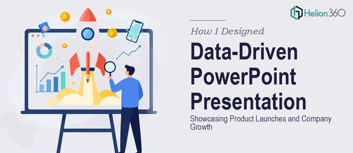
This wasn't a situation where a rough slide deck would do. The audience was sophisticated, the decisions on the table were real, and the presentation needed to communicate credibility at a glance. I recognized immediately that turning raw financial and market data into a polished, data-driven PowerPoint presentation was not a weekend task — and that getting it wrong in front of that room carried a genuine cost.
What I Found the Work Actually Required
Before doing anything else, I spent time understanding what a well-executed version of this actually looks like. What I found was that it goes considerably deeper than formatting a few charts.
First, the data itself needed interpretation before it could be visualized. Revenue trajectories, sector-level growth comparisons, competitive positioning — each of these requires a deliberate choice about what story the number is telling and which chart type makes that story legible. A bar chart and a waterfall chart can represent the same dataset and lead an audience to completely different conclusions.
Second, the structural logic of the deck had to carry the argument. Financial presentations that jump between data points without a connective thread lose the audience fast. The narrative arc — from market context, through product performance, to forward-looking positioning — had to be mapped before a single slide was built.
Third, visual consistency across what would become a 25-plus slide deck was a real production challenge. Brand colors, typography scale, chart formatting rules — these don't maintain themselves across a large file without a disciplined system in place.
What Proper Execution of This Work Involves
The structural work starts with a full audit of the source material — financial reports, sector analyses, product launch metrics — and a deliberate mapping of the narrative spine. In a presentation like this, the standard approach is a three-act structure: establish market context and opportunity, present performance evidence (product launches, growth metrics), and close with forward-looking positioning. Each slide gets assigned a single communicative job before any design begins. Skipping this step is what produces decks that feel like document dumps — technically accurate, but impossible to follow in a live setting.
The visual mechanics of financial data require specific decisions. Chart type selection follows function: grouped bar charts for period-over-period comparisons, waterfall charts for cumulative growth attribution, simple line charts for trend narratives. Typography hierarchy typically runs at three levels — 36pt for section titles, 24pt for slide headlines, 16pt for body and data labels — and deviating from that scale creates visual noise that the audience reads as lack of polish. A 12-column grid applied across master slides keeps layout consistent and prevents the misalignment issues that appear when slides are built independently. Getting this grid set up correctly so it propagates across a large deck takes meaningful time for anyone who hasn't built it before.
Polish and consistency across a 25-plus slide deck is where most self-managed attempts fall apart. The discipline required is a maximum of four brand colors applied with strict rules — primary for key data, secondary for supporting comparisons, neutrals for backgrounds and labels, and one accent for calls-to-action or highlights. Every chart needs identical axis label styling, consistent grid line weight, and matching data label placement. When those rules aren't enforced from a central style guide and master slide set, the deck develops visual drift — slides three and twenty-two look like they came from different presentations. Correcting that drift retroactively is slower than building it right the first time.
Why I Brought in Helion360 to Handle It
Once I understood the scope — narrative architecture, chart-level design decisions, and consistency discipline across a large file — it was clear this wasn't something to attempt in-house without the right tooling and background. The timeline was fixed. I needed it done fast and done to a standard the room would respect.
Helion360 handled the full project end-to-end. That meant taking the raw financial research and sector analysis, building the narrative structure, selecting and designing the appropriate chart types for each data story, and producing a fully consistent, brand-aligned deck. They managed the master slide system, the data visualization layer, and the final QA pass — all of it. What would have taken me weeks of learning curve and iteration was turned around quickly, in a fraction of the time it would have taken to work through it from scratch. The output arrived presentation-ready, with no gap between the quality of the research and the quality of the visual communication.
The Result and What I'd Tell Anyone in the Same Spot
The deck landed well. Leadership had the context they needed at each stage of the narrative, the product launch performance data was immediately readable, and the market positioning argument held together visually and logically. The quality of the presentation matched the quality of the underlying work — which is exactly what a high-stakes internal review requires.
The thing I'd say to anyone staring at a similar pile of financial data with a real deadline attached: the gap between raw research and a presentation that actually communicates it is larger than it looks, and it involves a specific set of skills that take time to develop. If you're in that spot and need it handled end-to-end without the weeks of iteration, Helion360 is the team I'd engage — they delivered fast and brought the kind of execution depth this work genuinely needs.