

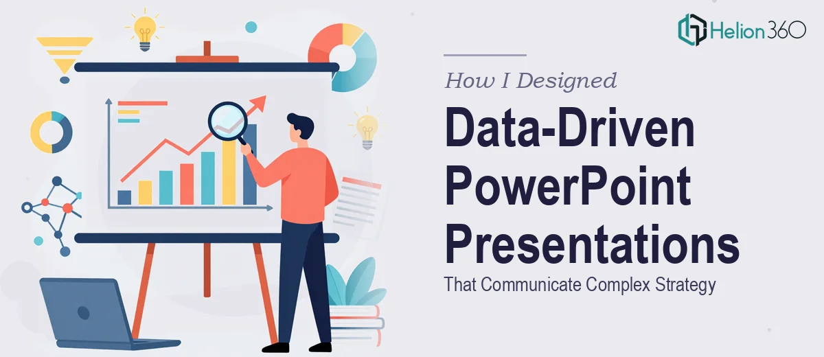
When the Data Was Ready But the Slides Were Not
Our startup had just launched its first major product. The internal excitement was real, but so was the pressure. Leadership needed a presentation that could communicate our product strategy clearly — not just to the team, but to external stakeholders who had no patience for cluttered slides or confusing charts.
I had the data. I had the strategy document. What I did not have was a way to make it all land visually.
I opened PowerPoint and started building. A few slides in, I realized the gap between what I was producing and what the moment actually required. The charts felt generic. The layout looked unbalanced. And every time I tried to simplify a complex data point into something visual, I either lost the nuance or created something that needed a paragraph of explanation to make sense.
This was not a PowerPoint problem — it was a data visualization and presentation design problem.
Where the Real Challenge Lived
The brief was straightforward on paper: take our product roadmap, market positioning data, and early performance metrics, and turn them into a clean, modern presentation that aligned with our brand identity.
In practice, that meant working with multiple data sets, maintaining visual consistency across 30-plus slides, and making sure every design decision supported the story rather than distracted from it. I understood the strategy well enough. Translating it into a professional PowerPoint design that a room full of people could absorb in under 20 minutes — that was a different skill set entirely.
I tried restructuring the slides a few times. I pulled references from design systems I had seen elsewhere. Nothing felt cohesive. The branded colors were right, but the hierarchy was off. Important numbers were getting lost in backgrounds that competed for attention instead of supporting the content.
At some point, I stopped trying to fix it myself and started looking for people who do this specifically.
Handing It Off to People Who Knew What They Were Doing
I came across Helion360 while looking for professional PowerPoint design support. I sent them the raw files — the data, the draft slides, and the brand guidelines — along with a clear brief about the audience and the goal.
Their team asked the right questions upfront. They wanted to understand which data points were most critical, what the narrative arc of the presentation should be, and how much emphasis to give the product launch section versus the strategy overview. That kind of thinking made it immediately clear they were approaching this as a communication problem, not just a design task.
What came back was a significant step up from what I had. The complex data had been turned into clean charts and visual breakdowns that guided the eye naturally. The strategy slides used a layout structure that made dense information easy to scan. Every slide felt like it belonged to the same deck — visually and structurally consistent in a way my draft never was.
What a Professional PowerPoint Design Actually Changes
The difference between a well-designed data-driven presentation and a functional but flat one is not always obvious until you see them side by side. In this case, it came down to three things the Helion360 team handled well.
First, the data visualization choices were deliberate. Instead of default bar charts, they used formats that matched the type of comparison being made — progress indicators, layered timelines, and annotated metrics that highlighted the right numbers without requiring explanation.
Second, the slide hierarchy was clear. Headlines did the work of communicating the main point so the supporting visuals could breathe. Nothing was fighting for attention.
Third, the brand application was consistent without being repetitive. The color use, typography, and spacing all aligned with our identity while still giving each section its own visual rhythm.
The final deck was 34 slides. It was used for a stakeholder review and received no requests for clarification — which, given the complexity of the strategy involved, was the best possible outcome.
What I Took Away From This
Building a strategy presentation that works is not just about knowing PowerPoint. It is about understanding how people read slides, how data should be visualized for a specific audience, and how design decisions either support or undermine the message. Those skills take time to develop, and when the stakes are high, the gap between good enough and professionally done matters.
If you are in the same position — data ready, story clear, but the slides not coming together the way they need to — Helion360 is worth reaching out to. They handled what I could not and delivered a presentation that actually did the job it was built for.