

When the Subject Matter Is as Complex as the Design Itself
I was working on an educational app focused on children who need support with feeding development and orofacial myofunctional therapy. The app was intended for use across hospitals, clinics, and home settings — which meant the materials had to work for both trained clinicians and parents with no medical background at all.
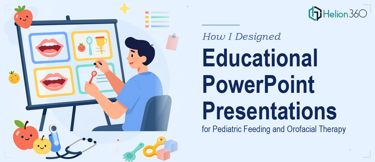
The PowerPoint presentations I needed were not your average slide decks. Each one had to explain things like orofacial development stages, infant feeding techniques, and the relationship between oral function and overall child health. The content was dense, the audience was mixed, and the visual standards had to be high enough for a clinical setting.
I figured I could handle the design myself. I had a reasonable grasp of PowerPoint and understood the subject matter well. I started building out slides — writing the copy, pulling together reference diagrams, trying to translate clinical information into something visual.
Where It Started to Break Down
The problem was not the content. The problem was the translation. Explaining orofacial myofunctional therapy to a speech pathologist is very different from explaining it to a parent who just wants to know why their toddler struggles to swallow. Designing slides that could do both simultaneously — clearly and visually — was harder than I expected.
I also ran into consistency issues. The infographics I was building looked different from the case study slides. The color palette I chose felt clinical in one section and too playful in another. I was spending more time reworking slides than building new ones.
After a couple of weeks of slow progress, I realized this project needed more than basic PowerPoint skills. It needed someone who understood visual communication of complex information — educational infographic design, interactive diagram development, and a consistent visual system that could hold everything together.
That is when I reached out to Helion360. I explained the full scope — the pediatric feeding content, the orofacial therapy diagrams, the need for case study slides, and the fact that the deck would be used by different audiences in very different settings. Their team understood the brief quickly and took over the design work from there.
What the Final Presentation Needed to Do
The scope was significant. The deck needed detailed slides covering proper feeding techniques for infants and toddlers, educational infographics illustrating the importance of oral function, and interactive diagrams walking through the stages of orofacial development. On top of that, there were comprehensive case study slides built around successful treatment outcomes.
Helion360 approached it systematically. They established a visual system first — a consistent color scheme, typography, and iconography style that could flex between clinical and parent-facing content without feeling jarring. Once that foundation was in place, the individual sections came together much more cleanly.
The infographics were particularly well-executed. Complex therapy concepts that had previously taken me two or three slides to explain were condensed into single, clear visual frames. The case study slides used a structured layout that made the treatment journey easy to follow without oversimplifying the clinical data behind it.
What I Took Away From This
Designing educational presentations for a specialized medical field is a different challenge from standard business slide design. The information architecture matters just as much as the aesthetics. How you sequence content, how you layer detail for different audience types, and how you maintain visual consistency across a large deck — all of that requires a level of design thinking that goes well beyond knowing your way around PowerPoint.
I came into this thinking the subject expertise I had would carry the project. It helped with the content, but it was not enough to produce presentations that were both clinically accurate and genuinely accessible. The gap was in the design execution, and that gap was real.
The finished deck was something I could confidently put in front of clinicians and distribute to families. The visual storytelling was clear, the infographics worked, and the whole presentation held together as a cohesive system.
If you are working on educational materials in a specialized field — healthcare, therapy, child development — and the design complexity is outpacing what you can manage in-house, Helion360 is a team worth contacting. They handled the translation from complex content to clear, professional slides in a way that genuinely moved the project forward.