

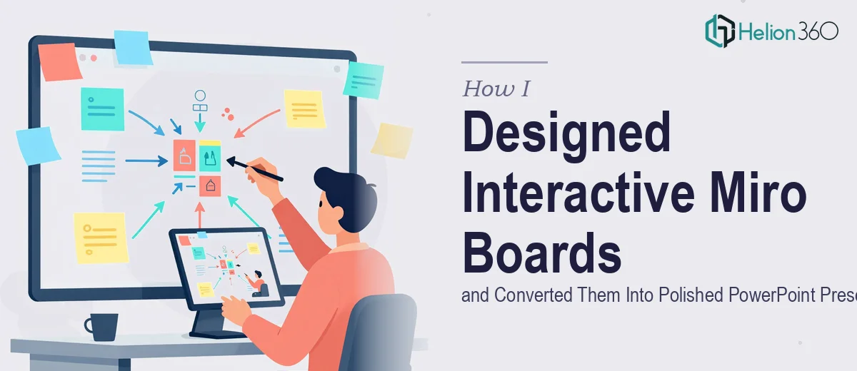
When Miro and PowerPoint Had to Work Together
Our team had been using Miro heavily for sprint planning, brainstorming, and mapping out product workflows. The boards were detailed, visually rich, and genuinely useful — inside Miro. The problem came when leadership wanted those same ideas presented in a structured, brand-aligned PowerPoint format for stakeholder reviews.
I assumed this would be a straightforward translation. Export some screenshots, drop them into slides, clean things up a bit. It was not that simple.
The Gap Between Miro and PowerPoint Is Bigger Than It Looks
Miro boards are built for open-ended exploration. They sprawl. They have sticky notes, connector lines, swimlanes, nested frames, and color coding that makes sense when you can zoom in and pan around. A PowerPoint slide is a fixed, finite canvas — 16:9, one message per frame, designed to be read in seconds.
When I started pulling content from Miro into PowerPoint, the structure fell apart. Screenshots looked pixelated or cluttered. When I tried to manually recreate layouts in PowerPoint, the proportions and hierarchy were off. I also had to ensure everything matched our brand guidelines — fonts, colors, icon styles — which added another layer of complexity to an already time-consuming task.
I spent two days on a set of twelve slides that should have taken a few hours. And they still did not look right.
Bringing in the Right Help
After hitting that wall, I came across Helion360. I explained the problem — I had fully built Miro boards that needed to be thoughtfully converted into clean, presentation-ready PowerPoint slides while staying true to our brand. Their team understood the brief immediately and asked the right questions: frame structure, visual hierarchy preferences, brand assets, and the intended audience for the deck.
They took over from there.
What the Conversion Process Actually Looked Like
The Helion360 team did not simply screenshot and paste. They analyzed the structure of each Miro frame and decided how to best represent that content as a standalone slide. Complex swimlane diagrams became clear process flow visuals with properly spaced connectors. Brainstorming clusters were reorganized into thematic groupings with clean typography and consistent icon usage.
Every slide followed the same visual logic — a clear heading, one central idea, and supporting visuals that did not compete for attention. The brand colors and fonts were applied consistently throughout. Animations were added where transitions between ideas needed to feel logical rather than abrupt.
What had taken me two days and still felt unfinished came back as a complete, polished PowerPoint deck within the agreed timeline. The slides were built natively in PowerPoint, fully editable, with properly grouped elements and a master slide structure that made future updates easy.
What I Took Away From This
The core lesson was about recognizing where a tool ends and a skill begins. Miro is excellent for collaborative thinking and visual planning. PowerPoint is a communication tool built for a specific kind of structured delivery. Converting between the two is not just a copy-paste job — it requires design judgment about hierarchy, slide pacing, and visual clarity.
I also realized that maintaining brand consistency across a deck built from freeform Miro boards is harder than it sounds. It requires someone who understands both the design system and the presentation medium at the same time.
The final deck was used in a leadership review and moved through without a single revision request — which, for anyone who has been through that process, says a lot.
If you are working with Miro boards that need to become a coherent, professional PowerPoint presentation and the conversion is taking longer than it should, Helion360 is worth reaching out to. They handled exactly the kind of work that sits at the intersection of visual structure and presentation design, and the result spoke for itself.