

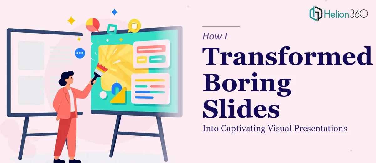
When Good Content Gets Buried in Bad Slides
I had a presentation that genuinely mattered. The content was solid — research done, data organized, key messages clearly thought through. But when I opened the PowerPoint file and looked at what I had built over the past week, I felt the problem immediately. Walls of text. Inconsistent fonts. Charts that made sense to me but would confuse anyone seeing them for the first time. The slides were functional, but they were not doing the content any justice.
This was not a simple polish job. The presentation had over thirty slides, and the issues ran deeper than swapping a few colors. The layout logic was inconsistent from section to section, the visual hierarchy was essentially nonexistent, and the branding elements I had tried to apply looked forced rather than intentional. I had spent hours on it and still could not get it to look the way it needed to.
What I Tried Before Asking for Help
I started by working through PowerPoint's built-in design tools, trying different themes and layout presets. That helped slightly but introduced new inconsistencies — some slides responded well to the theme changes, others broke entirely. I then tried rebuilding a few key slides from scratch using reference slides I had seen in other decks. That took most of an afternoon and produced three slides that looked decent but did not match the rest of the presentation.
The core issue was that professional PowerPoint slide design is not just about aesthetics. It requires decisions about visual storytelling, spacing, typography hierarchy, and how information flows from one slide to the next. I understood the content deeply, but translating that into a captivating visual presentation required a different kind of expertise.
Bringing In a Design Team
After hitting a wall, I came across Helion360. I explained the situation — the volume of slides, the inconsistency issues, the branding gaps, and the tight timeline — and their team took it from there.
What I appreciated most was that they did not just restyle the slides visually. They looked at the structure first. They identified where content was overloaded onto a single slide and where it needed to be split for clarity. They reorganized sections so the narrative had a cleaner flow, and they brought in consistent design elements that tied the whole deck together without making it feel like a generic template.
The charts were rebuilt with cleaner layouts that made the data easier to read at a glance. The headers were reworked to guide the audience through each section rather than just label it. Interactive elements were added where they made practical sense, and the overall formatting was aligned to a consistent visual system throughout.
The Difference a Professional Redesign Makes
When I received the revised deck, the difference was immediately obvious. The same content that had looked cluttered and difficult to follow now read clearly and confidently. The slides had room to breathe. The data visualizations communicated the key points without requiring explanation. The presentation felt like it belonged to the brand rather than looking like something assembled in a hurry.
I have worked with presentations long enough to know when something is technically correct versus when it actually works in front of an audience. This version worked. The visual hierarchy guided attention naturally, and the design reinforced the message rather than competing with it.
What This Experience Taught Me
The biggest takeaway was understanding where the real complexity in presentation redesign lives. It is not in knowing PowerPoint's features — I knew most of them. It is in the judgment calls: what to simplify, what to emphasize, how to balance visual engagement with clarity, and how to make thirty-plus slides feel cohesive. Those decisions require experience that goes beyond technical familiarity with the software.
A captivating visual presentation is not just a prettier version of what you already have. It is a restructured, intentionally designed communication tool. Getting there sometimes means recognizing when the work needs a different set of hands. Learn more about how data-heavy reports can be transformed into engaging presentations.
If you are sitting with a deck that has good content but is not landing visually, Helion360 is worth reaching out to — they handled what I could not manage alone and delivered a result that genuinely improved how the presentation communicated.