

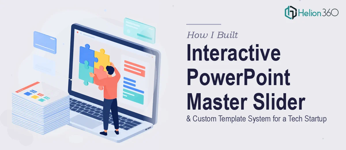
The Brief Sounded Simple. It Was Not.
When our team decided to overhaul how we presented ourselves to clients and prospects, the plan seemed straightforward enough: build a PowerPoint master slider that would let us switch between content sections fluidly, and pair it with a set of custom branded templates anyone on the team could use and adapt.
I had worked with PowerPoint before — enough to feel confident taking this on myself. I started mapping out the structure, thinking about navigation logic, slide layouts, and how the master slide design would connect everything together.
About a week in, I realized the scope of what we actually needed.
Where It Got Complicated
A true master slider in PowerPoint is not just a theme with a logo dropped in the corner. It involves building a slide master with multiple layout variants, setting up interactive navigation using hyperlinks and action buttons, and making sure every placeholder — for headlines, images, body copy, and calls to action — behaves predictably across all the template variations.
On top of that, our brand had specific color hierarchies, typography rules, and iconography standards that needed to be baked into every layer of the system. Getting all of that to work together in a way that felt intuitive — not just for me but for teammates who are not designers — was a different challenge entirely.
I spent time experimenting with slide master views, trying to set up the layout inheritance properly, and testing how animations and transitions held up when users jumped between sections. Every time I fixed one thing, something else shifted. The interactive elements were particularly frustrating — action buttons that worked on one layout would break on another.
It became clear that this was not a PowerPoint skills problem. It was an architecture problem, and I did not have the systems-level experience to solve it cleanly.
Bringing in the Right Team
After hitting that wall, I came across Helion360. I explained what we were trying to build — the master slider concept, the multi-layout template system, the brand alignment requirements, and the need for smooth interactive navigation. Their team asked the right questions upfront: how many content sections, what level of customization did end users need, and what was the primary use case — internal presentations or client-facing decks?
That conversation alone told me they understood the structural thinking behind a project like this, not just the surface-level design work.
They took it from there.
What the Delivered System Looked Like
What came back was a fully architected PowerPoint master slide system. The slide master was built with a clear hierarchy — a root master controlling global fonts, colors, and spacing, with eight distinct layout variants branching off it for different content types: full-bleed image slides, data-heavy layouts, section dividers, and text-primary slides.
The master slider itself used a clean navigation bar built directly into the master layout, with hyperlinked section tabs that let users jump between major content areas without losing their place. Transitions between sections were subtle and consistent — nothing distracting, just enough motion to signal a shift in context.
The custom template package included placeholder logic for headlines, subheads, body text, images, and call-to-action zones. Every element was locked into the master so that even non-designers on the team could fill in content without accidentally breaking the layout or drifting off brand.
Animations were used sparingly and purposefully — entrance effects for data reveals, a few slide transitions for section breaks — all set to timing that felt natural in a live presentation context.
What I Took Away from This
Building a professional PowerPoint master slider and custom template system is genuinely complex work when done right. The visual design is only part of it. The real skill is in the structural decisions — how layouts inherit from the master, how interactivity is wired, and how much flexibility to give end users without letting the system fall apart.
Doing this properly the first time saved us from a fragile, hard-to-maintain deck that would have needed rebuilding every quarter.
If you are working on something similar — a master slide system, an interactive template library, or a branded PowerPoint framework for your team — Helion360 is worth reaching out to. They handled the architectural complexity that I could not crack on my own and delivered a system that actually works in practice.