

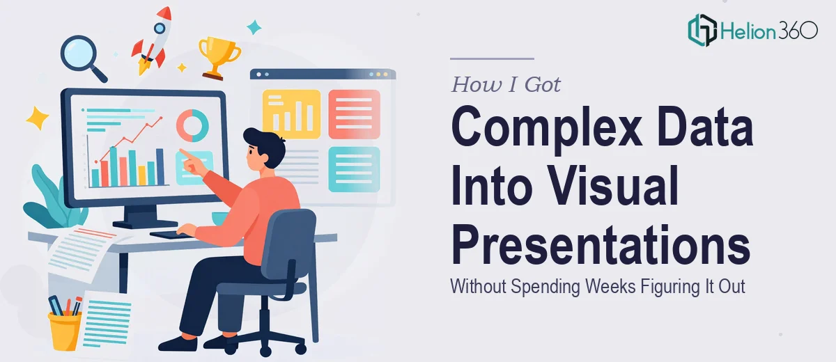
The Situation I Was Staring At
I had a significant amount of research and data that needed to become a presentation — and not a rough one. This was going into a room where the audience expected clarity, structure, and visual credibility. The kind of room where a cluttered slide or a confusing chart actively costs you trust.
The raw material was substantial: multiple data sources, competitive findings, trend lines, and strategic takeaways that all needed to cohere into a single narrative. The deadline was fixed. The stakes were real. And I knew from the moment I looked at what we were working with that this wasn't something to patch together over a weekend.
Doing this well — turning genuinely complex information into a data-driven presentation that lands — requires a specific kind of expertise. I recognized that quickly, and I knew the move was to bring in a team that does this work at a high level every day.
What I Found Out This Actually Takes
When I started understanding what a proper data-driven presentation design process involves, the complexity became obvious fast.
The first thing that stood out was the narrative architecture. Raw data doesn't tell a story on its own. Someone has to decide which findings lead, which provide context, and which are supporting detail. That sequencing work — building a logical flow that guides an audience from problem to insight to implication — takes real judgment. Get it wrong and the whole deck feels like a data dump, even if the individual slides look fine.
The second signal was chart selection and visual encoding. Every data point has a chart type that communicates it most honestly and clearly. Choosing the wrong one doesn't just look amateurish — it can actively mislead. That decision-making process requires both design literacy and analytical understanding working together.
The third thing I noticed was how much consistency work a polished presentation requires at scale. When you're working across many slides, keeping typography, spacing, color usage, and visual weight coherent is a full discipline on its own. It's not a finishing step — it runs through every decision.
What the Work Itself Actually Involves
The foundation of a strong market research presentation is structural and narrative work — auditing all source material, identifying the core argument, and mapping a story arc before a single slide is built. Done well, this means organizing findings into a three-act structure: context and problem, evidence and analysis, implication and recommendation. The decision a practitioner makes here is which data points are load-bearing to the argument and which are appendix material. This is harder than it sounds. Without a clear narrative map, even beautifully designed slides feel disconnected, and audiences lose the thread before the halfway point.
Visual mechanics are where the presentation becomes something an audience actually trusts. Proper layout work uses a consistent grid — typically a 12-column system — so that every element on every slide aligns to the same underlying structure. Typography follows a strict hierarchy: headline text at around 36pt, supporting callouts at 24pt, and body or data labels at 16pt or below. Chart selection follows encoding rules: comparisons use bar charts, trends use line charts, part-to-whole relationships use treemaps or stacked bars — never pie charts with more than four segments. Each of these is a deliberate choice. Making them correctly across a full deck, consistently, takes hours of focused work even for an experienced designer.
Polish and consistency across the full presentation is the layer that separates a professional deck from one that almost works. A disciplined palette means no more than four brand colors in active use at any time, with a clear hierarchy of primary, secondary, accent, and neutral. Every data visualization needs to use the same annotation style, the same grid line weight, the same legend placement. Spacing between elements should follow an 8px or 16px base unit so the visual rhythm feels deliberate rather than arbitrary. These rules sound mechanical until you're applying them to forty slides under time pressure — at which point they become an enormous amount of detail to track.
Why I Brought in Helion360 to Handle It
I didn't spend time attempting this myself. Once I understood what doing it well actually required — the narrative architecture, the visual mechanics, the consistency discipline across every slide — it was obvious that the smart move was to engage a team with all of that already built in.
Helion360 handled the full project end-to-end: the story structure and flow, the chart design and data visualization, and the complete visual system across every slide. They turned it around quickly — done in days, not weeks. That speed came from having the process, the tooling, and the judgment already in place, not from cutting corners.
What struck me was that nothing came back needing to be explained or re-briefed. The narrative held together. The charts were clean and honestly encoded. The visual consistency was exactly what the work needed. This is a team that does data-driven presentation design at a professional level every day — the expertise isn't something they have to assemble for each project.
What I'd Tell Anyone Looking at the Same Problem
The presentation landed well. The audience engaged with the material rather than spending energy trying to parse it. The data told a clear story, the structure held, and the visual execution gave the whole thing credibility in the room.
What I took away from this experience is that data-driven presentations look deceptively simple when they're done right — and that simplicity is the result of a significant amount of deliberate, skilled work. The narrative judgment, the visual mechanics, the consistency discipline: none of it is incidental. All of it takes time and expertise to execute properly.
If you're looking at a similar situation — complex data, a real deadline, and an audience that expects polished, professional presentation design — Helion360 is the team I'd engage. They handled the full scope fast and delivered the kind of execution depth the work actually required.