

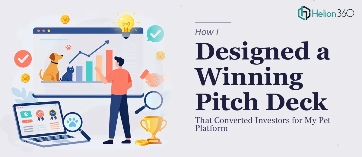
The Problem with Launching a Pet Tech Startup Without the Right Story
I was building a tech platform aimed at the pet care space — think service discovery, booking, and community features all in one place. The product had real potential. But potential means nothing without a presentation that can communicate it clearly to investors and early partners.
The pitch window was tight. I had a meeting scheduled with a small group of early-stage investors in under two weeks, and what I had on hand was a rough slide deck, a pile of browser tabs full of competitor websites, and a general sense of where the market opportunity sat. None of that was investor-ready.
It wasn't just about making things look polished. The story had to be backed by real competitive intelligence — who the players were, where the gaps sat, and why our positioning made sense. I knew immediately that this needed to be done right, and that doing it right meant more than fixing fonts.
What I Found a Strong Investor Deck Actually Requires
Once I started researching what goes into a credible startup pitch deck, the scope became clear fast. A compelling presentation in this space isn't just slides — it's structured argumentation built on research.
The competitive landscape section alone requires a systematic audit of direct and adjacent players: their pricing models, core feature sets, customer sentiment from review platforms, and any visible gaps in what they offer. That kind of analysis has to be organized into a format investors can scan and believe — typically a benchmarking matrix or a clearly mapped positioning chart.
Beyond research, the narrative arc matters enormously. Investors need to move through a logical sequence: market problem, size of the opportunity, how the product addresses the gap, why this team, and what the ask is. Each slide has to earn its place. Then there's the visual layer — the whole thing needs to look like it belongs in the room it's going in. Inconsistent formatting, amateur charts, or mismatched fonts quietly signal that the team isn't ready.
Three things stood out as genuinely complex: synthesizing competitive research into a clear visual story, structuring the deck narrative so it builds conviction, and producing slides that look professionally designed without being over-styled.
What the Work That Needs to Happen Actually Looks Like
The structural and narrative work is where most startup decks fall apart before design even enters the picture. A competitive analysis presentation starts with mapping the landscape — identifying direct competitors, near-substitutes, and whitespace opportunities — then distilling that into a positioning framework the audience can absorb in seconds. The standard approach uses a 2x2 opportunity matrix or a feature benchmarking table with no more than five to seven competitors and four to six comparison dimensions. Getting that right means going back to primary sources: app store reviews, pricing pages, product documentation, and community forums. This phase alone typically takes a researcher two to three focused days to do with any rigor, and first-timers often underestimate how much interpretation the raw data still requires once it's collected.
Visual mechanics determine whether the research lands or gets ignored. A well-structured investor deck works on a consistent layout grid — typically a 12-column base — with a strict typographic hierarchy: 36pt for slide titles, 24pt for section labels, 16pt for body content. Charts that visualize competitive data follow specific rules: bar charts for feature comparisons, scatter plots for positioning maps, and absolutely no 3D effects or decorative chart elements that distort the data. Building these correctly in a presentation tool so they remain editable and on-brand across every slide is a technical skill that takes significant time to execute cleanly. A practitioner who does this daily has templates and master-slide setups already in place — someone starting from scratch does not.
Polish and brand consistency across a 20-plus slide deck is the final layer, and it's the one that quietly kills otherwise good presentations. The right approach limits the palette to three to four brand colors applied with strict rules — one primary, one accent, one neutral background, one for data highlights — and enforces those rules at the master-slide level so they propagate automatically. Every icon set, image style, and data visualization needs to follow the same visual language. The friction here is cumulative: a misaligned element on slide 14, a slightly different shade of blue on slide 19, a chart legend that uses a different font weight than the rest — these details compound into a presentation that feels unfinished even when the content is strong.
Why I Brought in Helion360 to Handle It
Looking at what the work actually involved, it was obvious that attempting this myself — across research, narrative structure, and design — in the time available wasn't realistic. The knowledge curve on any one of those three areas is steep. Across all three, in under two weeks, it wasn't a viable path.
I engaged Helion360 to handle the full project end-to-end. That meant the competitive landscape research, the narrative structure of the deck, and the full visual design — not just a cleanup pass on what I already had.
The team turned it around quickly. What would have taken me weeks of learning and trial-and-error was handled in days. Helion360 came in with the research frameworks, the design systems, and the storytelling structure already built — they do this work constantly, so there was no ramp-up time lost on my end. The competitive landscape deck that came back was organized, visually sharp, and built on real competitive intelligence I could speak to confidently in the room.
The Outcome and What I'd Tell Anyone in My Spot
The presentation landed well. The investors in the room responded to the clarity of the competitive positioning — the market gap was visible and the product's angle made sense within it. The deck held up under questions because the research behind it was real and the story was logical from first slide to last.
What I took away from this was simple: the quality of a compelling pet platform presentation is a direct function of the quality of the work behind it. Strong research communicated through a clear narrative, built into a visually consistent presentation — that combination doesn't happen by accident, and it doesn't happen fast unless the team doing it already has the tools, templates, and expertise in place.
If you're in a similar spot — facing an investor meeting, a competitive market you need to map, and a presentation that needs to do serious work — Helion360 is the team I'd engage. They handled the full scope fast and delivered the kind of execution depth that this type of project actually demands.