

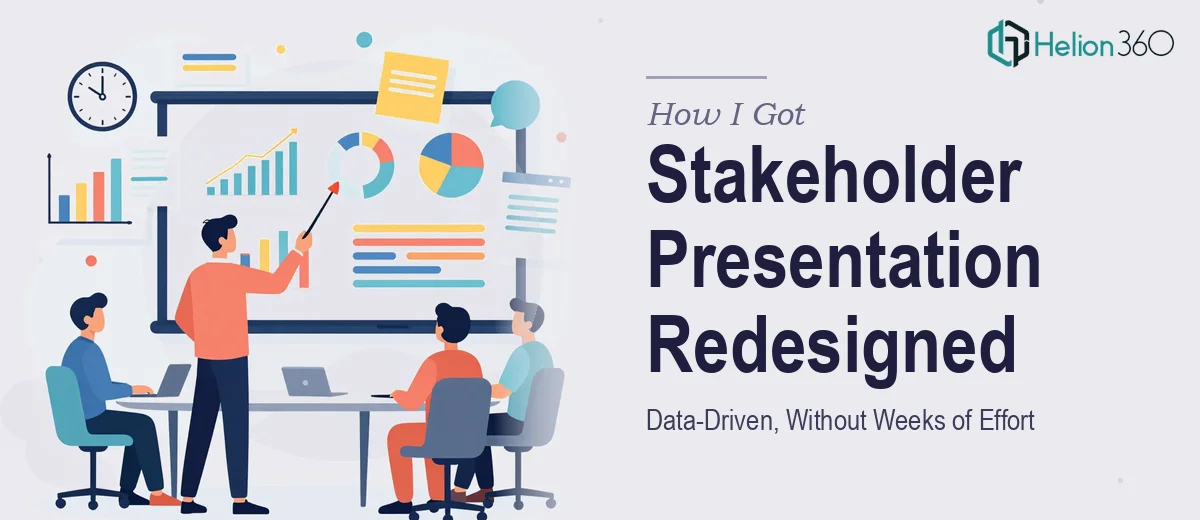
When the Presentation Stopped Doing Its Job
We had a presentation that had been built over time by multiple hands. It carried real substance — meaningful data, clear objectives, legitimate progress across fiscal years — but none of that was landing the way it should have. Stakeholders were disengaging. The slides looked dated, the data felt heavy, and the roadmap we needed them to understand was buried in a wall of text and generic charts.
The stakes were real. This wasn't an internal check-in. It was going in front of people who needed to leave the room with a clear picture of where we stood and where we were heading. A cluttered, visually inconsistent presentation wasn't just an aesthetic problem — it was a communication failure waiting to happen.
I knew this needed to be done properly. Not patched up, not cosmetically tweaked. Properly redesigned.
What I Discovered the Work Actually Involved
Before I did anything else, I spent time understanding what a well-executed stakeholder presentation redesign actually requires. What I found made it clear this was not a weekend fix.
First, the narrative had to be restructured before a single slide could be touched. Data-driven presentations fail most often not because of ugly charts, but because the story logic is broken. Slides that don't flow in a deliberate sequence force the audience to do the interpretive work — and they won't.
Second, the data visualization layer is its own discipline. Choosing between a grouped bar chart, a waterfall, or a slope chart isn't a stylistic preference — it's a functional decision based on what comparison or trend the data is actually making. Getting it wrong misleads the audience even if the numbers are right.
Third, the roadmap infographic I needed — one that mapped achievements, challenges, and forward steps across fiscal years — is genuinely complex to build well. A timeline that reads clearly at a glance requires careful hierarchy, spatial logic, and restraint. Most attempts produce something cluttered that nobody actually reads.
What the Actual Redesign Work Involves
The first thing that needs to happen in a project like this is a structural audit of the existing content. That means mapping every slide against the intended audience takeaway, identifying where the narrative loses logical momentum, and deciding what gets reordered, consolidated, or cut entirely. Done well, this step alone can reduce a 40-slide deck to 28 focused slides without losing a single critical idea — it just requires someone who understands both the subject matter context and presentation flow principles. The friction here is that most people inside the project are too close to the content to make these editorial calls confidently.
The visual mechanics layer is where the real technical work lives. A professional stakeholder presentation uses a consistent layout grid — typically a 12-column system — with a strict typographic hierarchy, usually something like 36pt for slide titles, 24pt for key callouts, and 16pt for supporting body text. Color usage gets disciplined to four brand-anchored tones maximum, with one reserved specifically for data emphasis. Charts get rebuilt from scratch in most cases, because imported charts rarely conform to the slide's grid or color system. Each of these decisions has downstream consequences across every slide, and a single inconsistency can make the whole deck feel unpolished even if individual slides look fine in isolation.
The roadmap infographic is its own design challenge separate from the slide deck itself. A fiscal-year roadmap that communicates achievements, current challenges, and future milestones has to balance information density against visual clarity — it can't be too sparse to be useful or too dense to be readable. The right approach uses a horizontal timeline structure with distinct visual zones for each phase, icon-supported callouts for milestone types, and a clear hierarchy that lets the eye move from macro to detail naturally. Building this correctly takes expertise in infographic composition that goes well beyond standard slide design skills.
Why I Brought Helion360 in to Handle the Full Project
Once I understood what proper execution actually involved, the path forward was obvious. I wasn't going to spend weeks learning layout grid systems and rebuilding charts from scratch while also running everything else on my plate. The right move was to engage a team that already had this expertise built in.
Helion360 handled the full project end-to-end — the structural narrative audit, the complete visual redesign of every slide, and the roadmap infographic from concept to final delivery. I didn't need to manage different pieces going to different places. They took the full brief, asked the right questions, and turned it around quickly. What would have taken me weeks of learning and iteration was handled in days.
The tooling, the design judgment, and the stakeholder presentation experience were already in place. That's exactly what the project needed.
What Was Delivered and What I'd Tell Anyone in My Position
What came back was a cohesive, visually confident deck that communicated the data clearly and moved the audience through the story in the right order. The data-driven stakeholder presentation worked exactly as intended — stakeholders could read it at a glance and understand where we'd been, where we hit friction, and where we were going. The presentation finally did what it was always supposed to do: give the room clarity.
The data-driven stakeholder presentation problem is genuinely hard to solve well on your own, especially under time pressure. The narrative, the visual mechanics, and the infographic design each require a different layer of expertise, and they all have to work together.
If you're looking at a similar situation and need it handled end-to-end without the weeks of learning curve, Helion360 is the team I'd engage — they delivered fast and brought the kind of execution depth this work genuinely requires.