

The Brief Looked Simple. The Execution Wasn't.
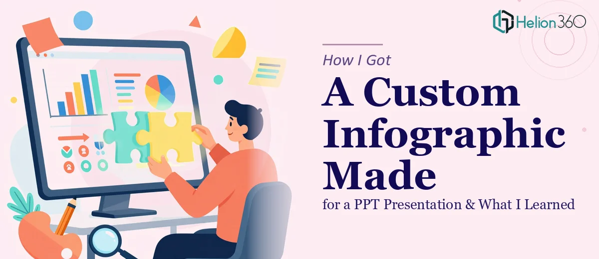
I had a product presentation coming up — the kind where you're walking a room full of stakeholders through features, benefits, and data. The goal was clear: make the content digestible, visually consistent, and memorable. The solution seemed equally clear: build a strong infographic for the PPT presentation that could carry the heavy lifting.
I figured I could handle it. I had the data, I had a rough idea of the layout, and I had access to PowerPoint. How hard could it be?
Pretty hard, as it turned out.
Where I Hit the Wall
The first issue was translating raw product information into a visual structure that actually made sense. I kept defaulting to bullet points, which is exactly what I was trying to move away from. Every time I tried to design something more visual — a flow, a comparison layout, a layered benefits chart — it either looked too cluttered or too basic.
The second issue was brand alignment. We had specific colors, font choices, and a general design aesthetic that needed to carry through the entire deck. Getting an infographic to match that without it looking forced or inconsistent was harder than I expected. I'd get one element right and another would feel off.
I spent nearly two days on drafts that weren't good enough to put in front of an audience. The deadline was getting close, and I knew I needed to make a call.
Bringing in the Right Help
After hitting that wall, I came across Helion360. I explained what I needed — a custom infographic for a PPT presentation, brand-aligned, focused on showcasing product features and benefits, with a clean and professional look. I shared the brand guidelines and a rough content outline.
Their team took it from there.
What stood out immediately was how they approached the brief. They didn't just ask about colors and fonts. They asked about the audience, the presentation context, and what action we wanted viewers to take after seeing the slide. That kind of thinking shaped the final design in a way I hadn't anticipated.
What the Final Design Delivered
The infographic they produced did a few things really well.
It organized complex product data into a clear visual hierarchy. Instead of cramming every feature into a single frame, the layout guided the eye through a logical sequence — from core function to key benefits to supporting proof points. It felt like a story rather than a list.
The brand integration was seamless. Colors, typography, and spacing all matched the existing deck without looking like they'd been stitched in from somewhere else. The infographic felt native to the presentation.
And it was built directly in PowerPoint, which mattered. It wasn't a flat image dropped onto a slide — it was a fully editable design that I could update if the content changed.
What This Experience Taught Me
The gap between knowing what you want and being able to produce it is real, especially when design precision is involved. I understood the content deeply. I understood the audience. But translating that into a polished, brand-consistent infographic for a PPT presentation requires a different set of skills — layout thinking, typographic judgment, visual hierarchy — that take time to develop.
Helion360's team handled the design execution cleanly and efficiently. The back-and-forth was minimal because the brief was taken seriously from the start. That saved me time I genuinely didn't have.
If you're working on a product presentation and need an infographic that actually communicates rather than just decorates, the design layer matters more than most people think. Getting it right isn't just about aesthetics — it directly affects how your audience processes and retains the information you're presenting. For a closer look at how infographic-style PowerPoint slides can visualize complex metrics, or how a full PowerPoint presentation redesign can transform a deck's impact, both are worth exploring.
Need Help With Your Presentation Infographic?
If your PPT presentation needs an infographic that's brand-aligned, visually clear, and built to communicate — Helion360 can help you get it done right.