

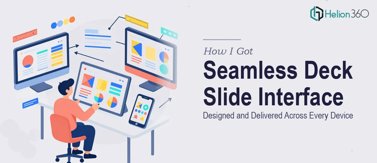
The Problem With Our Deck Slide Experience
Our platform had a deck slide effect that users could swipe through to navigate content. On paper, it worked. In practice, it was falling short. Animations felt clunky on mobile, the visual design looked inconsistent between breakpoints, and the overall interaction didn't feel polished enough for where we were trying to take the product.
The stakes were real. We were heading into a product refresh cycle, and the deck slide interface was central to the user experience. If it felt rough or unresponsive, that friction would show up in retention numbers. This wasn't a minor cosmetic fix — it was a foundational UI problem that needed to be solved properly, across every device, before we moved forward.
I knew immediately that this wasn't something to patch together with good intentions and spare hours. A responsive, interaction-rich deck slide design done well is a serious design discipline. I needed it handled end-to-end by people who already knew what that looked like.
What I Found the Solution Actually Required
Once I started researching what a proper deck slide interface redesign actually involves, it became clear this was far more layered than a visual refresh.
First, the responsive design challenge alone is substantial. A deck slide that swipes smoothly on desktop needs an entirely different interaction model on touch devices. Swipe gesture thresholds, snap-to-slide behavior, and scroll interference all behave differently across browsers and screen sizes. Getting this consistent requires deliberate interaction design decisions, not just CSS adjustments.
Second, the animation work is its own discipline. Smooth, physics-based transitions — the kind that feel natural when a user swipes — require careful easing curves, frame-rate awareness, and attention to what happens at the edge states (first slide, last slide, partial swipes that reverse). Amateur animation either overshoots or feels mechanical. Neither is acceptable in a product-facing UI.
Third, the visual design layer has to coexist with all of this. Typography hierarchy, color contrast, spacing grids, and component consistency all need to hold up whether the slide is 320px wide or 1440px. That's a lot of states to design for simultaneously — and all of them need to look intentional.
What the Design Work Actually Involves
The starting point for a deck slide interface redesign is the structural and interaction audit. The right approach means mapping every state the slide can be in — idle, mid-swipe, snapped, animating forward, animating back, at boundary — and defining the behavior for each. Proper interaction design at this level works with defined easing curves (ease-in-out cubic bezier values, for example) and gesture thresholds, typically somewhere in the 40–60px drag-before-commit range. This isn't guesswork; it's a deliberate specification. Getting the interaction map wrong here cascades into every device breakpoint downstream, which is why it's the most time-consuming phase for anyone doing it for the first time.
Visual mechanics come next, and this is where the design system for the deck slide takes shape. A proper layout grid — commonly a 12-column system that collapses to 4 columns on mobile — governs how slide content reflows across breakpoints. Typography hierarchy within each slide follows strict scale ratios: a heading at 36pt, subheading at 24pt, body at 16pt is a common starting point, but each must be tested at every breakpoint to ensure legibility holds. Color palette discipline matters too — keeping the deck slide interface to a maximum of 4 brand colors prevents visual noise and maintains the sense of calm, intentional design that makes swiping feel satisfying rather than disorienting. Executing this across multiple slide templates, with all variants in a tool like Figma, takes real methodical effort.
Polish and cross-device consistency is the final layer — and the one most likely to slip when teams are moving fast. Every animation state needs to be tested at 60fps on low-powered devices, not just a current flagship phone. Slide transition timing that feels snappy on a high-end device can feel abrupt on a mid-range Android. Component consistency — ensuring that buttons, indicators, and navigation elements look identical whether the interface renders on a 375px iPhone or a 1280px browser — requires a discipline of shared component libraries and systematic QA passes. This is the work that separates a polished interface design from one that merely functions.
Why I Brought Helion360 in to Handle It
I didn't spend time attempting pieces of this myself. The interaction design specification, the responsive visual design, the animation refinement — taken together, it was clear this needed a team that does exactly this kind of work, with the tooling and process already in place.
Helion360 handled the full project end-to-end. That meant the interaction audit and state mapping, the full visual design system for the deck slide interface across breakpoints, and the animation specifications handed off to the development team in a format they could actually implement without back-and-forth.
What struck me most was the speed. The project was turned around quickly — done in days, not the weeks it would have taken me to work through the learning curve on responsive interaction design alone. The team came in with context, asked the right questions up front, and delivered a complete design package that was immediately actionable. That's the value of engaging a team that does this all day, with the expertise already built in.
What We Got and What I'd Tell Anyone in My Spot
The result was a deck slide interface design that held up cleanly across every device we tested — mobile, tablet, desktop, and a range of browsers. The animation felt physics-based and responsive rather than mechanical. The visual design was consistent across all slide states and breakpoints. Our development team received a complete Figma file with annotated interaction specifications, component libraries, and transition guidelines — no guesswork on their end.
The broader outcome was that we moved into the implementation phase without the usual design-to-dev friction. The product felt like a step up from where it had been, and the user experience reflected the quality we were aiming for.
If you're looking at a similar deck slide interface problem and want it handled end-to-end without the weeks of learning curve, Helion360 is the team I'd engage — they delivered fast, covered every layer of the work, and produced a design package that was immediately ready to build from.