

The Problem: Our App Experience Was Leaking Engagement
We had a mobile app that users were downloading but not sticking with. The in-app slides — the ones that guide users through features, onboarding flows, and key moments inside the product — were inconsistent, visually flat, and disconnected from our brand. They didn't tell a story. They didn't lead the user anywhere meaningful.
The stakes were real. Every slide a user sees inside the app is a touchpoint. When those slides look patched together, users notice — even if they can't articulate why. It erodes trust. It reduces time-in-app. It hurts retention numbers in ways that are slow to reverse.
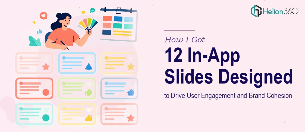
I knew we needed 12 slides redesigned end-to-end: visually striking, brand-aligned, and structured to carry users through the experience intuitively. I also knew this wasn't something to approach casually.
What I Found the Work Actually Required
My first instinct was to sketch out what "better slides" might look like. That lasted about twenty minutes before I realized the scope of what proper in-app slide design actually demands.
The first signal was the structural complexity. These aren't standalone graphics — each slide has to function as part of a sequential experience. The narrative arc across 12 slides needs to be intentional, not assembled slide-by-slide. Where does the user start? What do they need to understand by slide four? What action should they feel ready to take by slide twelve? Mapping that flow before touching a design tool is its own body of work.
The second signal was the visual execution depth. High-quality in-app graphics require consistent grids, type hierarchies, iconography systems, and color application that hold up across every slide — not just one or two. Inconsistency at this scale is immediately visible to users and immediately damaging to brand perception.
The third was the CTA architecture. Each slide needs a clear call-to-action — not just a button, but a purposefully placed, visually weighted prompt that fits the slide's moment in the journey. Getting that right across 12 slides, without it feeling repetitive or cluttered, requires real design judgment.
What Proper In-App Slide Design Actually Involves
The work starts with narrative and structural mapping. Twelve slides is enough to tell a meaningful story, but only if the sequence is deliberate. The right approach begins with auditing the content — what each slide needs to communicate — and then mapping a story arc that builds logically from introduction through engagement to action. This means deciding which slides carry educational weight, which create visual breathing room, and which are designed specifically to prompt a response. Practitioners working at this level typically define the slide sequence and key message per slide before a single design element is chosen. Skipping this step and going straight to visuals almost always results in a set of slides that feel disconnected, no matter how polished each one looks individually.
Once the structure is set, the visual mechanics need to be built to hold across all 12 slides. A proper in-app slide system runs on a defined layout grid — typically an 8-point spacing system — with a strict type hierarchy (display text, body text, and label text at consistent sizes such as 28pt, 16pt, and 12pt respectively) and a capped color palette of no more than four brand-aligned colors. Iconography and illustration style have to be sourced or created as a unified set, not assembled from mixed libraries. This is where most non-specialists run into trouble: the rules seem simple until you're on slide nine and realize the icon style doesn't match the illustration on slide three, and fixing it cascades across the whole system.
The final layer is polish and CTA consistency. Every slide needs a call-to-action that is visually distinct — typically through contrast ratio, button weight, and spatial isolation — without overwhelming the slide's primary message. The challenge is calibrating this across 12 slides where the CTAs vary in urgency and intent. A CTA on an onboarding slide reads differently than one on a feature highlight or a re-engagement prompt. The spacing, size, and copy weight on each needs to be tuned individually while staying visually consistent as a system. This calibration step alone takes experienced eyes and multiple review passes to get right.
Why I Brought in Helion360 to Handle It
Once I understood what doing this well actually involved, the decision was straightforward. I didn't have weeks to develop fluency in in-app slide systems, and the stakes of getting it wrong — in user experience terms and in brand terms — were too high to experiment with.
Helion360 handled the full project end-to-end. That meant the narrative mapping across all 12 slides, the full visual build with a consistent grid and type system, the iconography and graphic production, and the CTA design calibrated to each slide's role in the user journey. The work was delivered fast — done in days, not weeks — and the turnaround happened in a fraction of the time it would have taken me to research, prototype, and iterate through this myself.
What made the difference was that this is work Helion360 does continuously. The tooling, the design systems, the review process — it's already in place. There was no ramp-up cost on my end, no back-and-forth to establish basic conventions. The project moved at pace.
The Outcome and What I'd Tell Anyone in My Spot
What came back was a complete set of 12 in-app slides that held together as a system — visually coherent, brand-aligned, and sequenced in a way that actually moved users through the experience with clarity. The CTAs were purposeful. The visual hierarchy was clean. The slides felt like they belonged to the same product story, because for the first time, they did.
The downstream effect on in-app engagement was noticeable. Users moved further through onboarding flows. The feature highlight slides drove interaction. The brand perception inside the app matched what we were communicating outside of it, which matters more than most teams realize until they fix it.
If you're looking at a similar problem — slides that need to work as a system, not just look decent individually — and you want it handled end-to-end without the weeks of learning curve, Helion360 is the team I'd engage. They delivered for me fast, with the execution depth this kind of work genuinely requires.