

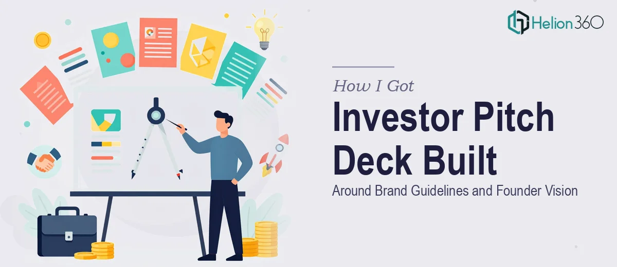
The Situation and What Was at Stake
We were preparing to go out to investors with a new software platform, and the pitch deck was the centerpiece of the entire effort. Not a nice-to-have — the actual first impression. Fourteen slides had to carry the full weight of the story: the problem we solve, the market opportunity, product features, competitive positioning, and financial projections. All of it wrapped in a visual language that matched the brand guidelines our founder had already established.
The deck needed to work in a room in front of investors who had seen hundreds of these. It had to feel polished, intentional, and credible — not like a template someone customized in an afternoon. The timeline was tight, the audience was sophisticated, and the stakes were high enough that doing this casually wasn't an option. I knew immediately this needed to be handled by people who build investor pitch decks for a living.
What I Found a Strong Pitch Deck Actually Requires
Once I looked seriously at what a well-executed 14-slide investor deck involves, the scope became clear fast. The structural challenge alone is significant — you're not just filling in slide templates. A proper investor pitch deck follows a deliberate narrative arc: problem, solution, market sizing, business model, traction, competitive landscape, team, and financials. Each section has to earn its place and lead the viewer forward.
Then there's the visual layer. Brand guidelines aren't just a logo and a color swatch — they define typeface hierarchies, spacing rules, color application logic, and tone. Applying those guidelines consistently across 14 slides with different content densities and data types is a real craft problem. A competitive analysis slide looks nothing like a financials slide, yet both need to feel like they came from the same hand.
And then there's the data. Market research numbers, growth projections, and competitive positioning need to be visualized in ways that are both accurate and persuasive. That intersection is harder than it sounds.
What the Work Actually Involves
The starting point for a pitch deck like this is structural and narrative work — auditing all the raw content from the founder, mapping it against the standard investor deck framework, and deciding what belongs on each slide and in what order. The right narrative arc for a software platform typically runs through a crisp problem statement, a differentiated solution, total addressable market sizing (often broken into TAM, SAM, and SOM layers), and a product walkthrough that connects features to buyer pain points. Getting that sequencing right before a single layout is touched is where most amateur decks fail — they design before the story is solid, and it shows.
Visual mechanics come next, and this is where brand guidelines do real work. A properly implemented deck uses a defined type hierarchy — typically something in the range of 36pt for slide titles, 24pt for section headers, and 16pt for body content — applied consistently across every master slide. A 12-column grid underneath the layout ensures that charts, text blocks, and images align without manual nudging on every slide. Color application follows strict rules: no more than three to four brand colors active at any given time, with accent colors reserved for emphasis rather than decoration. Setting up a master slide system that enforces all of this correctly takes hours even for someone experienced — and any deviation introduced mid-deck cascades into inconsistencies that erode the professional feel investors notice immediately.
The data visualization work on slides covering market research, competitive analysis, and financial projections carries its own complexity. The decision a practitioner makes here is which chart type actually serves each data story — a waterfall chart for cost structure reads differently than a stacked bar for market share, and choosing wrong misleads the audience even when the numbers are right. Financial projection slides in particular require a visual treatment that communicates confidence without overpromising: clean axis labels, honest scale, and annotations that explain inflection points rather than hide them. Doing this well across multiple data-heavy slides, while keeping the visual style consistent with the brand, is the kind of detail work that separates a fundable-looking deck from one that gets politely passed.
Why I Brought Helion360 in to Handle the Full Project
I didn't attempt any of this myself. The moment I understood what the work actually required — narrative architecture, master slide systems, brand-accurate visual mechanics, and investor-grade data visualization all working together across 14 slides — it was obvious that engaging the right team was the smart move.
Helion360 handled the project end-to-end. That meant taking the founder's raw direction and brand guidelines as inputs, structuring the full narrative arc, designing the slide system from the master layout down, and building out every section including the market research, competitive analysis, product overview, and financial projections. The deck was turned around quickly — done in days, not the weeks it would have taken to climb this learning curve independently. What I got back was a cohesive, investor-ready presentation that felt like it belonged in the room it was going into.
The Result and What I'd Tell Anyone Looking at the Same Problem
The delivered deck held together as a single visual and narrative object — not 14 slides that happened to share a color scheme, but a coherent story built on a proper grid, a consistent type hierarchy, and data visualizations that made complex information easy to process quickly. The brand guidelines were applied with the kind of precision that signals professionalism without announcing itself. Investors could focus on the content because the design didn't get in the way.
The market research and competitive positioning slides in particular landed well — they communicated clarity and confidence, which is exactly what early-stage investors need to see before they lean in.
If you're looking at a similar project — a founder vision that needs to become a credible investor pitch deck, built on real brand guidelines, under a real deadline — Helion360 is the team I'd engage. They handled the full execution fast and brought the kind of depth this work genuinely requires.