

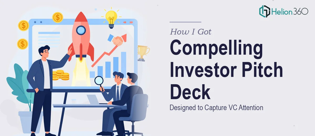
The Situation: A Pitch Window That Couldn't Be Wasted
Our tech startup had reached an inflection point. We'd built the platform, validated the market, and landed our first meaningful customers. The next step was a fundraising push — and we had real VC interest on the horizon. A few warm introductions were in motion, and the window to get in front of decision-makers was opening fast.
I already had the foundational slides roughed out: our core value proposition, market size, traction data, team credentials, and the ask. The content was there. But the presentation itself looked like a working document, not something you'd put in front of a partner at a serious venture firm. The stakes were too high to walk in with something that looked unfinished.
I knew immediately that getting this right wasn't a task I could take on myself. An investor pitch deck at this level isn't just a design job — it's a strategic communication exercise with very specific conventions. That recognition made my next move obvious.
What I Found a Professional Pitch Deck Actually Requires
Before I engaged anyone, I spent time understanding what separates a polished investor pitch deck from a decent-looking slide deck. The difference turned out to be significant.
Venture capitalists see hundreds of decks. The ones that move forward tend to follow a tight narrative logic — not just slide order, but a visual and verbal arc that builds conviction from problem to solution to market to traction to ask. Disrupting that flow, even subtly, causes skepticism.
Beyond narrative, there's the visual execution. Investor-facing materials have specific expectations around density: no more than one core idea per slide, data visualizations that communicate instantly, and a visual hierarchy that guides the eye without effort. Typography discipline matters — title treatments, supporting text, and data labels each have a role, and when they're inconsistently sized or weighted, the deck reads as amateur.
Then there's brand consistency across 15 to 20 slides. For a startup, that means building a cohesive visual identity — not just applying a logo — and maintaining it across charts, icons, callouts, and imagery in a way that feels intentional and credible. That combination of narrative, visual mechanics, and brand coherence is what makes a pitch deck feel fundable.
What the Work Actually Involves
The starting point for any strong investor pitch deck is a structural and narrative audit of the source material. The right approach maps the story arc first: does the problem slide create genuine urgency? Does the solution follow naturally? Does traction evidence appear at the right moment to answer the skeptical question in the investor's mind before they ask it? In practice, this means reorganizing slides, rewriting headline copy to carry argumentative weight rather than label content, and identifying where a single overstuffed slide needs to become two clean ones. For someone who hasn't done this kind of deck-level narrative work before, the audit phase alone can take a full day — and it's easy to miss structural gaps that an experienced eye catches in minutes.
Once the narrative frame is right, the visual mechanics take over. A well-executed investor deck typically operates on a consistent layout grid — often a 12-column system — with a strict typographic hierarchy: 36pt for slide titles, 24pt for supporting headers, 16pt for body and data labels. Color usage is constrained to 3 to 4 brand-aligned colors, with one accent used exclusively for emphasis so it retains its visual weight. Charts and data visualizations follow specific rules too: bar charts for comparisons, line charts for growth trajectories, and callout numbers pulled large to surface the most important figures immediately. Getting these mechanics right and propagating them across every slide through a clean master template is painstaking work — any inconsistency across 18 slides signals lack of polish to a trained eye.
The final layer is brand integration and finish — making sure the startup's visual identity reads as credible and deliberate rather than assembled. That means custom icon sets that match in weight and style, photography or illustration choices that reinforce the brand tone, and a cover and closing slide that frame the whole deck with confidence. Edge cases pile up here: a chart with an awkward legend placement, a slide where the logo sits slightly misaligned, a transition between a text-heavy slide and a visual one that feels tonally inconsistent. Catching and resolving each of these requires both a design eye and familiarity with what investors specifically expect from a fundable deck.
Why I Brought Helion360 in to Handle the Full Project
I didn't try to work through any of this myself. The combination of narrative architecture, visual mechanics, and brand polish — executed at the level a VC audience expects — required someone who does this kind of work regularly, with the process and tooling already in place.
Helion360 handled the full project end-to-end. That meant auditing and restructuring the narrative from my source slides, building a clean master template with proper grid and typographic hierarchy, applying our brand identity with consistency across every slide, and designing the data visualizations so the key numbers surfaced immediately. The whole thing was turned around quickly — done in days, not weeks — which mattered given the timeline we were working against.
What I valued most was that I didn't have to project-manage individual pieces. The full execution — story, structure, layout, and finish — came back as a complete, presentation-ready deck.
The Result and What I'd Tell Anyone in the Same Position
What came back was a deck that looked and read like something a serious company had produced. The narrative flowed cleanly from problem to traction to ask. The data slides communicated the right numbers at a glance. The brand felt consistent and credible across every slide. When I put it in front of the first VC contact, the response was focused on our business — not distracted by the presentation itself, which is exactly what you want.
The quality of the materials contributed to keeping the conversation moving. We generated genuine follow-up interest, and the deck held up in every room it entered.
If you're sitting on solid content and a real fundraising opportunity, and you're recognizing — like I did — that the gap between what you have and what investors expect is real, Helion360 is the team I'd engage: they delivered fast, handled the full execution depth this kind of work demands, and the result spoke for itself.