

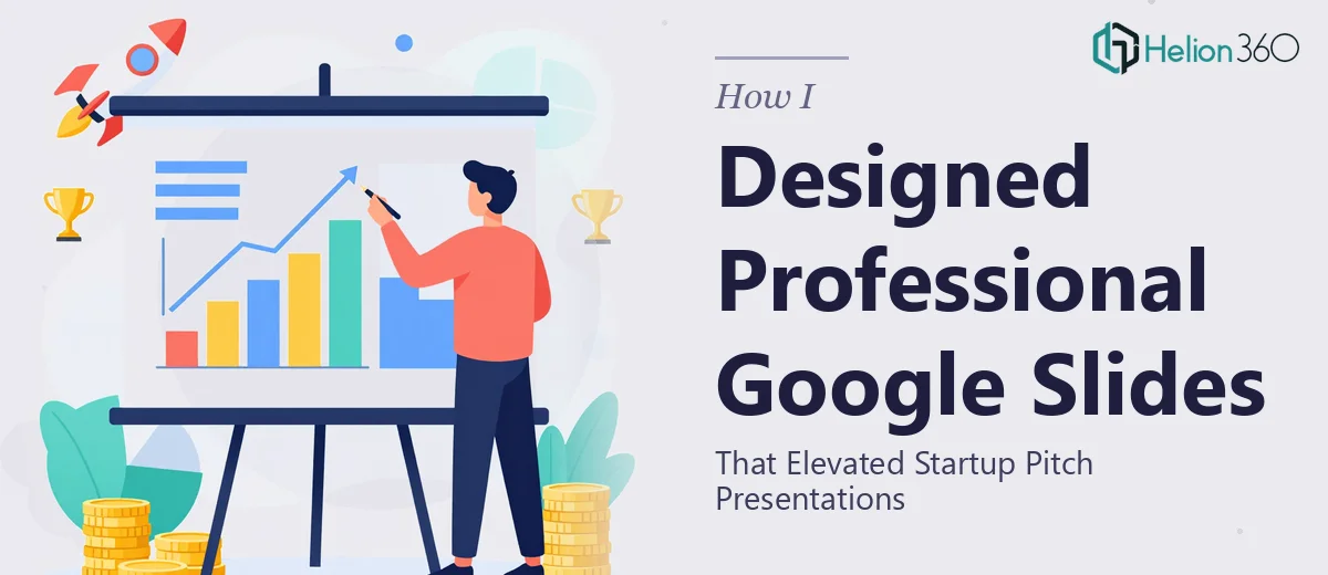
The Problem with Our Startup Pitch Google Slides
We had a real problem. Our startup was preparing for a round of pitch meetings, and our Google Slides looked exactly like what they were — a set of functional but uninspiring slides put together by people who knew the business well but had no real design background. The content was solid. The story was there. But the moment an investor opened the deck, the visual quality of the slides was undermining the credibility of everything we'd built.
With meetings scheduled and a tight window to get ready, the stakes were clear. A professional Google Slides presentation wasn't a nice-to-have — it was the difference between walking into that room with confidence or making a first impression that worked against us. I knew this needed to be done properly, not patched up overnight with a free template.
What I Found Professional Google Slides Design Actually Required
Once I started digging into what a properly designed Google Slides pitch deck actually involves, it became obvious this wasn't a weekend fix.
The first thing that stood out was how much structural work sits underneath the visual layer. A good pitch deck doesn't just look clean — it follows a deliberate narrative sequence. The problem slide, the solution, the market opportunity, the traction, the ask — each section needs to earn its place and set up the next one. Getting that architecture right before a single visual decision is made takes real skill.
Then there's the Google Slides platform itself. It handles master slides, theme fonts, and color schemes differently from PowerPoint, and those differences trip people up constantly. Custom fonts don't always render correctly across devices, linked layouts can break when slides are duplicated, and the transition and animation tools behave in ways that aren't immediately intuitive.
Finally, brand consistency across a multi-slide deck inside Google Slides — ensuring every slide looks like it belongs to the same family — is more demanding than it appears from the outside.
What the Work of Building a Great Pitch Deck in Google Slides Actually Involves
The work starts with narrative structure and slide architecture. A strong startup pitch deck typically runs between 10 and 15 slides, and the sequencing follows established investor expectations: problem, solution, market size, product, business model, traction, team, and ask. Deviating from that sequence without good reason creates friction for the reader. Each slide needs a single governing idea — one headline claim supported by one visual or data point, not a wall of text. The structural audit alone — mapping what exists against what the story actually needs — can surface gaps and redundancies that would otherwise survive into the final version.
Visual mechanics in Google Slides demand a level of precision that isn't obvious until you're inside the tool. A professional deck uses a defined layout grid — typically a 12-column structure — that governs where text blocks, images, and data visuals are placed on every slide. Type hierarchy follows strict sizing rules: a title at 36pt, a supporting headline at 24pt, body copy at 16pt or below. Color palette is constrained to four brand colors maximum, with one accent color reserved for calls to action and key data points. Setting up master slides and slide layouts correctly so these rules propagate consistently across the entire deck is the kind of work that takes hours to configure properly and breaks subtly if shortcuts are taken.
Polish and brand consistency across every slide is where many decks fall short even after the structural and layout work is done. Every icon needs to share the same visual weight and style family. Every chart needs matching axis labels, consistent color coding, and no default Google Slides chart styling left visible. Spacing between elements needs to be optically even, not just numerically equal — 24px of padding around a text block reads differently depending on what surrounds it. Running a consistency pass across 12 to 15 slides, catching every misaligned element, off-brand color, or inconsistent font weight, is methodical and time-consuming work that requires a trained eye.
Why I Brought in Helion360 to Handle It
I looked at what the work actually required — the structural thinking, the Google Slides platform expertise, the brand consistency demands — and the decision to bring in a specialist team was immediate. There was no version of me learning the nuances of Google Slides master slide configuration and delivering a polished 14-slide pitch deck in the window I had.
Helion360 handled the full project end-to-end. That meant the narrative audit and slide restructuring, the full visual design built on a proper layout system with brand-accurate typography and color, and the final polish pass to make sure every slide was consistent and presentation-ready. The deck was turned around quickly — done in days, not weeks — and at a quality level that would have taken me significantly longer to approach on my own, if I could have gotten there at all.
The speed came from the fact that this is what their team does every day. The tooling, the templates, the review process — it was already in place. I handed over the brief, the brand assets, and the raw content, and what came back was a finished deck ready for the room.
The Outcome and What I'd Tell Anyone in My Spot
We walked into those pitch meetings with a Google Slides presentation that looked like it belonged in the room. The visual quality matched the quality of the business being presented. The structure made it easy for investors to follow the story without having to work for it. And critically, none of our time in the days before those meetings was spent wrestling with slide design.
The business outcome mattered, but what I came away understanding is that the real cost of not doing this properly isn't just aesthetic — it's the credibility gap that opens up when the design doesn't match the ambition of what you're presenting. For a startup, that gap is expensive.
If you're looking at a similar situation — a pitch, a marketing presentation, a set of slides that needs to move from functional to genuinely professional — and you want it handled end-to-end without the weeks of learning curve, Helion360 is the team I'd engage. They delivered fast and brought the kind of execution depth this work actually needs.