

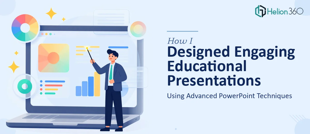
When Educational Content Needs More Than Basic Slides
I was working on a series of educational presentations for our organization — the kind that needed to do real work in a classroom or training setting. The content was dense, the topics were layered, and the audience ranged from beginners to people with strong subject-matter backgrounds. Simply dropping bullet points onto slides was never going to cut it.
I understood the material well enough. What I underestimated was how much visual design work goes into making complex concepts genuinely easy to follow on a screen.
The Problem With DIY Educational Slide Design
I started building the slides myself. I had a decent handle on PowerPoint — I knew how to use templates, add transitions, and format text. But as the content grew more complex, I kept running into the same wall: the slides looked cluttered, the color choices felt inconsistent, and the layouts I was building did not scale well across multiple modules.
Educational presentations are different from standard business decks. You are not just communicating information — you are structuring it so someone can absorb, retain, and apply it. That requires deliberate use of color theory, visual hierarchy, and content pacing across slides. I could see what I wanted in my head. Getting it onto the slide was a different problem entirely.
I also realized that our subject matter experts had strong opinions about how concepts should flow, but no bandwidth to think about visual execution. That gap between content logic and design execution kept widening.
Bringing In a Team That Understood Both Design and Education
After a few weeks of revisions that were going in circles, I reached out to Helion360. I described the scope — multiple educational modules, varied content types, and the need for a consistent visual system that could be applied across all of them.
What made the difference was that their team did not just ask for the slides. They asked about the audience, the learning objectives, and how the presentations would actually be used. That told me they were thinking about educational presentation design as a discipline, not just a formatting task.
They took the existing drafts and rebuilt the visual structure from the ground up — creating a clear slide hierarchy, a color system that reinforced content categories, and custom graphic elements that made abstract concepts easier to visualize. Dynamic layouts replaced the static, text-heavy slides I had been working with. Each module now had its own visual rhythm while still feeling like part of a unified system.
What the Final Presentations Actually Looked Like
The difference between what I had started with and what came back was significant. The slides were clean without being sparse. Information-dense sections had been broken into digestible visual sequences. Color was being used purposefully — not decoratively — to guide the eye and signal transitions between ideas.
The typography was handled with the same care. Hierarchy was clear at a glance. Icons and custom graphics replaced walls of text in places where a visual explanation genuinely worked better than words.
Our subject matter experts reviewed the final versions and immediately noticed the improvement. The content they had worked hard to develop was finally being presented in a way that matched its quality.
What I Took Away From This Process
The experience taught me something I had suspected but not fully acted on: educational presentation design is a specialized skill. It sits at the intersection of instructional design, graphic design, and communication strategy. Knowing PowerPoint well enough to operate it is not the same as knowing how to build something that actually teaches.
Advanced PowerPoint techniques — smart use of master slides, color theory, custom layouts, and consistent visual language — only produce results when they are applied with a clear design rationale. That rationale takes experience to develop.
If you are working on educational presentations and finding that the gap between your content and your slides keeps growing, Helion360's business presentation design services is worth reaching out to — they handle exactly this kind of work, and the results speak for themselves.