

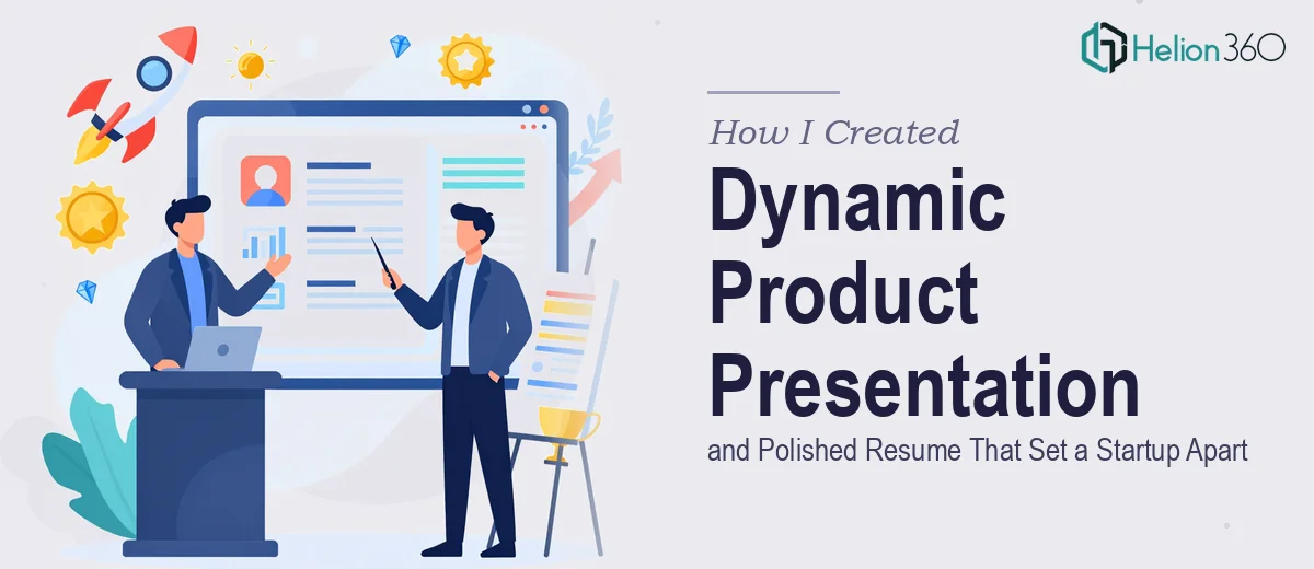
When a Startup Launch Needs More Than a Basic Slide Deck
When our startup finally launched its first product, I assumed putting together a presentation to showcase it would be the straightforward part. We had the story, the data, the enthusiasm. How hard could it be to translate that into slides?
Harder than I expected.
The product itself was genuinely innovative, and that made the communication challenge even bigger. A generic template would flatten everything that made it interesting. I needed a dynamic product presentation — something that moved, breathed, and actually told our story — not just a list of features arranged in a grid.
The Problem With Doing It Yourself
I started in PowerPoint. I had a rough structure in place: a problem slide, a solution slide, a product walkthrough, some competitive positioning, and a closing ask. On paper it made sense. On screen it looked like every other startup deck I had ever rolled my eyes at.
The typography felt inconsistent. The color choices were either too safe or too loud. The animations I tried to add looked choppy rather than purposeful. And every time I fixed one slide, it made the next one look worse by comparison.
On top of that, we needed a polished resume — one that captured the team's actual achievements in a way that felt sharp and credible, not a wall of bullet points in Times New Roman.
Both of these were high-stakes deliverables. The product presentation was going into demos and investor conversations. The resume would be representing our founding team in professional contexts. I could not afford for either to look like a first draft.
Bringing in the Right Help
After spending a full weekend going in circles, I reached out to Helion360. I described exactly what we needed: a visually compelling product presentation that felt dynamic and on-brand, and a resume that was polished and differentiated. I shared our rough slides, some brand references, and the content we had written.
Their team came back with questions I had not thought to ask myself — about tone, about the specific audience for each deliverable, about which product features needed visual emphasis versus which ones should be stated simply. That back-and-forth alone made me realize how much intentional thinking goes into professional presentation design.
What the Final Work Looked Like
The product presentation Helion360 delivered was genuinely different from what I had built. The visual storytelling was clear and sequenced — each slide had a purpose, and the transitions between sections felt natural rather than mechanical. The layout gave breathing room to the key messages instead of crowding every inch of the canvas. The color palette was consistent, the typography hierarchy actually worked, and the product feature slides used custom graphics rather than stock icons that could belong to any company.
What stood out most was how the slides communicated the why behind the product, not just the what. That is the part I had struggled with most on my own.
The resume went through a similar transformation. The content stayed the same — the experience and achievements were ours — but the structure, the visual weight given to key accomplishments, and the overall presentation made it feel authoritative and intentional. It no longer looked like a document that had been updated over five years without a plan.
What I Took Away From This
The gap between functional and polished is wider than most people realize until they are staring at a deck that needs to be both. Good startup presentation design is not about decoration — it is about making sure the ideas land clearly and memorably with whoever is in the room. The same is true for a resume representing a founding team: the content has to be right, but so does the presentation of that content.
I also learned that the time I spent fighting with PowerPoint could have been redirected toward things only I could do — refining the actual product story, preparing for the conversations these materials would start.
If you are in a similar position — you have the content, you know what you want to say, but the design is not coming together the way you need it to — Helion360 is worth reaching out to. They took what I had and turned it into something I was genuinely proud to put in front of people. For reference, I've found success with approaches like 3D product renders and static product images transformed into dynamic video presentations as well.