

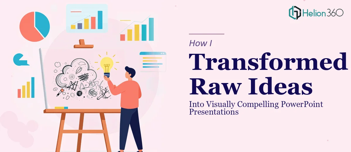
When You Have the Ideas but Not the Slides to Match
I had all the ingredients. A clear message, solid content, and a good sense of what I wanted to communicate. What I did not have was the ability to turn any of it into a presentation that looked the part.
Every time I opened PowerPoint, I would spend an hour rearranging text boxes, testing font combinations, and second-guessing color choices — only to end up with something that felt flat and amateurish. The ideas were strong. The slides were not.
This is a frustrating place to be, especially when the stakes are real. A presentation that looks unpolished quietly signals to your audience that the thinking behind it might be unpolished too. That was not a risk I was willing to take.
The Gap Between a Good Idea and a Great Slide
The challenge with creative PowerPoint presentation design is that it requires two very different skill sets to work together. You need someone who understands the message and someone who knows how to express that message visually — through layout, hierarchy, color, and data visualization.
I am reasonably good at the first part. I know what I want to say and why it matters. But translating that into a visually compelling presentation is a craft in itself. It involves making decisions about how information flows across slides, when to use a chart versus an icon, and how to keep a viewer engaged from the opening slide to the last.
I tried pulling in a few PowerPoint templates, hoping they would do most of the heavy lifting. They helped a little, but they also boxed me in. The structure never quite fit my content, and customizing templates without a strong design eye just led to more inconsistency.
Bringing in the Right Team
After a few rounds of trial and error, I reached out to Helion360. I explained what I had — a set of rough notes, key messages, and a general sense of the tone I was going for — and asked if they could build something from that.
They asked the right questions upfront. What was the audience? What was the context — internal presentation, external pitch, something else? What feeling did I want the slides to leave behind? It was clear from the start that they were thinking about storytelling through design, not just decoration.
From there, I handed over my content and stepped back.
What the Finished Presentation Actually Looked Like
The result was a significant step up from anything I had managed on my own. The slide design had a clear visual language — consistent typography, a deliberate color palette, and a layout that gave each idea room to breathe. Where I had walls of text, they found ways to break the content into digestible visuals. Where I had raw numbers, they built clean charts that made the data speak clearly.
More importantly, the slides told a story. Each one connected to the next in a way that felt intentional. The progression made sense, and the key messages landed with weight rather than getting lost in clutter.
The visual storytelling aspect was the part I had struggled with most on my own. Knowing which slide should carry an image, which should use a diagram, and which should stay minimal — that kind of judgment comes from experience, and the Helion360 team had it.
What I Took Away From the Process
Going through this process taught me something worth knowing: having strong content is necessary, but it is not sufficient. A professional presentation design can be the difference between an idea that resonates and one that gets skimmed past.
I also learned that handing off the design work does not mean losing control of the message. The right team listens first and designs second. The version I received still sounded like me — it just looked far better than anything I could have produced independently.
If you are sitting on a set of ideas that deserve better than a default PowerPoint template, Helion360 is worth reaching out to. They handled the design complexity I could not, and delivered something I was genuinely proud to present.