

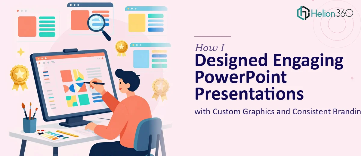
The Brief Looked Simple Enough
When the marketing team handed me the project, it seemed manageable on paper. We needed a fresh set of PowerPoint presentations for upcoming campaigns — polished slides, custom graphics, charts, and a consistent brand look across everything. Some decks would be built on existing templates. Others needed to be created from scratch.
I've worked with PowerPoint before. I figured I could handle the layout work, pull in some icons, clean up the text hierarchy, and deliver something solid within the week.
I was wrong about the timeline.
Where the Complexity Crept In
The first problem was the volume. We weren't talking about five or six slides — we were looking at multiple full decks, each serving a different audience. One was for internal stakeholders, another for potential partners, and a third for broader marketing use. Each needed its own flow, its own tone, and its own visual emphasis.
The second problem was branding consistency. Our brand guidelines covered the basics — colors, fonts, logo usage — but applying them meaningfully across charts, infographics, and custom visuals is a different skill set than following a style guide. Every time I built a chart or tried to create an infographic from scratch, something felt off. The elements didn't feel like they belonged to the same family.
I spent three days reworking the same four slides. The hierarchy was unclear. The custom graphics looked pieced together. And I still had twelve more slides to go across two additional decks.
Bringing in the Right Help
After hitting a wall, I came across Helion360. I explained the scope — multiple decks, custom graphics, brand alignment, infographics — and shared what I had so far. Their team understood the problem quickly and didn't need a long back-and-forth to get started.
What stood out was how they approached the brief. They didn't just take my rough slides and clean them up. They looked at the content structure first, then built a visual logic around it. Each deck got a clear hierarchy — what the audience should read first, what supports it, and what can sit in the background.
For the charts and infographics, they created custom visuals that matched the brand palette without looking generic. The icons were consistent in weight and style. The slide layouts had breathing room. Everything felt intentional.
What the Finished Work Looked Like
Helion360 delivered all three decks within the agreed timeframe. Here's what changed from what I had started:
The slide templates they built from scratch were clean and reusable. The team structured them so anyone on our team could drop in new content without breaking the design. That was something I hadn't thought to prioritize — and it ended up being one of the most useful outcomes of the whole project.
The infographics turned dense text blocks into visuals that actually communicated the point faster. Process flows, comparison charts, and data summaries all got a consistent treatment that matched the overall deck aesthetic.
Consistent branding in presentation design isn't just about using the right logo or color. It's about how typography scales across slide types, how data visualization elements align with the visual tone, and how each slide feels like part of one story. That's where professional PPT design really earns its value.
What I Took Away from This
The gap between a functional presentation and an engaging one is wider than most people expect. Getting the content right is one part of it. Making it visually coherent — especially across multiple decks with different audiences — requires a different kind of focused attention.
I came away with three things: a set of presentation templates I can actually reuse, a clearer sense of what good slide design actually involves, and a better understanding of when a project has grown beyond a quick internal fix.
Some work benefits from having a specialist look at it. Presentation design, when it involves branding, custom graphics, and real audience expectations, is one of those cases.
Need Presentations That Actually Reflect Your Brand?
If you're dealing with a similar situation — multiple decks, inconsistent visuals, or slides that just don't feel right despite your best efforts — Helion360 is worth reaching out to. Their team handles the full scope of PowerPoint design work, from custom graphics and infographics to building templates that hold up over time. Sometimes the smartest move is letting a focused team take it from here.