

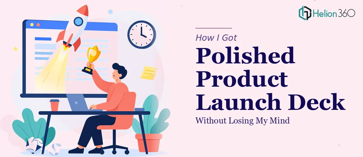
The Presentation That Had to Be Perfect
Our company had been building toward this product launch for months. The event date was locked in, stakeholders were confirmed, and I was the one responsible for the presentation deck. Twelve slides, brand-consistent design, high-quality visuals, animations — the works.
I figured I could handle it. I've used PowerPoint plenty of times. How hard could it really be?
Where Things Started to Break Down
The first issue hit me on slide two. Our brand guidelines required a very specific color palette, custom font pairings, and logo placement rules. Replicating that consistently across every slide — while also making each one visually distinct — was harder than I expected.
Then came the data slides. We had market positioning data, product feature comparisons, and unique selling proposition charts that needed to look clean and professional, not like a copied-from-Excel table dropped into a blank slide. Every time I tried to make them look polished, something felt off — either the layout was too dense, the fonts were inconsistent, or the chart styles clashed with the rest of the deck.
By day three, I had a cover slide I was halfway happy with and seven slides that ranged from acceptable to embarrassing. The launch was ten days out.
Reaching Out for Real Help
After hitting a wall, I came across Helion360. I explained the situation — the brand guidelines, the slide count, the need for animations and transitions that actually added value rather than distraction, and the dual delivery in PPTX and PDF formats.
Their team asked the right questions upfront: What's the audience profile? What emotion should the deck leave people with? What does the cover slide need to communicate in under three seconds?
Those questions alone shifted how I was thinking about the whole presentation.
What the Design Process Actually Looked Like
Helion360 started with the master slide layout — establishing the color scheme, typography hierarchy, and spacing rules so that every subsequent slide would feel like it belonged to the same family. This is something I had skipped entirely, which is probably why my earlier attempt looked inconsistent.
The cover slide came together with the logo positioned prominently against a high-resolution background that felt premium without being busy. It was exactly the kind of first impression the launch deserved.
Slides That Actually Communicated Something
For the product feature slides, they used a mix of custom icons, short text blocks, and white space — nothing crammed, nothing buried. The market positioning slide used a clean visual chart rather than a raw data table, making the competitive landscape immediately readable.
The infographic slides were particularly strong. Instead of plain bullet points listing our unique selling propositions, the information was laid out as a visual flow that guided the viewer's eye naturally from one point to the next.
Animations That Didn't Overstay Their Welcome
One thing I always get wrong with PowerPoint is animations. I either use none or go overboard. The team built in subtle entrance animations and smooth slide transitions that made the presentation feel dynamic without pulling attention away from the content. Every effect had a reason to be there.
The Final Delivery
The completed deck landed in my inbox two days before the event — both the editable PPTX file and a PDF version for offline distribution. I went through it slide by slide and was genuinely impressed. The design was cohesive, the hierarchy was clear, and it looked like something a well-resourced in-house design team had spent weeks on.
The launch event went well. Multiple attendees commented on how professional the presentation looked. One person asked which agency had designed it.
What I Took Away From This
The complexity here wasn't in making slides — it was in making slides that held together as a system, communicated clearly under pressure, and represented a brand at a critical moment. That's a specific skill set, and trying to shortcut it under a deadline is a bad idea.
If you're working on a product launch presentation, a corporate deck, or anything where the visual quality actually matters, don't wait until you're three slides in and already behind.
If your presentation work has grown beyond what you can handle alone, Helion360 is worth a conversation — they step in, ask the right questions, and deliver work that holds up.