

When the Data Was Ready But the Design Was Not
Every quarter, our team compiled weeks of performance data — revenue numbers, customer growth metrics, pipeline breakdowns — into a master spreadsheet. The numbers told a clear story. The problem was that no one could read it easily in a presentation room.
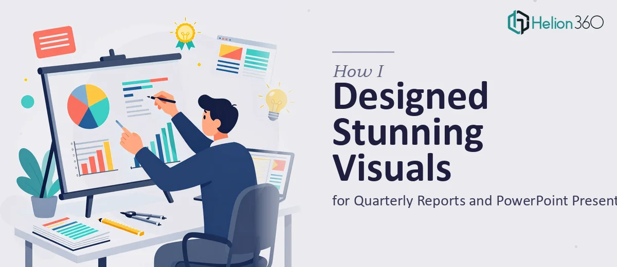
I had been tasked with turning all of that into a polished quarterly report and a matching PowerPoint presentation for leadership. The expectation was clear: data visualization that stakeholders could follow in under five minutes, visuals that reinforced the narrative, not just decorated it.
I understood the brief. What I underestimated was the execution.
The Gap Between Knowing and Doing
I opened Adobe Illustrator with good intentions. I had a rough sense of what strong data visualization looked like — clean charts, clear hierarchy, consistent brand colors. But translating that instinct into actual slides at scale was a different challenge entirely.
The quarterly report alone had over twenty data points across multiple departments. Each one needed its own visual treatment: some as bar charts, some as trend lines, a few as infographic-style summaries. On top of that, the PowerPoint had to maintain visual consistency across thirty slides while staying within our brand guidelines.
After two full days of working in PowerPoint and Illustrator, I had a rough draft that felt exactly that — rough. The slides lacked cohesion. The infographics looked generic. The chart layouts were functional but not compelling. There was nothing wrong with the data. The design just wasn't doing it justice.
I also had a deadline that was not moving.
Bringing in the Right Expertise
After hitting that wall, I came across Helion360. I explained exactly where I was stuck — I had all the raw content, the brand assets, the data — but needed someone who could interpret complex information into clear, visually compelling slides quickly.
Their team asked the right questions from the start. What is the audience? What is the tone — formal board presentation or internal team review? Which slides need to carry the heaviest visual weight? That kind of scoping made it clear they had done this kind of work before.
I handed over the data files, the brand kit, and a rough outline of what each slide needed to communicate.
What the Final Deliverables Looked Like
Within the agreed timeline, Helion360 delivered a complete set of quarterly report visuals and PowerPoint slides that looked nothing like what I had started with.
The data visualization was the most noticeable improvement. Numbers that had lived in spreadsheet cells were now clean, readable charts with clear labels, logical color coding, and supporting callout text that explained the takeaway — not just the data. Custom infographic layouts replaced the bullet-point-heavy slides I had been building.
The PowerPoint presentation held together visually from the first slide to the last. Typography was consistent. Slide spacing followed a clear grid. The brand colors were used with restraint — not plastered everywhere, but placed where they actually guided the eye.
Even the more complex slides — the ones comparing quarter-over-quarter performance across three business units — were laid out in a way that made the comparison immediately readable.
What I Took Away From This
The biggest lesson was understanding where graphic design for reports and presentations actually becomes a specialized skill. It is not just about knowing Photoshop or Illustrator. It is about understanding how a viewer's eye moves through a slide, how much information a single frame can hold before it becomes noise, and how to make a chart feel like a story rather than a table.
Handling the content strategy and the data logic myself made sense. But visual execution at this level — especially under deadline pressure — needed someone with dedicated expertise in presentation design and data visualization.
The quarterly report went out on time. The leadership review went smoothly. A few people specifically mentioned how easy the slides were to follow, which is exactly what good design is supposed to do: disappear behind the content.
Need Visuals That Match the Work Behind Your Data?
If you are working on a quarterly report or a presentation where the data is ready but the design is not quite there, Helion360 is worth reaching out to. Their team steps in at exactly the point where the complexity exceeds what one person can reasonably handle alone — and they deliver work that is ready to present.