

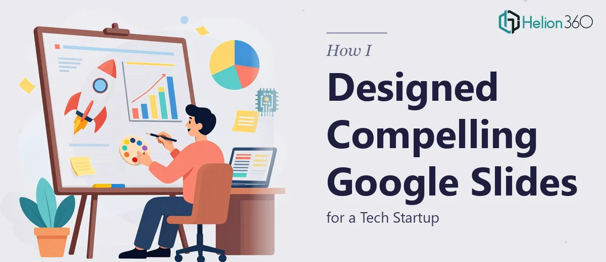
When a Simple Slide Refresh Became Something Much Bigger
It started as a straightforward ask. A tech startup needed their Google Slides presentations cleaned up — better graphics, tighter layouts, a more professional look overall. I had done slide work before, so I figured I could handle it.
I opened the first deck and immediately saw the gap between where things were and where they needed to be. The content was solid. The ideas were clear. But visually, it looked like the slides had been built in a hurry — inconsistent fonts, placeholder graphics, no real visual hierarchy. For a startup trying to impress investors and close deals, that kind of presentation would work against them.
What I Tried to Fix on My Own
I started with the basics. I standardized the typography, aligned the layout grids, and replaced the generic stock icons with something more intentional. For a few slides, that was enough. But as I moved deeper into the deck, the complexity compounded.
The startup had product feature slides that needed custom UI-style graphics to illustrate how their software worked. There were data slides that needed proper chart design, not just default Google Slides bar graphs. And the overall visual identity needed to feel cohesive — like someone had actually thought about how each slide connected to the next.
I spent a couple of evenings pushing the slides further, but I kept running into the same wall. The graphic design work — the kind that makes a Google Slides presentation genuinely compelling — required a level of visual craft that went beyond reformatting. I was good at structure. The visual storytelling layer was a different skill set.
Bringing in the Right Team
After hitting that wall, I reached out to Helion360. I explained the situation — a tech startup, a set of Google Slides decks, and a clear need for custom graphics, visual consistency, and presentation design that could hold up in a real boardroom. They asked the right questions, understood the startup context quickly, and took over from there.
What they delivered changed how I thought about Google Slides presentation design. The feature slides got clean, custom-built graphics that illustrated the product without being cluttered. The data visualizations were redesigned with proper hierarchy — the key numbers stood out, the supporting context stayed visible but secondary. The slide-to-slide flow had a coherence that the original decks completely lacked.
What the Final Presentation Actually Looked Like
The finished decks were a significant step up. Every slide had visual purpose. The graphics felt native to the brand, not pulled from a free icon library. The color usage was disciplined — the startup's palette ran through every slide without ever feeling repetitive.
More practically, the presentations were built to be used. Speaker notes were clean, transitions were minimal and functional, and the file was organized in a way that made it easy for the startup team to update slides without breaking the design.
What I Took Away From This
Working on this project clarified something I had suspected but not fully confronted: presentation design for a tech startup is not just about making slides look better. It is about communicating product value, brand credibility, and technical clarity — all at once, within the constraints of a Google Slides format. That combination of skills takes real specialization.
I also learned that knowing when a project needs more than you can offer is not a limitation. It is just accurate self-assessment. The startup needed a result, and the result required the right expertise.
If you are working on a similar project — a Google Slides presentation that needs real graphic design work, not just formatting — Helion360 is worth reaching out to. They handled the parts I could not and delivered exactly what the startup needed.