

When a Simple Slide Turned Into a Layout Problem
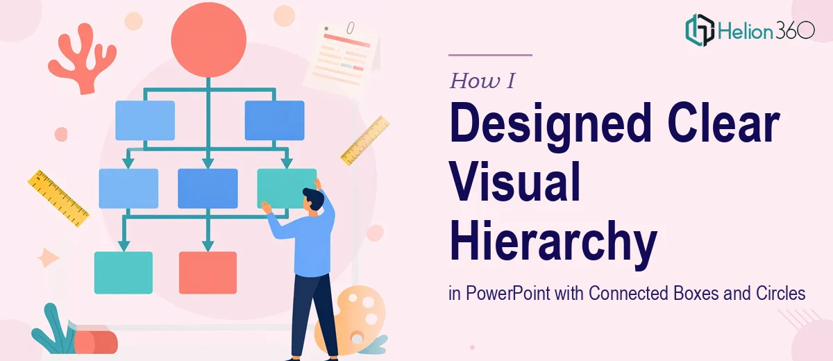
It started with what seemed like a straightforward request. I needed to build a single PowerPoint slide that showed three boxes pointing toward two circles, with four additional boxes arranged around them. The goal was simple: show a relationship between elements in a way that was clean, logical, and easy to follow at a glance.
I opened PowerPoint, confident I could knock it out in under an hour.
That confidence did not last long.
The Challenge of Communicating Relationships Visually
The moment I started placing shapes on the slide, I ran into a problem that anyone who has worked with custom diagrams in PowerPoint will recognize. The shapes did not align the way I imagined. The connectors between the boxes and circles looked awkward. The visual hierarchy — which was supposed to be the whole point of the slide — was not reading clearly at all.
I tried adjusting the layout manually, nudging shapes pixel by pixel. I experimented with SmartArt, but none of the built-in templates matched what I needed. I tried drawing custom connectors, but they curved in directions that made the flow confusing rather than clear.
The content was simple. The data was simple. But translating that into a slide where a viewer could instantly understand which boxes feed into the circles, and how the surrounding boxes relate to the whole — that was harder than I expected.
After about two hours of rearranging and second-guessing myself, I had a slide that looked more like a rough sketch than a professional presentation asset.
Bringing in the Right Help
That is when I reached out to Helion360. I described the layout — three input boxes pointing to two central circles, four supporting boxes positioned around them — and shared a rough sketch of what I was going for. Their team understood the structure immediately and asked a few clarifying questions about the visual style, color palette, and how the slide would be used in context.
Within a short turnaround, they came back with a version that solved everything I had been struggling with. The three boxes fed cleanly into the circles using properly weighted connectors. The four surrounding boxes were balanced and proportional. The whole diagram had a logical visual flow that you could read in seconds without any explanation.
What Made the Final Design Work
Looking at what Helion360 delivered, I could see the decisions that made it work. The shapes were aligned on a grid that I had not thought to set up. The connectors used a consistent stroke weight that made directionality obvious without being heavy-handed. Color was used strategically — the input boxes, the circles, and the outer boxes each had a distinct but harmonious tone that reinforced the hierarchy rather than competing with it.
The spacing between elements was deliberate. Everything had room to breathe, which made the relationships between shapes legible rather than cluttered. It was the kind of slide design that looks effortless when done well, but takes real thought to execute.
I also noticed they kept the layout flexible. The text inside each shape was sized and positioned so that real content could drop in without breaking the structure.
What I Took Away From This
Designing a diagram that communicates relationships clearly is a different skill from making a slide look good. You can have great aesthetics and still produce a layout that confuses your audience if the visual logic is off. The arrangement of elements, the weight of connectors, and the use of color all have to work together to guide the viewer's eye in the right direction.
For a single slide, it was a bigger investment of thought than I initially expected. And for anyone working on slides that need to communicate structure — process flows, organizational relationships, system diagrams — getting that visual hierarchy right is worth taking seriously.
If you are working on a similar diagram and finding that the layout is not reading the way you intend, Helion360 is worth reaching out to. They handled the complexity I could not work through on my own and delivered exactly what the slide needed.