

The Moment I Realized First Impressions Were on the Line
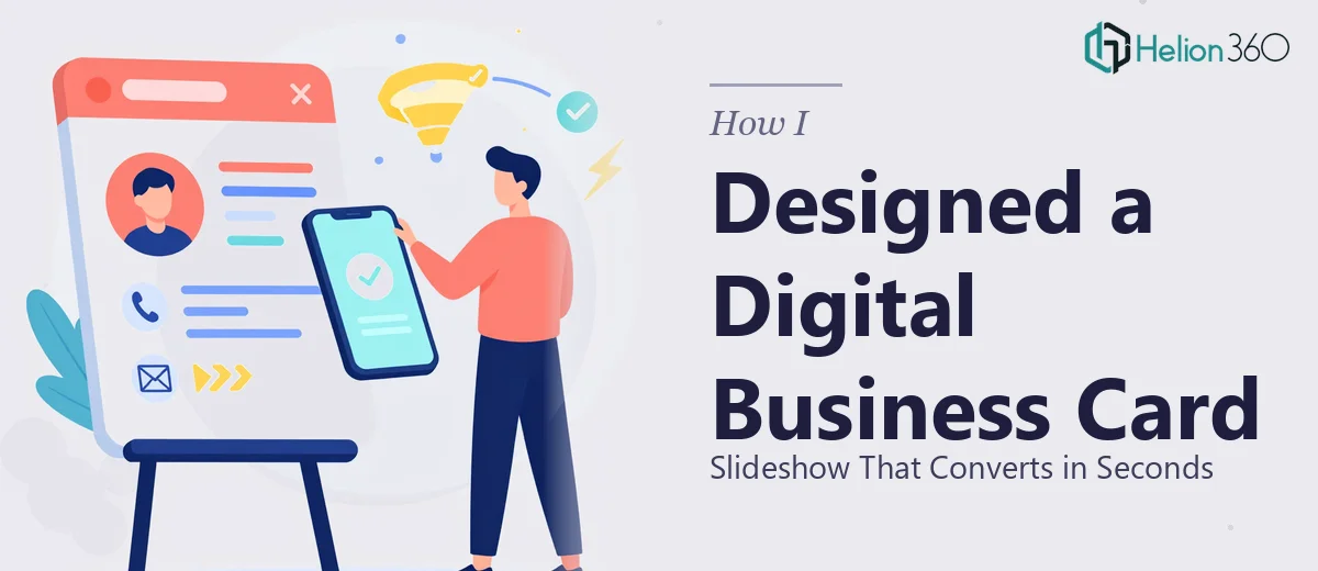
I was launching a new digital marketing venture, and the very first thing a potential client would see was a short slideshow — essentially a digital business card presentation that needed to communicate who we are, what we do, and why we're worth contacting. All of that in a matter of seconds.
The stakes were clear. If the slides looked generic, inconsistent, or cluttered, it would signal exactly the opposite of what a digital marketing brand should project. The presentation wasn't a supplementary asset — it was the front door. It needed a clean, modern design that held attention immediately and made a confident visual statement about the brand.
I knew straight away this had to be done properly. A rushed attempt with a template would show. This needed real design thinking behind it.
What I Discovered a High-Impact Slideshow Actually Involves
Once I started researching what a well-executed digital business card presentation actually requires, a few things became immediately clear — and none of them were simple.
First, a strong visual identity has to be established before a single slide is designed. That means color palette decisions, typeface pairing, spacing rules, and a logo treatment that works at multiple sizes. Without that foundation locked down, slides end up drifting in look and feel from one to the next.
Second, this type of presentation is consumed fast — often in five to eight seconds per slide or less. That changes everything about how content is structured. Copy has to be ruthlessly tight. Visual hierarchy has to do most of the communicative work. A designer working in this format has to think in terms of immediate comprehension, not gradual reading.
Third, the format requires genuine motion design awareness. Static slides alone won't hold attention in a digital context. Transitions, entry animations, and timing all affect how professional the piece feels. Getting those right requires both technical skill and aesthetic judgment — it's not something you configure in five minutes.
What the Work Behind a Polished Digital Business Card Presentation Looks Like
The right approach to a digital business card slideshow starts with narrative structure — deciding exactly what story each screen tells and in what order. A proper audit of the brand's core message, services, and differentiators comes first. From that, a content map is built: typically five to eight slides, each with a single focused point. The rule of thumb used by practitioners here is one idea per screen, with a headline capped at six to eight words and a supporting line no longer than twelve. Getting the hierarchy right at this stage saves hours of revision later — but getting it wrong means every subsequent design decision is built on a shaky foundation.
The visual mechanics layer is where the complexity compounds. Done well, a digital presentation of this type uses a defined layout grid — often a 12-column structure — with consistent margin and padding values applied across every slide. Typography is set on a clear hierarchy: a display size around 40–48pt for headlines, a body size around 18–20pt for supporting copy, and a restricted palette of no more than three to four brand colors applied with strict rules about where each appears. Inconsistencies at this layer are immediately visible to a trained eye, and they're the most common place an otherwise decent concept falls apart in execution.
The polish and motion layer is the one most people underestimate. Smooth, purposeful animation — entrance timing, slide transitions, element sequencing — takes significant time to configure correctly when it needs to feel intentional rather than decorative. Each animation decision has to serve the communication goal, not distract from it. When transitions are off by even a fraction of a second or an element animates in a direction that draws the eye away from the headline, the whole thing feels off. Practitioners working at this level test multiple animation configurations before landing on the one that feels effortless.
Why I Brought Helion360 in to Handle the Full Project
After understanding what this work actually involved, the decision was easy. I wasn't going to spend weeks learning grid systems, motion design timing, and brand consistency rules for a single project with a tight deadline. The right move was to engage a team with the tooling and expertise already in place.
Helion360 handled the project end-to-end — from establishing the visual identity framework and brand color system, to designing and animating every slide in the presentation, to delivering a final file ready for immediate use. The turnaround was fast: done in days, not weeks. What would have taken me a significant chunk of time just to research and set up, they handled as a matter of course.
The depth of execution was what stood out. Every slide arrived consistent, intentional, and sharp — the kind of result that only comes from a team that does this kind of work every day.
What the Finished Work Delivered and What I'd Tell Anyone in My Spot
The final digital business card slideshow was exactly what the brand needed at launch. Clean visual identity applied consistently across every screen, a narrative that communicated the core offer in under ten seconds of viewing, and motion design that felt polished without being distracting. It became a reliable asset — shared in pitches, linked in outreach, and used as the first impression for every new conversation.
The business outcome was tangible: the presentation did its job of establishing credibility immediately, which is the only thing a digital business card is supposed to do.
If you're looking at a similar project — a short, high-stakes presentation that needs to make a strong visual impression fast — and you recognize that the execution depth required is beyond a weekend effort, consider Business Presentation Design Services. Learn more about the process in how teams approach interactive business presentations or explore what goes into professional conference presentations.