

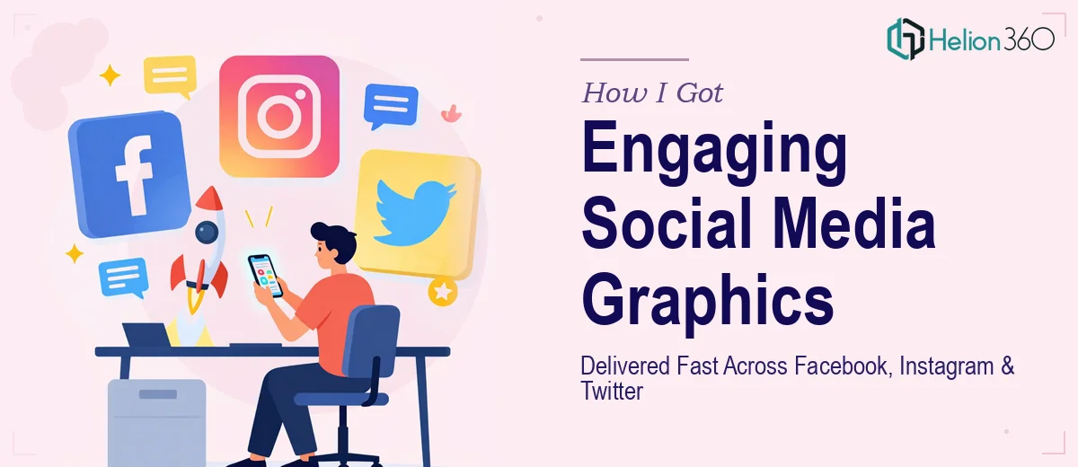
The Problem With Our Social Media Visual Strategy
Our brand had been active on Facebook, Instagram, and Twitter for a while, but the content wasn't landing. Engagement was flat. The graphics looked inconsistent — some slides too text-heavy, some visuals that clearly hadn't been sized for the platform they were posted on, and animated content that felt out of step with the tone we were trying to set.
The stakes were real. We had a campaign coming up, a product story to tell, and an audience that scrolls fast and forgives nothing. Generic visuals weren't going to move the needle. What we needed was a cohesive set of social media graphics — infographics, animated GIFs, short video snippets — that felt intentional, on-brand, and built specifically for how each platform works.
I knew straight away that this wasn't something to patch together over a weekend. Doing it well was going to require a level of craft and platform-specific thinking that needed a proper approach.
What I Found Social Media Presentation Design Actually Requires
When I started looking closely at what professional social media graphic design actually involves, I understood why so many brands end up with content that underperforms. The surface looks simple — make a nice image, post it — but the reality is considerably more involved.
First, every major platform has its own canvas rules. Instagram's square and story formats, Facebook's link preview dimensions, Twitter's timeline crop behavior — each one demands assets sized and composed differently. A graphic that looks sharp on one platform can get clipped or compressed on another if the specifications aren't followed precisely.
Second, animated content isn't just a design task — it's a motion design and file optimization task. An animated GIF that's too large won't loop correctly on mobile. A short video snippet that hasn't been exported at the right bitrate looks degraded in-feed. These are technical decisions that compound on top of the creative ones.
Third, brand consistency across a high volume of assets is genuinely hard to maintain without a system. When you're producing twenty or thirty pieces of content across formats, keeping typography, color palette, and visual language locked is a discipline in itself. That recognition made the scope of the project very clear.
What the Work Actually Involves
The right approach to social media graphic design starts with a structural audit of the brand message and a content map. Each piece of content needs to know what it's doing — is it driving awareness, explaining a feature, prompting a share? That narrative layer informs every visual decision downstream. Done well, this phase produces a clear content brief for each asset type, organized by platform and campaign moment. Skipping it is where most DIY attempts fall apart: without a framework, assets end up visually disconnected and strategically unfocused, no matter how good the individual designs look in isolation.
Visual mechanics are where the execution gets technical. Platform-safe canvas sizes run from 1080×1080px for Instagram square posts to 1200×628px for Facebook link shares and 1600×900px for Twitter timeline cards. Typography hierarchies for social content typically follow a compressed scale — a headline at 48–60pt, a supporting line at 24–28pt, and any fine print no smaller than 14pt — because legibility at thumbnail size is non-negotiable. Color contrast ratios, safe zones for text placement, and bleed margins all have to be set up correctly in the master file before a single design element is placed. Getting the grid right once saves rework on every asset that follows.
Polish and animation add the final layer of complexity. Animated GIFs need to be exported at under 8MB for reliable platform rendering, and loop timing — typically 1.5 to 3 seconds for social — has to feel natural, not rushed. Video snippets require proper codec selection (H.264 for broad compatibility), correct aspect ratio per platform, and caption-safe framing since most in-feed video plays without sound. Maintaining brand palette discipline across all of this — no color drift, no rogue font weights, no logo placement inconsistencies — is the kind of detail that separates content that looks considered from content that looks assembled. It takes experience and the right tooling to hold all of it together across a full asset set.
Why I Brought in Helion360 to Handle It
I looked at what the project actually required — platform-specific specs, motion design, brand consistency across thirty-plus assets, tight deadlines — and I didn't need to think long about the right move. Attempting it myself would have meant weeks of learning curve, software investment, and iteration cycles I didn't have time for.
Helion360 handled the full project end-to-end: the content mapping and brief-building, the full suite of static and animated social media graphics sized correctly for each platform, and the motion and video assets optimized for in-feed performance. They turned it around quickly — what would have taken me weeks of ramp-up and trial-and-error was done in days. The team came with the tooling, the platform knowledge, and the design system discipline already in place. There was no back-and-forth getting them up to speed on what good looks like — they already knew.
The Result and What I'd Tell Anyone Facing the Same Situation
What was delivered was a complete, campaign-ready set of social media graphics — infographics, animated GIFs, and short video snippets — all sized correctly per platform, visually consistent, and built to the brief. The campaign launched on schedule. Engagement across all three platforms improved meaningfully compared to our previous content cycles, and the brand finally looked like it had a coherent visual identity in-feed.
The work itself was sound: every asset hit the technical specs, the motion content looped cleanly, and the typography was legible even at small sizes on mobile. More importantly, the content actually communicated what we needed it to communicate — it wasn't just pretty, it was purposeful.
If you're looking at a similar scope — a multi-platform social media design project that needs to be done right and done fast — Helion360 is the team I'd engage. They handled the full execution depth this kind of work demands and delivered without the weeks of overhead I would have spent figuring it out myself.