

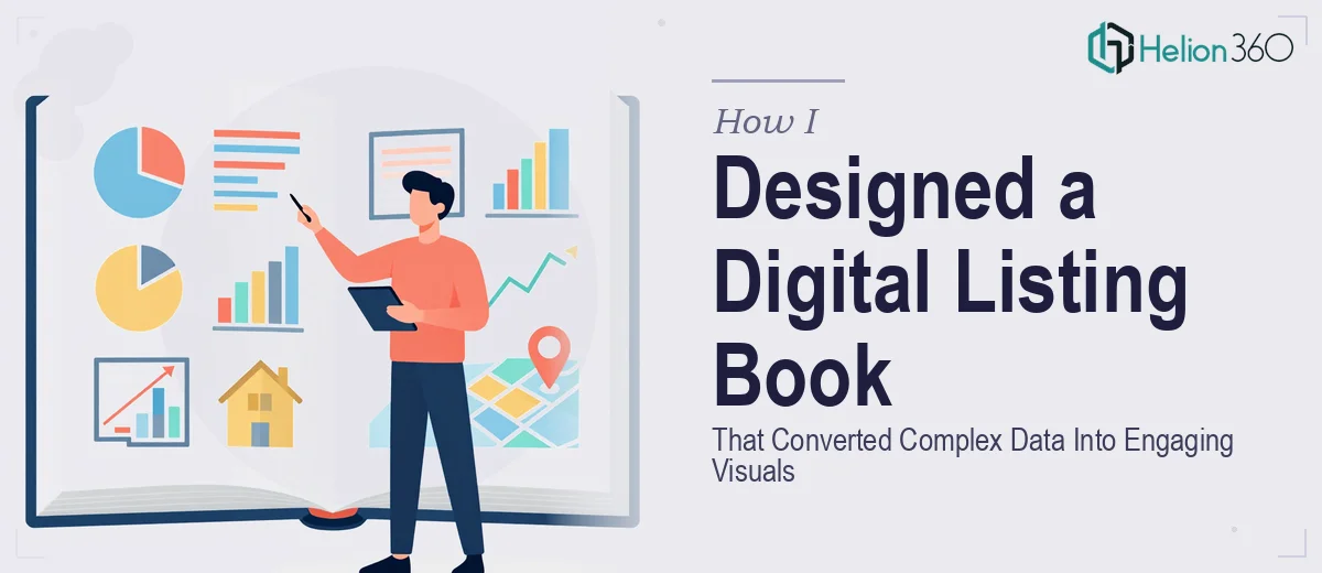
When a Presentation Needs to Do More Than Look Good
I was handed a project that sounded straightforward at first: design a digital book that could serve as both a listing presentation and a buyer presentation guide. The idea was to create something that prospects could read through on their own — a polished, branded resource that explained complex property and market information in a way that felt accessible, not overwhelming.
On paper, it made sense. In practice, it turned into one of the more demanding design challenges I had encountered in a while.
The Real Challenge: Turning Dense Content Into a Readable Flow
The content itself was rich — market data, property highlights, buyer process steps, brand messaging, and calls to action all woven together. The goal was not just a pretty digital brochure. It needed to function as an educational guide while also reinforcing the brand's visual identity at every turn.
I started by mapping out the structure. I tried building the layout in PowerPoint, thinking I could adapt a presentation format into something that read more like a digital book. The slides looked decent individually, but they did not flow as a cohesive reading experience. The data-heavy sections felt cluttered. The visual storytelling I was aiming for was not landing.
I then attempted to rework the information architecture — separating the listing presentation logic from the buyer presentation logic so each had its own narrative thread. That helped with organization, but the design execution still felt inconsistent. Brand colors were applied correctly, but the overall aesthetic did not carry the weight the content deserved.
Where the Project Got Stuck
The core problem was that this project sat at the intersection of presentation design, editorial layout, and data visualization. Making complex real estate and buyer journey information genuinely engaging — not just formatted — required a level of visual storytelling expertise that went beyond standard slide design.
I had the content direction. I understood the audience. But translating that into a digital book that felt professionally designed, brand-consistent, and genuinely easy to navigate was proving harder than expected.
That is when I reached out to Helion360. I explained the scope — a multi-section digital presentation book, dual purpose for listings and buyers, brand-specific aesthetic, and a need to make data feel visual rather than dense. Their team understood the brief immediately and took over the design execution from there.
How the Design Came Together
Helion360 approached it as a visual storytelling problem, not just a formatting task. They restructured the layout so that each section had a clear visual hierarchy — the kind where a reader's eye naturally moves through the page without effort. Data points that had previously felt like blocks of text were reimagined as clean infographic-style visuals that conveyed the same information with far more impact.
The brand's aesthetic was applied consistently across every section — from the listing showcase pages to the step-by-step buyer process breakdown. Typography choices, color weight, and spacing all worked together to give the digital book a premium, editorial feel that matched the brand's positioning.
What surprised me most was how the dual-purpose structure was handled. Rather than making it feel like two separate documents stitched together, the design created a natural transition between the listing presentation section and the buyer presentation section. It read as one cohesive piece.
What I Took Away From This
Designing a digital presentation book is genuinely different from designing a slide deck. The pacing, the visual rhythm, and the way information is layered all need to account for a reader moving through content at their own speed — not a presenter controlling the flow. Getting that balance right requires a specific kind of design thinking.
This project also reinforced something I already suspected: when complex data needs to become engaging visuals inside a branded document, the design decisions compound quickly. One inconsistent choice early in the layout can ripple through the entire piece.
If you are working on a similar project — a digital listing presentation, a buyer guide, or any branded document that needs to balance visual design with real informational depth — Helion360 is worth reaching out to. They stepped in at exactly the right point and delivered a finished product that did what the brief asked for.