

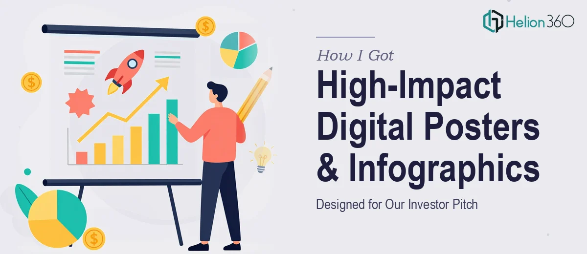
The Pitch Was Real and the Visuals Had to Match
We were heading into a serious investor pitch — not a casual intro call, but a room where decisions get made. The deck was mostly in shape, but the digital posters and infographics were still rough drafts at best. They were doing nothing to communicate the strength of our idea or the scale of the opportunity.
For a tech startup, visuals aren't decoration. Investors read between the lines of every slide. Weak infographics signal unclear thinking. Overcrowded posters signal a team that can't distill what matters. I knew that getting the design right on these specific assets would either reinforce our credibility or quietly undercut it.
This wasn't a job for a late-night Canva session. It needed real craft, real judgment, and a fast turnaround — and I recognized that immediately.
What Doing This Well Actually Requires
I spent a few hours researching what separates mediocre pitch infographics from the kind that actually land with investors. The gap was bigger than I expected.
First, infographic design for a pitch context follows different rules than general marketing graphics. Investors aren't skimming a social feed — they're evaluating logic, scalability, and confidence. Every visual element has to earn its place. A poorly chosen chart type or a cluttered layout doesn't just look bad; it creates doubt.
Second, brand consistency across a set of digital assets is harder to maintain than it looks. It's not just using the same logo — it's enforcing a consistent color palette (typically no more than four primary brand colors), a defined type hierarchy, and spatial rules that hold across every poster and infographic in the set.
Third, the information architecture has to be solved before any visual work starts. What's the core message each asset needs to land? What's the hierarchy of information? If that thinking hasn't been done upstream, the design work stalls or produces something that looks polished but communicates nothing. That alone ruled out any quick fix.
What the Design Work Actually Involves
The starting point for this kind of project is always the narrative and information architecture. A practitioner working on pitch infographics begins by auditing all the source content — value propositions, market data, product logic — and mapping each asset to a single core message. Done well, each digital poster or infographic communicates exactly one idea with total clarity. That sounds simple, but the editing discipline required to get there is significant. Most first drafts try to say four things at once, and the work of stripping that back to one clear visual argument takes multiple rounds of structured critique and revision.
The visual mechanics layer is where execution complexity compounds. Proper infographic design for a pitch context uses a disciplined layout grid — typically a 12-column structure — so that every element lands in a position that feels intentional, not accidental. Type hierarchies follow strict sizing rules: headline at 36pt or above, supporting text at 22–24pt, captions or labels at 14–16pt. Chart types are chosen deliberately: a market size story calls for a bubble or area chart, not a pie; a competitive landscape calls for a quadrant, not a bar. Getting these decisions wrong undermines the credibility of the data, and getting them right requires both design knowledge and domain fluency that takes years to build.
Polish and consistency across the full set of assets is the final layer — and where DIY attempts most often fall apart. Applying a brand palette consistently across six to ten distinct poster and infographic formats means managing master styles, checking color hex values asset by asset, and ensuring that spacing, shadow, and iconography rules hold everywhere. A single off-brand color or misaligned margin breaks the sense of a cohesive, professional presentation. This review and correction pass alone can take an experienced designer several hours on a moderate-sized asset set, and someone without established workflows will spend far longer chasing inconsistencies they can barely see.
Why I Brought in Helion360 to Handle It
Once I understood what the work actually involved, I didn't try to tackle it myself. The timeline was tight, the stakes were real, and the skill set required — narrative editing, layout precision, brand application, and pitch-context design judgment all working together — wasn't something I could assemble on the fly.
I engaged Helion360 to handle the Pitch Graphics Design Services. That meant they took it from the raw source content all the way through to final production-ready files. They handled the information architecture and message-distillation work, built the layout system and applied the type hierarchy consistently across every asset, and enforced brand discipline through the full set of posters and infographics.
What stood out was the speed. The work was turned around quickly — done in days, not weeks — and at a level of execution depth that would have taken me far longer to achieve even if I had the skills. They do this kind of work constantly, and it shows in how efficiently the project moved.
What the Pitch Showed and What I'd Tell Anyone in This Spot
The final set of investment presentation deck with digital posters and infographics looked like they belonged in the pitch. Investors engaged with the visuals the way we needed them to — the market size graphic landed clearly, the product logic poster communicated the core idea without requiring a verbal explanation, and the overall set read as cohesive and confident.
The feedback from the room confirmed that the visuals were doing real work, not just filling space. That outcome was directly connected to the quality of the design execution — not just the ideas behind it.
If you're heading into an investor pitch and your infographics and digital posters aren't where they need to be, don't underestimate what it takes to get them there. The design work is more complex than it looks, and the margin for error in a high-stakes room is thin. If you're in that situation and want it handled end-to-end without the learning curve, Helion360 is the team to engage — they delivered fast, and the execution depth matched what the project actually required.