

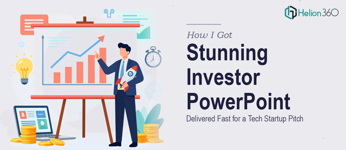
The Presentation That Had to Work
I was working with a tech startup that had one shot at a room full of serious investors. The deck wasn't just a formality — it was the entire first impression. The founding team had strong ideas, a defensible market position, and early traction, but the slides they had going into that meeting looked like a first draft. Text-heavy, inconsistent formatting, no visual hierarchy, and a narrative that jumped around without ever landing a clear point.
The stakes were obvious. Investors make decisions quickly, and a cluttered deck signals disorganization before a single word is spoken. What the startup needed wasn't a light polish job — it needed a presentation that could carry the story end-to-end, look credible on a big screen, and give the founders something they could speak to with confidence. I recognized immediately this wasn't something to patch together internally on a Friday night.
What Building a Proper Investor Deck Actually Requires
Before engaging anyone, I took a hard look at what a well-executed investor PowerPoint presentation actually demands. The gap between a serviceable deck and one that earns credibility in a pitch meeting is significant — and it's not just about making things look prettier.
The first thing that became clear was the narrative structure. Investors follow a specific mental sequence: problem, solution, market size, traction, team, ask. A deck that doesn't move cleanly through that logic loses the room at slide three. That's a writing and strategy problem before it's a design problem.
The second thing was the visual discipline required. An investor pitch deck for a tech startup carries implicit credibility signals — typography has to be precise, data visualizations have to be clean and immediately readable, and the overall aesthetic has to say "we are serious" without saying it out loud.
Third, every single slide has to feel like it belongs to the same family. Inconsistency in spacing, color use, or icon style reads as sloppiness, and sloppiness in a pitch deck is a trust killer. Doing all three of these things well simultaneously, under time pressure, is not a weekend project.
What the Work Actually Involves
The structural and narrative work is where a strong investor PowerPoint presentation is either won or lost before design even begins. The right approach starts with a full audit of the existing content — identifying what belongs in the deck, what should be cut, and what's missing entirely. A proper investor narrative follows a tight arc: the problem takes no more than two slides, the solution gets three, and traction data lives in a format investors can absorb in under ten seconds per slide. Mapping that arc correctly and writing slide titles that double as argument statements takes real editorial judgment. For someone new to pitch narrative conventions, this phase alone can consume days of iteration.
Visual mechanics determine whether the deck reads as professional or amateur the moment it opens. A well-built presentation uses a constrained type scale — typically three sizes: a headline at 36pt, a subhead at 24pt, and body copy no smaller than 16pt — applied consistently across every slide through properly configured master slides. Chart types follow strict rules too: comparisons use bars, trends use lines, and composition uses pies only when there are fewer than five segments. Building these mechanics into a PowerPoint file so they propagate correctly across forty-plus slides requires template architecture experience that most generalist users don't have, and getting it wrong means slide-by-slide manual fixes that compound quickly.
Polish and brand consistency is the layer that separates polished PowerPoint graphics from one that just looks cleaned up. The right approach limits the palette to no more than four brand colors with defined use rules — primary for headers, accent for callouts, neutrals for backgrounds — and applies them without exception. Icon sets need to come from a single source library, at a single weight, scaled to a consistent size across all slides. The execution friction here is real: a forty-slide deck has hundreds of individual elements, and maintaining consistency across all of them while working under a deadline is exactly the kind of detail work that slips when someone is doing it for the first time or doing it alone.
Why I Brought in Helion360 to Handle It
I looked at what the work actually required and made the call quickly. The narrative restructuring, the visual system, the brand application across every slide — this was a complete end-to-end project, not a task I could hand off in pieces or abbreviate without it showing.
Helion360 handled the full project from the ground up. That meant taking the existing content, rebuilding the narrative arc into a clean investor sequence, designing the full slide system from master templates through to final delivery, and applying consistent visual polish across every single slide. The deck was turned around quickly — done in days, not weeks — which mattered because the pitch window was fixed and there was no room to be waiting on revisions.
What made the engagement work was that this is the kind of project Helion360 does repeatedly. The tooling, the template architecture, the editorial instincts for investor narrative — all of it was already in place. That's the difference between engaging a capable team and trying to build the capability from scratch under deadline pressure.
What Was Delivered and What I'd Tell Anyone in This Spot
The final deck was a complete rebuild. Clean slide architecture, a narrative that moved through the investor logic sequence without friction, data visualizations that communicated traction immediately, and a visual system that held together across every slide. The founders went into the room with something that looked like it belonged in that room.
The outcome was exactly what it needed to be: a presentation that supported the story without getting in the way of it, delivered fast enough to matter.
If you're looking at a similar situation — a pitch deck that needs to work, a tight timeline, and a gap between what you have and what the room expects — Helion360 is the team I'd engage. They handled the full execution end-to-end and delivered fast, with the depth this kind of work requires.