

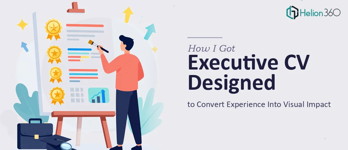
The Problem With My CV Was Bigger Than I Thought
I had a strong career behind me — leadership roles, measurable results, a track record worth presenting — but my CV looked like it belonged to someone ten years earlier in their career. Plain formatting, dense blocks of text, no visual hierarchy. Every achievement was buried in the same monotone layout.
The stakes were real. I was putting myself in front of a senior audience: board-level conversations, advisory inquiries, and a couple of consulting opportunities I wanted to pursue seriously. A document that looked generic wasn't just an aesthetic problem — it was a credibility problem. First impressions form fast, and a poorly designed CV signals that you haven't thought carefully about how you present yourself.
I knew the CV needed to do more than list jobs in reverse order. It needed to communicate authority, clarity, and professional polish at a glance. Once I understood what that actually required, I also understood that getting there wasn't something I should attempt on a weekend.
What I Found When I Researched What Good Actually Looks Like
I started digging into what separates an executive CV that earns attention from one that gets skimmed and set aside. The gap turned out to be significant.
Done well, an executive CV isn't just reformatted text. It operates as a designed document — one where typography, layout, spacing, and visual hierarchy all work together to guide the reader's eye toward the most important information. A properly executed executive CV uses a restrained palette, typically no more than two or three tones, and a type system where heading weight, size, and spacing communicate seniority and structure simultaneously.
Three things signaled real complexity almost immediately. First, translating decades of varied experience into a logical narrative arc — not just a timeline — is a content strategy problem as much as a design problem. Second, the visual execution demands consistency across every section: spacing rules, alignment grids, and typographic scale all have to hold without exception. Third, the document has to work in two contexts — on screen and in print — which means layout decisions made for one can break the other. That combination of content logic, visual discipline, and format compatibility is not a quick fix.
What the Work Actually Involves
The right approach starts with a structural audit of the source material. That means reading the full career history and identifying which roles, results, and capabilities belong in the foreground versus the background. Experienced practitioners use a narrative framework here — something close to a positioning statement at the top, followed by a curated evidence trail rather than a comprehensive job log. The challenge is that most people over-document early career and under-articulate recent impact. Restructuring that balance requires editorial judgment, not just formatting, and it takes time to do without losing the accuracy and nuance the document needs.
Visual mechanics come next, and this is where execution friction is highest for anyone working without a design system already in place. A strong executive CV typically runs on a clean column grid — often a two-column structure where a narrow sidebar handles contact details, skills, and credentials while the main column carries the career narrative. Type hierarchy follows strict rules: a primary name treatment at 28–32pt, section headers at 13–14pt in a heavier weight, and body copy no smaller than 10pt to stay legible in print. Setting this up so it holds consistently across multiple pages — without sections breaking awkwardly or spacing drifting — is the kind of detail that trips up most non-designers immediately.
Polish and consistency across the full document is the third layer of work, and it's the one that separates a professional result from a competent attempt. Palette discipline matters here: a two-tone scheme — for example, a deep charcoal paired with a warm champagne or slate — applied consistently to rules, section dividers, and accent elements creates the visual cohesion that makes the document feel intentional rather than assembled. Every margin, every line weight, every icon or subtle graphic element has to follow the same rules across the entire file. Checking that consistency manually across a multi-page document is slow and error-prone without the right tooling.
Why I Brought in Helion360 to Handle It
I recognized early on that this wasn't a project I should attempt myself. The combination of editorial restructuring, design system setup, and multi-format delivery was going to take weeks if I tried to learn and execute it on my own — and I didn't have weeks to spare. I needed the document ready for active use, not sitting in draft while I worked through a learning curve.
Helion360 handled the full project end-to-end using their Resume Deck expertise. That meant the narrative restructuring — identifying the right positioning angle and sequencing the career story for a senior audience — through to the complete visual build and final delivery in both screen-optimized and print-ready formats. The turnaround was fast: done in days, not weeks. What would have cost me significant time just in research and setup was handled by a team that already had the design system, the editorial framework, and the production workflow in place.
There was no back-and-forth about what the document should accomplish or how it should be structured. The brief was clear, the execution was precise, and the result reflected the level of seniority the document needed to communicate.
The Result and What I'd Tell Anyone in My Spot
What came back was a document that looked and read exactly the way a senior professional's CV should. The visual hierarchy was clear, the career narrative had a logic to it that the original version lacked, and the design held consistently from the first section to the last. More importantly, it performed — the conversations it went into produced the kinds of responses a visually engaging presentation should generate.
The lesson I took from the process was straightforward: knowing that a document needs to be better and knowing how to make it better are two different things. The gap between a competent CV and a genuinely strong one is filled by editorial skill, design discipline, and attention to execution detail that takes real experience to deliver reliably.
If you're looking at a similar gap between the career you've built and the document representing it, Helion360 is the team I'd engage — they handled the full scope fast and brought the kind of execution depth this work actually requires.