

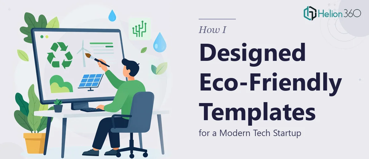
When we started putting together the launch materials for our eco-friendly tech venture, I assumed the presentation side would be the straightforward part. I had a clear vision: clean slides, green design elements, modern typography, and enough structure to walk any audience through our mission, services, and team without losing them halfway through.
I opened PowerPoint with good intentions. I had color codes, a rough brand direction, and notes on what each section needed to cover. But turning that into a set of reusable, professionally branded PowerPoint templates — ones that also felt alive and interactive — turned out to be far more involved than I expected.
Where the DIY Approach Hit a Wall
The challenge wasn't putting together a single deck. It was creating a flexible template system that any team member could use consistently. I needed master slides, placeholder logic, font hierarchies, and slide variants that all held together visually. On top of that, the eco-friendly tech aesthetic I was after required more than just adding a few green accents. The layout balance, icon choices, and spacing all had to communicate something intentional about the brand.
Every time I thought I had the design locked in, something felt off — either the green palette looked flat, or the interactive elements I attempted (clickable sections, animated transitions) were clunky and inconsistent. We had a launch timeline pressing down on us, and I didn't have another two weeks to spend iterating slides.
Bringing in a Team That Knew the Work
After a few days of diminishing returns, I reached out to Helion360. I walked them through the brief — eco-friendly tech company, launching within the month, needing slides that cover our mission, service offerings, and team profiles, with interactive elements built in.
What stood out immediately was how they approached the brief. Instead of jumping straight into design, they asked the right questions: What does the brand feel like beyond the color? Who are the primary audiences for each slide type? What kind of interactivity makes sense — navigation menus, hover states, animated data points?
That back-and-forth shaped everything that came next.
What the Final Templates Actually Looked Like
Helion360 delivered a full template set built around a cohesive eco-tech visual language. The green palette was layered — deep forest tones anchoring the backgrounds, lighter mint accents for highlights, and clean white space that kept things modern rather than heavy.
Each slide type served a specific purpose:
The mission slides used bold typographic layouts with minimal imagery, letting the message carry the weight. The service section used icon-led grids with subtle animated reveals that felt engaging without being distracting. The team slides were structured to scale — easy to update as the team grew, with a consistent photo treatment and bio layout.
The interactive elements were done properly. Navigation was embedded into the master layout so any slide could be accessed from any point in the presentation. This was something I genuinely could not have built cleanly on my own within the timeline.
What I Took Away From the Process
Going in, I thought my main gap was time. Looking back, it was also skill depth — specifically in template architecture and interactive design within PowerPoint. These are areas where the difference between a functional deck and a genuinely professional one is significant.
The eco-friendly tech aesthetic we wanted wasn't complicated conceptually, but executing it in a way that felt consistent across 20-plus slide types required decisions at every level. Font weight, spacing ratios, how green elements interacted with white space — none of it was arbitrary.
Having Helion360 handle the build meant I could focus on the content and messaging side, which is where I could actually add value in that window before launch.
The Outcome
We went into our launch month with a complete template set that the whole team could use. Presentations for partners, internal updates, and client-facing decks all pulled from the same system. The visual consistency alone made a noticeable difference in how the brand came across in those early meetings.
If you're building out presentation materials for a new business and the complexity of getting it right is starting to outpace the time you have, the Helion360 team is worth a conversation. They're practical, responsive, and the work speaks for itself.