

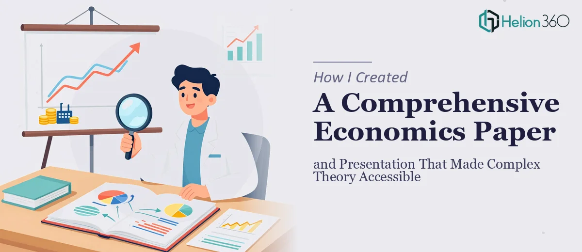
When Academic Rigor Meets a Real Deadline
I had a project that seemed straightforward at first: produce a comprehensive economics paper backed by solid data analysis, then translate the findings into a presentation that a mixed audience — academics, practitioners, and non-specialists — could actually follow. The subject involved macroeconomic theory layered with sector-level data, and the goal was to make it both academically rigorous and genuinely accessible.
I started with the research. That part I could manage. I pulled together economic data from multiple sources, mapped out the theoretical framework, and began drafting the paper's core arguments. It came together reasonably well on the content side. The challenge was what came next.
The Gap Between a Paper and a Presentation
Converting dense academic content into an engaging presentation is not just a formatting task. The logic of a written economics paper does not automatically translate to slides. Concepts that read clearly across paragraphs can fall completely flat on a slide if the visual hierarchy is wrong, if the data is not visualized properly, or if the narrative flow breaks down.
I tried building the presentation myself. I started with a basic slide structure, moved the key arguments across, and attempted to create charts from the economic data I had compiled. The charts looked cluttered. The slides were heavy with text. The overall structure did not guide the audience through the argument the way the paper did — it just reproduced it in a smaller format, which defeated the purpose.
The problem was not the economics. It was the translation from complex economic analysis into a visual, audience-ready format that could hold attention and encourage discussion. That required a different skill set than writing the paper.
Bringing In the Right Support
After spending more time than I had trying to fix slides that were not working, I reached out to Helion360. I explained the situation: a data-heavy economics paper that needed to become a presentation capable of communicating complex economic theories clearly to a diverse audience. Their team asked the right questions about the audience, the key arguments, and the tone — and then got to work.
What they did was take the paper's structure and rebuild it as a proper visual narrative. The economic data that I had struggled to present in chart form was redesigned into clean, readable data visualizations that supported each argument without overwhelming the slide. The theoretical sections were distilled into crisp, well-sequenced slides that guided the viewer through the logic without losing academic substance.
What the Final Presentation Actually Achieved
The result was a presentation that held its own alongside the paper rather than feeling like a reduced version of it. The economic theories were communicated through a combination of clear headings, structured visuals, and concise supporting text. The data visualization work in particular made a real difference — charts that I had built as rough tables were transformed into visuals that made trends and comparisons immediately obvious.
The presentation was also designed to encourage discussion, which was part of the original brief. The slide flow ended each major section in a way that naturally opened a question or invited a response from the audience, something I had not figured out how to do on my own without the slides feeling forced.
Helion360 also maintained consistency between the paper and the presentation — same terminology, same argument structure, same data references — so there was no disconnect when someone moved between the two documents. That alignment mattered, especially for an academic context where credibility depends on consistency.
What This Project Taught Me
I came away with a better understanding of where the real difficulty in this kind of work sits. Writing the economics paper was hard work, but it was the kind of hard work I was equipped for. Turning that paper into a presentation that could communicate complex economic data analysis clearly to a diverse audience — that required visual and structural expertise that I simply did not have at the level the project needed.
The lesson was practical: knowing your own limits on a complex project is not a weakness. It is what allows you to get the outcome right.
If you are working on something similar — an economics paper, a research-backed presentation, or any project where the content is solid but the visual communication is not landing — Helion360 is worth reaching out to. They handled the part I could not and delivered a presentation that matched the standard of the paper itself.