

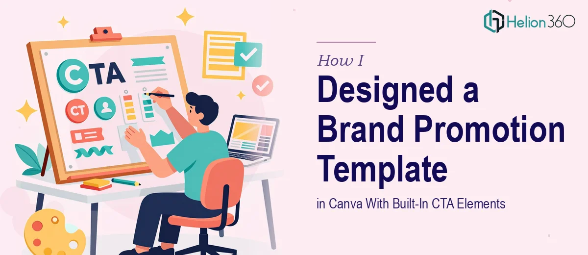
Starting With a Simple Idea That Got Complicated Fast
When our team finalized the new company logo and brand identity, the next step felt straightforward enough — create a polished, editable image we could use to promote the rebrand across social media. We wanted something that featured the logo prominently, included our tagline, gave a brief description of what we do, and had a call-to-action button linking back to our website.
Simple in concept. Harder to execute well.
I started in Canva since it seemed like the most accessible option. I pulled together a template, dropped in the logo, added the tagline, and tried to make the layout feel modern and professional. It looked decent at first glance. But the more I refined it, the more I noticed the problems — the CTA button felt misaligned with the rest of the design, the text hierarchy was off, and the overall layout didn't feel like something I'd want representing our brand publicly.
Where the DIY Approach Started to Break Down
The core issue wasn't just aesthetics. I needed the final file to be truly editable — structured in a way that anyone on the team could open it later and swap out text or update the visuals without breaking the layout. That kind of intentional design structure is harder to build than it sounds.
I also kept second-guessing the CTA placement. Should it be at the bottom? Overlaid? Separate from the main visual block? Every choice I made felt like a compromise. I was spending hours on something that was supposed to take an afternoon, and the deadline was a week out.
That's when I reached out to Helion360. I explained what we were trying to do — an editable brand promotion template in Canva, built around our new logo, with a clean layout, readable text, and a functional CTA element. Their team understood exactly what was needed and asked the right questions upfront: brand colors, font preferences, tone of the design, and where the template would be used.
What the Final Template Actually Looked Like
Helion360 came back with a design that handled everything I had been struggling with. The layout was clean and structured — the logo sat in a natural focal point, the tagline was given proper visual weight, and the service description was kept short and legible without feeling cramped.
The CTA button was integrated into the design properly, not just dropped in as an afterthought. It was visually distinct but still consistent with the overall brand palette. More importantly, the file was set up in Canva with clearly labeled text layers, so editing it in the future would take minutes, not hours.
The typography choices made a real difference too. Clean hierarchy, appropriate sizing, enough white space to let the logo breathe — all things I had been trying to get right on my own but couldn't quite land.
What I Learned From the Process
Designing something that looks professional and functions as a reusable editable template are two different skills. A well-structured Canva template requires intentional layer organization, consistent use of brand elements, and an understanding of how the design will hold up when someone else opens and edits it down the line.
I had the content and the brand assets. What I was missing was the design judgment to put it all together in a way that would actually work — both visually and practically. The process also reminded me that a tight deadline is not the time to experiment with tools and layouts you're not fully confident in.
The final social media graphic went out on schedule, and the response from the team was immediately positive. The template has since been reused for follow-up posts with minimal effort, which was exactly the goal.
If you're in a similar position — trying to build an editable brand promotion template that looks polished and stays functional across future edits — Helion360 is worth reaching out to. They stepped in at the right moment and delivered something I couldn't have produced alone in the time available. For additional insights on designing professional visual presentations, explore how others have tackled brand-aligned PowerPoint presentations.