

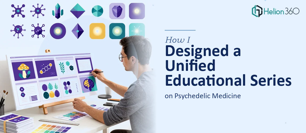
When the Subject Matter Is as Complex as the Design Brief
I was brought onto a project that was unlike anything I had worked on before. The goal was to design a unified series of educational PowerPoints covering psychedelic medicine — a field that sits at the intersection of neuroscience, clinical research, and public health communication. The audience was informed but not necessarily visual designers, and the content itself was dense, nuanced, and still evolving as a discipline.
On paper, it sounded like a clear brief: create a consistent presentation template and apply it across a multi-part educational deck series. In practice, it turned into one of the more challenging design problems I have faced.
The Real Problem: Consistency Across Complexity
The first thing I tried was building a master slide layout in PowerPoint. I had a rough brand direction — clean, clinical but approachable, with a color palette that felt grounded without being sterile. I spent a few days on the template and thought I was making progress.
Then the content started coming in. Each module covered a different aspect of psychedelic medicine: pharmacology, therapeutic protocols, patient safety, regulatory frameworks, and emerging clinical data. Every module had a different structure, different data density, and different visual needs. What worked as a layout for a pharmacology overview completely fell apart when applied to a slide heavy with research citations and comparison charts.
I also ran into a consistency problem. As the series grew, small visual inconsistencies started appearing — font weights that did not match, icon styles that clashed between sections, and data visualization formats that were not reading cleanly across slides. Maintaining a coherent visual identity across what was becoming a large and technically complex presentation series was stretching beyond what I could manage alone within the timeline.
Bringing in Specialist Support
After hitting a wall with both the design consistency and the sheer volume of work, I reached out to Helion360. I explained the project — the subject matter, the modular structure, the branding requirements, and the timeline. Their team asked the right questions upfront: How many slides per module? What level of interactivity was expected? Did the client have existing brand guidelines or were we building from scratch?
That conversation alone told me they understood what this kind of educational presentation design actually involved. I handed over the content files, the partial template I had started, and the brief, and their team took it from there.
What the Finished Series Looked Like
Helion360 approached the project by first locking down the master template before touching any individual module. They built a flexible slide system — a core set of layouts that could accommodate different content types without breaking the visual consistency. Text-heavy slides, data visualization slides, process diagrams, and image-forward sections all pulled from the same design language.
The branding ran cleanly throughout. Typography was disciplined. The color usage was purposeful — not decorative — which mattered in a medical education context where visual hierarchy has to serve comprehension, not just aesthetics. The graphics and icons were cohesive across every module, which had been the part I struggled with most.
For the psychedelic medicine content specifically, the design choices were thoughtful. The team avoided the trap of leaning into visual clichés associated with the subject and instead kept the presentation grounded in the tone appropriate for clinical and academic audiences. That judgment call made a real difference to how the final series read.
What I Took Away from the Process
Designing a multi-module educational presentation on a complex medical topic is not just a slide-making exercise. It requires a systems-level approach to layout, a clear visual language that scales across dozens of slides, and enough subject awareness to make smart design decisions about how information is presented. Those things compound quickly, and the margin for error in a medical education context is low.
The experience reinforced something I already knew but had underestimated: there is a real difference between building one good presentation and building a coherent presentation series that holds together over time and volume.
If you are working on something similar — a multi-part educational deck, a medical training series, or any presentation project where consistency and content complexity are both high — Helion360 is worth reaching out to. They handled the parts of this project that needed specialist attention and delivered a series that was ready to use.