

When the Content Is Ready but the Slides Are Not
I had spent weeks putting together a detailed training outline. Circuit analysis fundamentals, safety protocols for live systems, troubleshooting flowcharts, and real-world scenarios — everything was there on paper. The content was solid. What I did not have was a way to turn it into something a room full of new employees would actually absorb and remember.
I had tried building the slides myself. I am comfortable in PowerPoint at a functional level, and I thought that would be enough. But the moment I started laying out circuit diagrams alongside equations and safety steps, I realized the problem. The information was dense, and I was not able to structure it visually in a way that moved the learner forward. Every slide felt either overloaded or oversimplified. Neither worked for a technical audience that needed precision but also clarity.
Why Electrical Training Slides Are Harder Than They Look
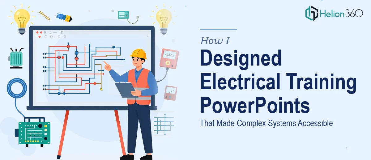
Electrical training PowerPoint design is not like building a sales deck or a company overview. You are dealing with material that has layers — conceptual explanations, diagrams that must be technically accurate, sequential procedures that cannot be reordered, and safety information that has to register immediately. When any one of those elements is handled poorly, the whole session suffers.
I tried reorganizing the content structure a few different ways. I experimented with splitting slides by topic, then by learning objective, then by difficulty level. Each approach solved one problem and created another. The diagrams were too small when I added explanatory text alongside them. The safety protocol slides looked like warning labels rather than instructional content. The troubleshooting section, which had a clear logical flow in my notes, became a jumbled set of disconnected slides when I tried to visualize it.
After two full evenings of revisions that kept making things worse, I stepped back and accepted that this was a design problem, not just a content problem.
Handing It Off to a Team That Understood Both
A colleague had mentioned Helion360 after a similar situation with a technical training project. I reached out, shared my outline, a few rough slides I had built, and the context — new employee onboarding, electrical systems, mixed audience of engineers and non-specialists. Their team asked the right questions upfront: What was the audience's baseline knowledge? Would the slides be presenter-led or self-paced? Were there brand guidelines to follow?
Those questions told me they had done this kind of work before. Within a short turnaround, they came back with a structured approach — each major topic broken into a logical slide sequence, circuit diagrams redrawn cleanly, safety protocols given their own visual language so they stood out from instructional content, and troubleshooting steps laid out as a visual flow rather than a text block.
What the Final Electrical Training Presentation Looked Like
The finished slides were genuinely different from what I had attempted. The circuit analysis section used annotated diagrams with callouts that walked learners through the logic step by step rather than presenting everything at once. Equations were placed in context next to the scenarios they applied to, not dropped onto a slide alone. The safety protocol section used consistent iconography and color cues so that hazard information was immediately distinguishable from instructional content.
The troubleshooting section — the one I had struggled with most — was built as a branching visual flowchart across several slides. A learner could follow the decision path from symptom to diagnosis to resolution without losing their place. That alone changed the training session significantly.
What I Took Away From This Experience
Building an electrical training PowerPoint that actually teaches something requires more than organizing content onto slides. It requires understanding how people learn technical material in a group setting, how visual hierarchy guides attention, and how to balance technical accuracy with readability. Those are design skills that take time to develop.
Knowing your content well is the starting point. But translating that content into a presentation that holds an audience's attention through circuit theory, safety compliance, and fault diagnosis — that is a different skill set entirely.
If you are working on a technical training presentation and finding that your slides are not doing justice to your content, Helion360 is worth reaching out to. They handled the structural and visual complexity that I could not manage alone, and the result was a training deck that actually served its purpose in the room. For similar challenges with complex compliance materials, their approach has proven effective across different technical domains.