

When the Content Is Critical, the Design Has to Match
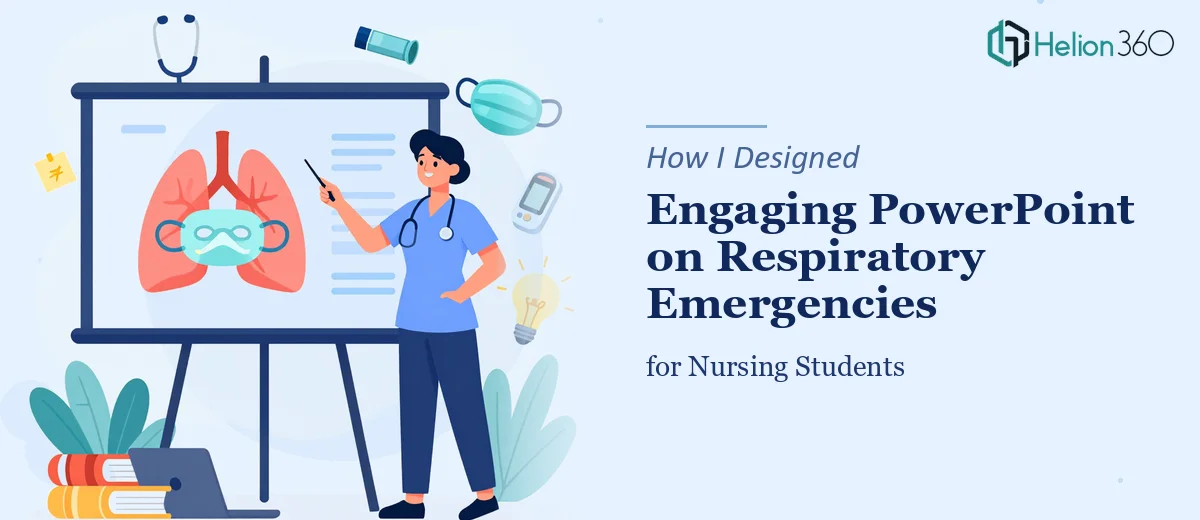
I was tasked with building a PowerPoint presentation on respiratory emergencies for beginning nursing professionals. The audience was clear — students early in their clinical training who needed to understand symptoms, causes, treatment protocols, and emergency management. The stakes were high. This was not a corporate deck where a weak slide could be quietly forgiven. If a nursing student walked away confused, that gap in understanding had real consequences.
I knew the clinical content well enough to structure the outline. But turning dense medical information into something visually clear, educationally sound, and genuinely engaging for early-career nurses — that was a different challenge entirely.
The Problem With Medical Education Slides
Most medical education PowerPoints I had seen followed the same tired pattern: walls of text, generic stock photos, and dense bullet-heavy slides that dulled rather than sharpened attention. For a topic like respiratory emergencies — covering conditions like acute asthma, pulmonary embolism, pneumothorax, and respiratory failure — that approach would not work. Beginning nursing professionals need visual anchors, clear sequencing, and digestible explanations. The information has to flow logically from symptom recognition to triage to treatment.
I spent a few days trying to build this myself. I drafted the content flow, sketched out a slide structure, and started working in PowerPoint. The written content was solid. But the design kept falling flat. I could not figure out how to present airway anatomy, emergency intervention steps, and clinical decision points in a way that felt both accurate and visually compelling. Every time I tried to make a slide cleaner, I lost important detail. When I added the detail back, the slide became overwhelming again.
I also wanted interactive elements — a way for nursing students to engage with the content rather than passively read it — but building that into PowerPoint without it looking amateurish was harder than I expected.
Bringing in the Right Team
After hitting that wall, I reached out to Helion360. I explained the context: a medical education presentation on respiratory emergencies aimed at beginning nursing professionals, needing a balance between clinical accuracy and visual accessibility. I shared my content outline, the flow I had in mind, and some rough notes on the tone I wanted.
Their team took it from there. They asked the right questions upfront — about the audience's experience level, how the slides would be delivered, and whether the presentation needed to work in classroom settings or self-paced learning. Those details shaped every design decision that followed.
What the Final Presentation Looked Like
The finished deck was structured in a way I had not been able to crack on my own. Each respiratory emergency was introduced with a clean visual layout — a concise symptom overview, a clearly labeled diagram or icon set representing physiological changes, and a step-by-step management pathway that a nursing student could actually follow in sequence.
The design used a consistent color system to signal severity and urgency — immediately useful for a clinical education context. Slides covering high-acuity emergencies like respiratory failure were visually distinct from introductory overview slides, guiding the learner's attention without any explanation needed. The interactive elements were built in cleanly, using PowerPoint's native features in ways I had not thought to use them.
The typography was readable at a distance for classroom projection but also worked for individual screen viewing. Nothing was cluttered. Nothing was missing. The content I had written landed the way it was supposed to.
What This Project Taught Me
Presentation design for medical education is genuinely its own discipline. It sits at the intersection of instructional design, clinical communication, and visual layout — and getting all three right at the same time requires more than PowerPoint skills. The content has to teach, the structure has to guide, and the design has to reduce cognitive load rather than add to it. That combination takes experience to execute well.
The end result was a presentation I felt confident putting in front of nursing students. Clear, accurate, visually engaging, and structured to support learning rather than replace it.
If you're working on a medical education presentation and finding that the design keeps getting in the way of the content, consider PowerPoint Redesign Services — they understood the requirements quickly and delivered something that genuinely worked for the audience it was built for. For additional insights, explore how custom graphics and consistent branding transformed other complex projects, or learn about minimalist PowerPoint templates that command attention without clutter.