

The Problem With Our Share Scheme Rollout
We were rolling out an employee share scheme across a team of over two hundred people. The scheme itself was genuinely good — competitive vesting terms, meaningful upside, real participation incentives. But when I looked at the materials we had to communicate it, the gap was obvious. Dense policy documents, a few rough slides, and a lot of financial language that most employees would glaze over before reaching slide three.
The stakes were high. Low participation in the launch window would signal distrust, not disinterest. HR had one shot at this — a company-wide all-hands with a follow-up slide deck going out to every team lead. The presentation needed to make a complex financial instrument feel clear, fair, and worth acting on. This wasn't a slide refresh. It needed to be built properly from the ground up, and I knew that doing it badly would cost us more than doing it right.
What I Found This Kind of Presentation Actually Requires
I started mapping out what a well-executed employee share scheme presentation actually involves, and the scope became clear quickly. This isn't a standard business update deck. It sits at the intersection of financial communication, legal compliance, and behavioral design — and each dimension has real requirements.
First, the content architecture has to work for a non-financial audience. The narrative can't assume employees understand vesting cliffs, dilution mechanics, or tax treatment on exercise. The structure needs to sequence information so that trust is built before complexity is introduced — problem, then solution, then mechanics, then what to do next.
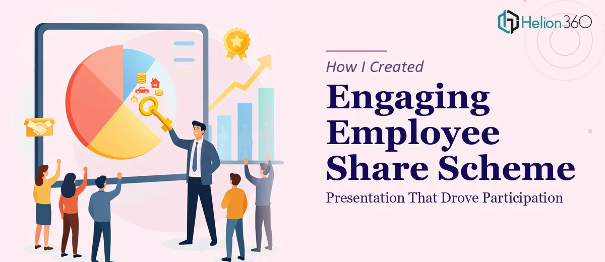
Second, the visual layer has to carry the explanatory work. Concepts like vesting schedules, option pools, and strike prices don't survive as bullet points. They need timelines, comparison visuals, and scenario illustrations. Getting those visuals right — accurate, proportional, and clearly labeled — is not a quick task.
Third, the compliance layer is real. Share scheme communications in most jurisdictions sit close to regulated financial promotion territory. Disclaimers, defined terms, and accuracy in every number matter. A presentation that gets this wrong creates legal exposure, not just confusion.
The Work That Goes Into Building It
The right approach starts with a structural audit of the source material — the scheme rules, legal summaries, and any HR briefing documents — and then a deliberate mapping of the narrative arc. For an employee audience, that arc typically moves from "why this exists" through "what you actually get" to "how to participate," with each section earning the right to introduce the next level of detail. Restructuring raw policy language into a logical, plain-English sequence takes careful editorial judgment and typically involves multiple passes before the slide-level outline is stable.
Visual mechanics for this type of presentation demand precision alongside clarity. A vesting timeline, for example, needs to be proportionally accurate — four-year cliff vesting with a one-year cliff renders very differently from monthly vesting, and a designer who draws it arbitrarily will produce something misleading. Typography hierarchy matters too: a three-level system — roughly 36pt for key claims, 24pt for supporting points, 16pt for footnotes and caveats — keeps each slide scannable. Layout grids, consistent icon sets, and color-coded scenario comparisons all have to be built into master slides so they propagate correctly. Setting that up properly takes hours even for someone experienced with the software.
Polish and consistency across a thirty-slide deck is where most internal attempts fall apart. Every number, every defined term, and every disclaimer has to be cross-checked against the source documents. Color usage needs to stay within a tight palette — typically three to four brand colors — with a clear system for which color signals a benefit, a condition, or a caution. When slide layouts are inconsistent, or when the same figure appears differently on slides eight and twenty-two, the credibility of the entire communication takes a hit. Reaching that level of consistency manually, without templated masters and a structured review pass, is genuinely time-consuming work.
Why I Brought in Helion360 to Handle It
I looked at what the work genuinely required and made a straightforward call: this was not something to attempt internally with a tight deadline and no dedicated design resource. The all-hands was in ten days. The deck needed to be accurate, legally compliant, and visually clear enough to actually move people toward participation.
Helion360 handled the full project end-to-end. That meant taking the raw scheme documents and HR briefing notes, building the narrative structure from scratch, designing the visual system, and producing a presentation that was ready to deliver without any internal rework. They handled the vesting timeline visuals, the scenario comparison slides, and the brand-consistent layout across every section — turned around quickly, in a fraction of the time it would have taken any internal team to learn, build, and QA the same output.
The speed mattered as much as the quality. Done in days, not weeks, and with the kind of attention to accuracy and compliance framing that this type of content demands.
What the Presentation Delivered — and What I'd Tell Anyone in My Spot
The all-hands landed well. Employees who had previously said the scheme felt confusing told us afterward they finally understood what they were signing up for. Participation in the first window exceeded what we had modeled. The team leads who received the follow-up deck reported that it held up just as well in small group conversations as it had in the full presentation.
What I took from the project was a clear sense of how much is actually at stake in a communication like this — and how easy it is to underestimate the work. A presentation that handles financial complexity for a general employee audience has to earn clarity through structure, earn trust through visual precision, and earn action through a logical, unhurried sequence. That is not a weekend project, and it is not something a well-intentioned internal team member can pull off in ten days alongside everything else they have going on.
If you're facing the same kind of high-stakes internal communication and want it handled end-to-end without the learning curve, Helion360 is the team I'd engage — they delivered for me fast and brought exactly the execution depth this work requires.