

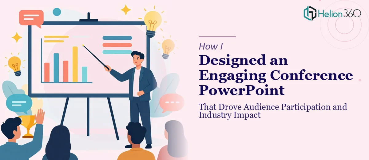
The Brief Looked Simple. It Wasn't.
I was tasked with building a conference PowerPoint from scratch. The event was bringing together professionals from across the industry, and the presentation needed to do a lot of heavy lifting — introduce key speakers, walk through technology trends, present case studies with data visualizations, address sector challenges, and somehow keep a room full of busy professionals engaged from start to finish.
On paper, that's about seven distinct sections. In practice, it's seven different design problems rolled into one file.
I started with what I knew. I roughed out a slide order, pulled together the content brief, and began laying things out in PowerPoint. The cover slide came together quickly. The agenda and speaker introduction slides were manageable. But the moment I hit the case studies and the data visualization sections, things slowed down considerably.
Where the Complexity Crept In
The challenge wasn't the data itself — it was making it readable and visually coherent. Raw statistics on a slide don't communicate anything. They need context, hierarchy, and the right chart type. I was spending more time trying to make charts look presentable than I was thinking about what the audience actually needed to understand.
Then there were the interactive sections. The brief called for embedded polls and quiz-style engagement moments — the kind of interactive elements that make a conference presentation feel live rather than just a slideshow being read aloud. I had ideas, but implementing them cleanly within PowerPoint, while keeping the design consistent and brand-aligned, required a level of precision I simply didn't have bandwidth for at that point.
On top of that, the presentation had to work across different devices and screen sizes. Something that looks sharp on a laptop can fall apart on a projector or a tablet. That's a real constraint that affects layout decisions at every level.
After hitting a wall on several of these fronts, I reached out to Helion360. I explained the full scope — the sections, the audience, the brand guidelines, the need for interactive elements — and their team took it from there.
What the Design Process Actually Looked Like
Helion360 came back with a clear approach. They started with the cover slide and established a visual language that would carry through the entire deck — consistent typography, a color palette pulled from the brand guidelines, and a layout structure that could flex across different slide types without looking disjointed.
The speaker introduction slides were designed to feel personal without being cluttered. Each key speaker got a clean layout with enough white space to breathe. The case studies with data visualizations were rebuilt with proper data visualizations — bar charts, comparison tables, and callout statistics that were easy to scan even from the back of a room.
The interactive sections were handled thoughtfully. Rather than trying to force third-party poll tools into an awkward integration, the team designed slides that could pair seamlessly with live polling platforms, with clear visual cues that prompted audience participation at the right moments. It kept the energy in the room without disrupting the flow.
The challenges-and-solutions section used a structured two-column format that made it easy to follow without being overly text-heavy. And the closing slides — the key takeaways and the contact and resources page — wrapped the presentation in a way that felt intentional, not like an afterthought.
What I Took Away From This
Building a conference PowerPoint that actually works for an audience isn't just about getting content onto slides. It's about making design decisions that serve communication — how data is visualized, how interactive moments are timed, how brand identity stays consistent from the first slide to the last. Those decisions compound quickly, and the gap between a functional presentation and a genuinely engaging one is wider than it looks from the outside.
The finished deck was polished, on-brand, and device-ready. More importantly, it held the room.
If you're building something similar — a conference presentation with multiple sections, real data, and an audience that needs to stay engaged — Helion360's business presentation design services is worth talking to. They handled the parts that were genuinely difficult and delivered a presentation that was ready to use without a round of fixes.