

The Brief Sounded Simple. It Wasn't.
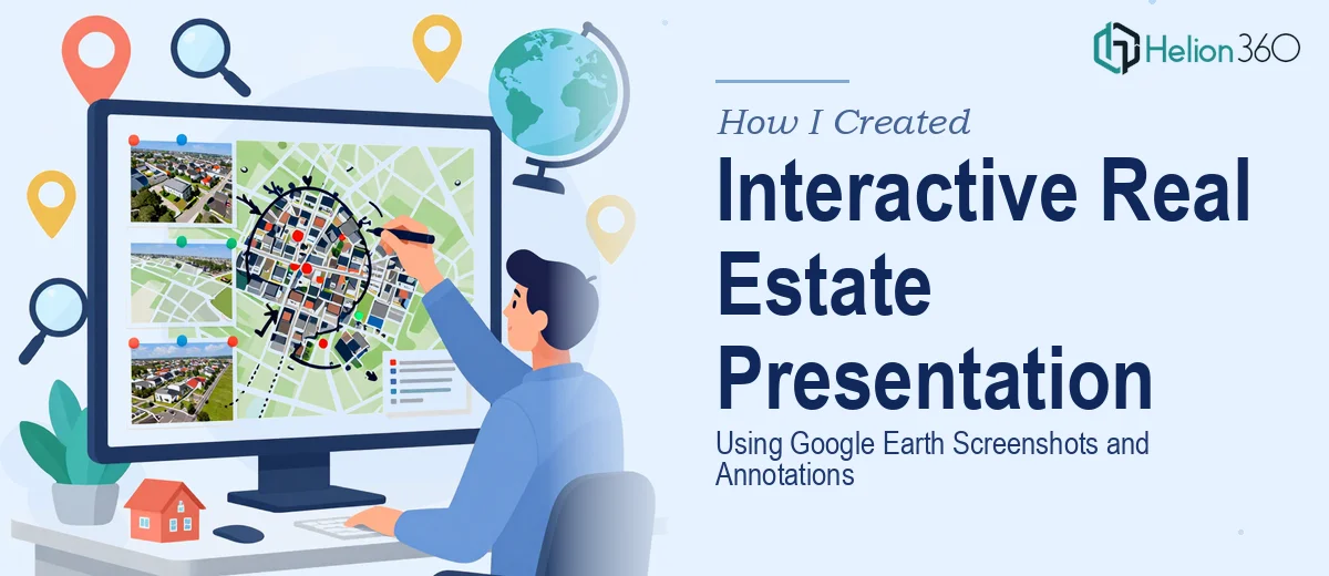
I was tasked with putting together a marketing presentation for a real estate company operating in New York City. The goal was to showcase several commercial properties using Google Earth — high-definition aerial and panoramic views with clear annotations calling out architectural details, floor counts, nearby landmarks, and points of interest.
On paper, it felt manageable. Pull some screenshots from Google Earth, drop them into PowerPoint, add a few labels, done. I had done basic slide decks before, and I figured this one would follow the same pattern.
It did not.
Where Things Started to Break Down
The first issue was image quality. Google Earth screenshots, when pasted directly into a PowerPoint slide, lost a lot of their sharpness. Zoomed-in aerial views that looked crisp on screen turned muddy the moment I placed them inside a slide and resized them. The detail that made the images useful — rooflines, setbacks, neighboring structures — became hard to read.
The second problem was layout. Each property slide needed to do a lot of work: display the aerial view, include annotation callouts pointing to specific building features, maintain visual consistency across the deck, and leave room for supporting text. Every time I got one element to look right, something else fell out of balance.
The interactive component made things considerably harder. The idea was to allow viewers to click on a building within the slide and zoom into a more detailed view of that area. I knew PowerPoint supported hyperlinks and zoom features, but building that kind of navigation cleanly — without it feeling clunky or confusing — was a different challenge entirely. My attempts produced something that technically worked but looked unprofessional.
After a few days of iterating and not making real progress, I had to be honest with myself: the combination of Google Earth visual sourcing, annotated real estate slide design, and interactive PowerPoint navigation was more than I could execute to the standard this presentation needed.
Bringing in a Team That Could Handle It
That's when I reached out to Helion360. I described the project — the NYC real estate context, the Google Earth screenshot workflow, the annotation requirements, and the interactive click-through elements — and their team understood it immediately.
What I handed over was a rough working file, a list of properties, and notes on what each slide needed to communicate. They took it from there.
What the Final Presentation Looked Like
The team sourced and optimized the Google Earth visuals at a resolution that held up at full screen without losing clarity. Each property slide was structured cleanly, with the aerial view taking up the appropriate amount of space and callout annotations placed in a way that guided the viewer's eye without crowding the layout.
The annotations themselves were precise — floor counts, architectural style labels, and landmark indicators were all formatted consistently across slides, which gave the deck a cohesive, professional feel. For the interactive layer, Helion360 built a navigation system where clicking on a building area triggered a zoom view into a supplementary slide with additional detail, then returned the viewer to the main property slide. It was smooth and intuitive in a way my version never was.
The branding was consistent throughout, and the slide design matched the tone a commercial real estate marketing presentation should carry — clear, authoritative, and visually grounded.
What I Took Away From This
The challenge with a project like this isn't any single element — it's the combination. Google Earth screenshots as a source material, annotated real estate slide design, and interactive PowerPoint navigation each require specific knowledge. When you need all three to work together inside a polished deck, the complexity compounds quickly.
I also learned that the visual storytelling layer of a real estate presentation matters more than I initially assumed. Investors and decision-makers reading through a property deck are making judgments based on how the visuals communicate, not just what data they contain. A blurry aerial view with misaligned callouts sends a different signal than a crisp, well-annotated one.
If you're working on a real estate presentation that involves property mapping, aerial visuals, or any kind of interactive PowerPoint navigation in PowerPoint, Helion360 is worth reaching out to — they handled the technical and design complexity that I couldn't and delivered a deck that was genuinely ready to present.