

The Brief Sounded Simple Enough
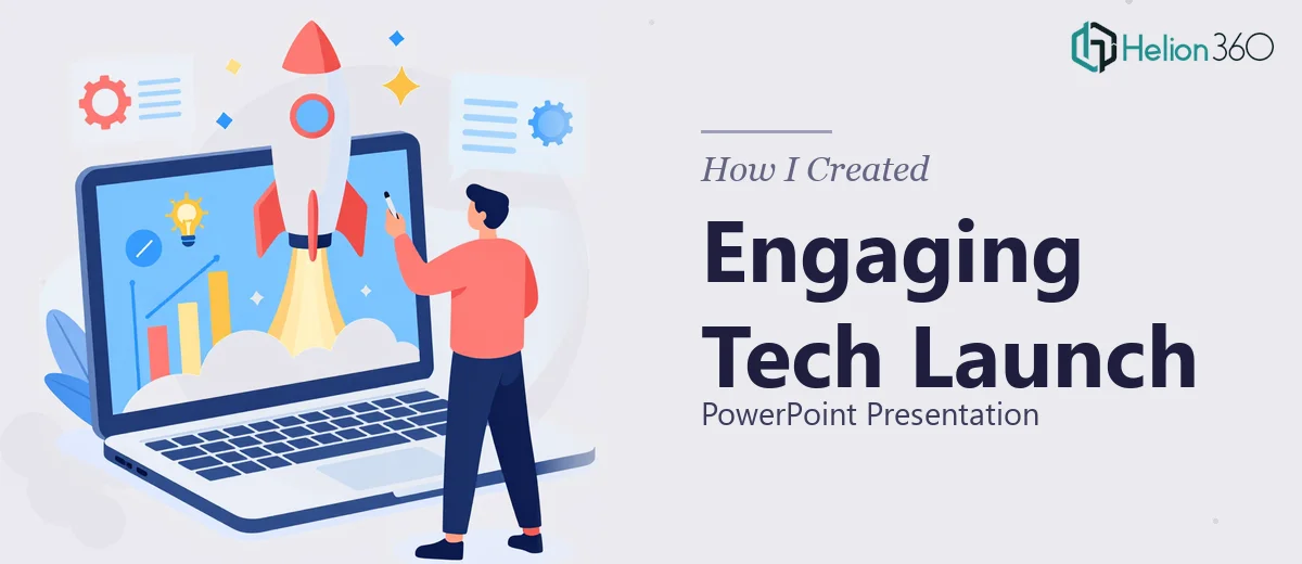
We had a product launch coming up at a tech conference, and someone had to turn our key talking points into a polished, engaging PowerPoint presentation. That someone ended up being me.
The brief was clear on the surface: introduction slide, product overview, features, how it works, customer testimonials, a strong conclusion, and a few interactive elements sprinkled in. The team also wanted it to feel energetic, not stiff — with room for a bit of humor where it fit naturally. Conference audiences don't want to stare at walls of text.
I figured I could handle it. I know my way around PowerPoint well enough, and I had all the content ready to go.
Where It Got Complicated
The problem wasn't putting content into slides. That part was fine. The problem was making it look and feel like it belonged on a conference stage in front of a room full of tech professionals.
Every time I tried to design a slide, something felt off. The feature slides looked too dense. The testimonial section felt flat. The transitions I added either looked cheap or slowed the whole thing down. I spent an entire afternoon trying to make one product overview slide feel dynamic — and it still looked like an internal report.
I also realized that "engaging" and "professional" are harder to balance than they sound. Go too minimal and it feels cold. Add too much and it becomes a distraction. The interactive elements I tried to build — clickable navigation, animated sections — weren't behaving the way I expected them to.
The conference date wasn't moving, and I was burning time I didn't have.
Bringing in the Right Help
After hitting that wall, I came across Helion360. I explained what I was working on — a product launch presentation for a live conference, roughly 15 to 18 slides, professional but energetic in tone, with interactive elements and visual storytelling that matched the product's positioning.
Their team asked the right questions upfront: brand colors, font preferences, any existing design assets, the intended audience, and how the slides would be presented — screen share or projected display. That alone told me they were thinking about the full picture, not just making something that looked nice as a static file.
What the Final Deck Looked Like
The result was a complete product launch presentation that I genuinely couldn't have produced on my own in the time available — at least not at that level.
The introduction slide set the tone immediately, with a clean visual hierarchy and a layout that felt more like a product reveal than a standard opener. The feature slides used iconography and structured layouts that made dense information feel scannable. The "how it works" section was built as a flow-based visual, which made the process easy to follow without being over-explained.
The customer testimonial slides were the most improved section compared to what I had tried. Helion360 used a card-style layout with visual emphasis on the key quote, which made them feel credible and human rather than like a data point.
The interactive elements — chapter navigation and a clickable feature breakdown — worked cleanly and didn't interrupt the presentation flow. And yes, the humor landed in the right places without undermining the professional tone.
What I Took Away From This
Building a strong product launch PowerPoint isn't just about filling slides with content. It's about pacing, visual hierarchy, slide-to-slide flow, and understanding how an audience experiences information in a live setting. Those things take time and a specific kind of design thinking that goes beyond knowing the software.
The conference presentation went well. The slides held up on the big screen, the interactive sections worked without a hitch, and the team got the energetic-but-polished feel they were after.
If you're working on a product launch presentation and the gap between "good enough" and "conference-ready" feels wider than expected, Helion360 is worth reaching out to — they handled the complexity and delivered exactly what the moment required.